UWP - How to add a Hyperlink to a TextBlock

UWP - Add a Hyperlink to a TextBlock
The TextBlock is the primary control for displaying read-only text in UWP apps. The UWP app developers can use it to display single-line or multi-line text, inline hyperlinks, and text with formatting like bold, italic, or underlined. The TextBlock is designed to display a single paragraph and it does not support text indentation.

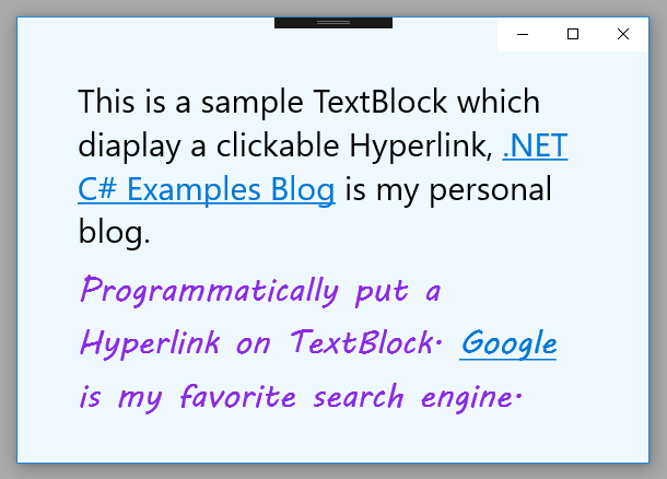
The following Universal Windows Platform application development tutorial demonstrates how we can add a Hyperlink to a TextBlock. Here we will display a Hyperlink inside two TextBlock texts. That means we will put a Hyperlink within the TextBlock text.

For the first TextBlock control, we will add a Hyperlink inside the text using the XAML language. And for the second TextBlock control, we will put a Hyperlink within its text programmatically.

For the first TextBlock control, we will use inline Run and Hyperlink elements to add a Hyperlink in the text. And for the second TextBlock control, we will create and apply the Run and Hyperlink elements programmatically.

The Run class represents a discrete section of formatted or unformatted text. The UWP developers can use a Run instance in a TextBlock or RichTextBlock. The UWP app developers can even place multiple Run elements inside a Span. The UWP developers should typically use the Run element only when they want to format a discrete section of text within the TextBlock.

The Run class Text property gets or sets the text contents of the Run.

The Hyperlink class provides an inline-level content element that provides facilities for hosting hyperlinks.

The Hyperlink class NavigateUri property gets or sets the Uniform Resource Identifier (URI) to navigate when the Hyperlink is activated. This property value is a Uri which is the Uniform Resource Identifier (URI) to navigate to when the Hyperlink is activated. The default value is null. By default, a Hyperlink appears as a text hyperlink.

The Hyperlink class Inlines property gets an InlineCollection containing the top-level inline elements that include the contents of Span. This property is inherited from Span.

The TextBlock class Inlines property gets the collection of inline text elements within a TextBlock. This property value is an InlineCollectionWhich is a collection that holds all inline text elements from the TextBlock. The default value of this property is an empty collection.
MainPage.xaml

<Page
    x:Class="UniversalAppTutorials.MainPage"
    xmlns="http://schemas.microsoft.com/winfx/2006/xaml/presentation"
    xmlns:x="http://schemas.microsoft.com/winfx/2006/xaml"
    xmlns:local="using:UniversalAppTutorials"
    xmlns:d="http://schemas.microsoft.com/expression/blend/2008"
    xmlns:mc="http://schemas.openxmlformats.org/markup-compatibility/2006"
    mc:Ignorable="d"
    >
    <StackPanel Padding="50" Background="AliceBlue">
        <TextBlock
            x:Name="TextBlock1"
            TextWrapping="Wrap"
            Margin="5"
            FontSize="30"
            >
            <Run>This is a sample TextBlock which diaplay a clickable Hyperlink,</Run>
            <Hyperlink
                NavigateUri="https://asp-net-example.blogspot.com/"
                >
                .NET C# Examples Blog
                </Hyperlink>
            <Run>is my personal blog.</Run>
        </TextBlock>
        <TextBlock
            x:Name="TextBlock2"
            FontSize="30"
            Foreground="BlueViolet"
            TextWrapping="Wrap"
            Margin="5"
            FontFamily="MV Boli"
            />
    </StackPanel>
</Page>
MainPage.xaml.cs

using Windows.UI.Xaml.Controls;
using Windows.UI.Xaml.Documents;


namespace UniversalAppTutorials
{
    public sealed partial class MainPage : Page
    {
        public MainPage()
        {
            this.InitializeComponent();
            UpdateSecondTextBlock();
        }

        void UpdateSecondTextBlock() {
            // Initialize a new Run instance
            Run run = new Run();
            run.Text = "Programmatically put a Hyperlink on TextBlock. ";

            // Initialize a new Run instance for Hyperlink text
            Run run2 = new Run();
            run2.Text = "Google";

            // Initialize another Run instance
            Run run3 = new Run();
            run3.Text = " is my favorite search engine.";

            // Initialize a new Hyperlink instance
            Hyperlink hyperlink = new Hyperlink();
            // Specify the Hyperlink navigate Uri
            hyperlink.NavigateUri=new System.Uri("https://www.google.com");
            // Specify the Hyperlink text
            hyperlink.Inlines.Add(run2);

            // Clear the TextBlock
            TextBlock2.Inlines.Clear();
            // Add the text to the TextBlock
            TextBlock2.Inlines.Add(run);
            // Programmatically put a clickable Hyperlink on TextBlock
            TextBlock2.Inlines.Add(hyperlink);
            // Add the text to the TextBlock
            TextBlock2.Inlines.Add(run3);
        }
    }
}
UWP - How to make TextBlock text selectable

UWP - Make TextBlock Text Selectable
The TextBlock is the primary control for displaying read-only text in UWP apps. The UWP app developers can use it to display single-line or multi-line text, inline hyperlinks, and text with formatting like bold, italic, or underlined. The TextBlock is designed to display a single paragraph and it does not support text indentation.

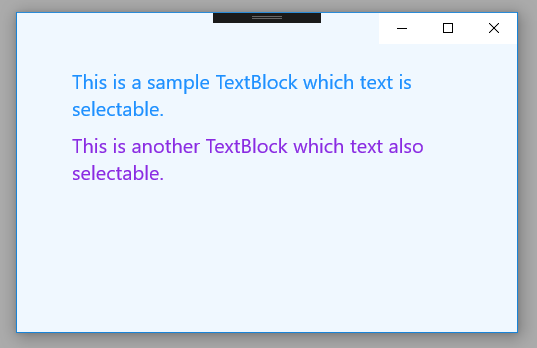
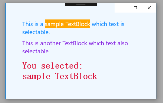
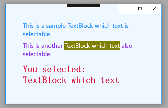
The following Universal Windows Platform application development tutorial demonstrates how we can enable text selection in a TextBlock control. Here we will set the TextBlock IsTextSelectionEnabled property value to true to enable text selection. We will also handle text selection changes by using the TextBlock SelectionChanged event and display the selected text to another TextBlock control.

The TextBlock class IsTextSelectionEnabled property gets or sets a value that indicates whether text selection is enabled in the TextBlock, either through user action or calling selection-related API.

This property value is a Boolean. The value is true if text selection is enabled otherwise the value is false.So using this IsTextSelectionEnabled property the UWP developers can enable the text selection in a TextBlock control.

The TextBlock SelectionChanged event occurs when the text selection has changed. The SelectionChanged event type is RoutedEventHandler. The RoutedEventHandle delegate represents the method that will handle routed events.

The RoutedEventHandler(object sender, RoutedEventArgs e) method has two parameters named sender and e. The sender parameter is the object to which the event handler is attached. And the e parameter is a RoutedEventArgs which is the event data.

So using the TextBlock SelectionChanged event the UWP app developers can get the TextBlock selected text when the TextBlock text selection is changed.
MainPage.xaml

<Page
    x:Class="UniversalAppTutorials.MainPage"
    xmlns="http://schemas.microsoft.com/winfx/2006/xaml/presentation"
    xmlns:x="http://schemas.microsoft.com/winfx/2006/xaml"
    xmlns:local="using:UniversalAppTutorials"
    xmlns:d="http://schemas.microsoft.com/expression/blend/2008"
    xmlns:mc="http://schemas.openxmlformats.org/markup-compatibility/2006"
    mc:Ignorable="d"
    >
    <StackPanel Padding="50" Background="AliceBlue">
        <TextBlock
            x:Name="TextBlock1"
            FontSize="20"
            Foreground="DodgerBlue"
            TextWrapping="Wrap"
            Margin="5"
            Text="This is a sample TextBlock which text is selectable."
            IsTextSelectionEnabled="True"
            SelectionChanged="TextBlock_SelectionChanged"
            SelectionHighlightColor="Orange"
            />
        <TextBlock
            x:Name="TextBlock2"
            FontSize="20"
            Foreground="BlueViolet"
            TextWrapping="Wrap"
            Margin="5"
            Text="This is another TextBlock which text also selectable."
            SelectionChanged="TextBlock_SelectionChanged"
            />
        <TextBlock
            x:Name="TextBlock3"
            FontFamily="SimSun"
            FontWeight="Bold"
            FontSize="30"
            Foreground="Crimson"
            TextWrapping="Wrap"
            Margin="5,15,5,5"
            />
    </StackPanel>
</Page>
MainPage.xaml.cs

using Windows.UI.Xaml.Controls;
using Windows.UI.Xaml;
using Windows.UI;
using Windows.UI.Xaml.Media;


namespace UniversalAppTutorials
{
    public sealed partial class MainPage : Page
    {
        public MainPage()
        {
            this.InitializeComponent();

            /*
                TextBlock.IsTextSelectionEnabled
                    Gets or sets a value that indicates whether text
                    selection is enabled in the TextBlock, either
                    through user action or calling selection-related API.
            */

            // Programmatically make second TextBox text selectable
            TextBlock2.IsTextSelectionEnabled = true;

            // Set TextBlock selection highlight color
            TextBlock2.SelectionHighlightColor = new SolidColorBrush(Colors.Olive);

            // Set a selection changed event listener
            TextBlock2.SelectionChanged += TextBlock_SelectionChanged;
        }

        private void TextBlock_SelectionChanged(object sender, RoutedEventArgs e)
        {
            // Cast sender as a TextBlock
            TextBlock textBlock = sender as TextBlock;

            if (textBlock.SelectedText.Length > 0)
            {
                // Get the TextBlock selected text and display it on another TextBlock
                TextBlock3.Text = "You selected:\n" + textBlock.SelectedText;
            }
            else
            {
                TextBlock3.Text = "";
            }
        }
    }
}

UWP - How to use TextBox SelectionChanged event

UWP - TextBox SelectionChanged Event
The TextBox class represents a control that can be used to display and edit plain text. A TextBox can be single or multi-line. The TextBox control enables the UWP app user to enter text into a UWP app. The TextBox is typically used to capture a single line of text but the UWP developers can configure it to capture multiple lines of text. The text displays on the screen in a simple uniform plaintext format.

The following Universal Windows Platform application development tutorial demonstrates how we can use the TextBox SelectionChanged event. Here we displayed the TextBox selected text on a TextBlock control when the TextBox selection changed.

The TextBox SelectionChanged event occurs when the text selection has changed. The TextBox SelectionChanged event type is RoutedEventHandler. The RoutedEventHandler delegate represents the method that will handle routed events.

The RoutedEventHandler(object sender, RoutedEventArgs e) method has two parameters named sender and e. The sender parameter is an Object to which the event handler is attached. And the e parameter is RoutedEventArgs which is the event data.

The TextBox SelectedText property gets or sets the content of the current selection in the text box. This property value is a String which is the currently selected text in the text box. If no text is selected then the value is an empty String.
MainPage.xaml

<Page
    x:Class="UniversalAppTutorials.MainPage"
    xmlns="http://schemas.microsoft.com/winfx/2006/xaml/presentation"
    xmlns:x="http://schemas.microsoft.com/winfx/2006/xaml"
    xmlns:local="using:UniversalAppTutorials"
    xmlns:d="http://schemas.microsoft.com/expression/blend/2008"
    xmlns:mc="http://schemas.openxmlformats.org/markup-compatibility/2006"
    mc:Ignorable="d"
    >
    <StackPanel Padding="50" Background="AliceBlue">
        <TextBox
            x:Name="TextBox1"
            PlaceholderText="Input some text here"
            Header="TextBox"
            Margin="5"
            MaxHeight="125"
            Height="100"
            AcceptsReturn="True"
            TextWrapping="Wrap"
            ScrollViewer.VerticalScrollBarVisibility="Auto"
            SelectionChanged="TextBox1_SelectionChanged"
            SelectionHighlightColor="Crimson"
            />
        <TextBlock
            x:Name="TextBlock1"
            FontFamily="MV Boli"
            FontSize="30"
            Foreground="DodgerBlue"
            TextWrapping="Wrap"
            Margin="5"
            />
    </StackPanel>
</Page>
MainPage.xaml.cs

using Windows.UI.Xaml.Controls;
using Windows.UI.Xaml;


namespace UniversalAppTutorials
{
    public sealed partial class MainPage : Page
    {
        public MainPage()
        {
            this.InitializeComponent();
        }

        /*
            TextBox.SelectionChanged event
                Occurs when the text selection has changed.
        */

        private void TextBox1_SelectionChanged(object sender, RoutedEventArgs e)
        {
            // Cast sender as a TextBox
            TextBox textBox = sender as TextBox;

            if (textBox.SelectedText.Length > 0)
            {
                // Get the TextBox selected text and display it on TextBlock
                TextBlock1.Text = "You selected:\n" + textBox.SelectedText;
            }
            else {
                TextBlock1.Text = "";
            }
        }
    }
}

UWP - How to use TextBox TextChanged event

UWP - TextBox TextChanged Event
The TextBox class represents a control that can be used to display and edit plain text. A TextBox can be single or multi-line. The TextBox control enables the UWP app user to enter text into a UWP app. The TextBox is typically used to capture a single line of text but the UWP developers can configure it to capture multiple lines of text. The text displays on the screen in a simple uniform plaintext format.

The following Universal Windows Platform application development tutorial demonstrates how we can use the TextBox TextChanged event. Here we displayed the TextBox entered text on a TextBlock control when the TextBox text changed.

The TextBox TextChanged event Occurs when content changes in the text box. The TextBox TextChanged event type is TextChangedEventHandler. The TextChangedEventHandler delegate represents the method that will handle the TextChanged event.

The TextChangedEventHandler(object sender, TextChangedEventArgs e) method has two parameters named sender and e. The sender parameter is an Object to which the event handler is attached. And the e parameter is TextChangedEventArgs which is the event data.

The TextBox Text property gets or sets the text contents of the text box. This property value is a String which is the string containing the text contents of the text box. The default value of this property is an empty string.
MainPage.xaml

<Page
    x:Class="UniversalAppTutorials.MainPage"
    xmlns="http://schemas.microsoft.com/winfx/2006/xaml/presentation"
    xmlns:x="http://schemas.microsoft.com/winfx/2006/xaml"
    xmlns:local="using:UniversalAppTutorials"
    xmlns:d="http://schemas.microsoft.com/expression/blend/2008"
    xmlns:mc="http://schemas.openxmlformats.org/markup-compatibility/2006"
    mc:Ignorable="d"
    >
    <StackPanel Padding="50" Background="AliceBlue">
        <TextBlock
            x:Name="TextBlock1"
            FontFamily="MV Boli"
            FontSize="25"
            Foreground="Crimson"
            TextWrapping="Wrap"
            Margin="5"
            />
        <TextBox
            x:Name="TextBox1"
            PlaceholderText="Input some colors here"
            Header="Colors"
            Margin="5"
            MaxHeight="125"
            Height="100"
            AcceptsReturn="True"
            TextWrapping="Wrap"
            TextChanged="TextBox1_TextChanged"
            ScrollViewer.VerticalScrollBarVisibility="Auto"
            />
    </StackPanel>
</Page>
MainPage.xaml.cs

using Windows.UI.Xaml.Controls;


namespace UniversalAppTutorials
{
    public sealed partial class MainPage : Page
    {
        public MainPage()
        {
            this.InitializeComponent();
        }

        /*
            TextBox.TextChanged event
                Occurs when content changes in the text box.
        */

        private void TextBox1_TextChanged(object sender, TextChangedEventArgs e)
        {
            // Cast sender as a TextBox
            TextBox textBox = sender as TextBox;

            // Get the TextBox inputted text and display it on TextBlock
            TextBlock1.Text = "You inputted:\n"+textBox.Text;
        }
    }
}

UWP - TextBox ScrollBar example

MainPage.xaml

<Page
    x:Class="UniversalAppTutorials.MainPage"
    xmlns="http://schemas.microsoft.com/winfx/2006/xaml/presentation"
    xmlns:x="http://schemas.microsoft.com/winfx/2006/xaml"
    xmlns:local="using:UniversalAppTutorials"
    xmlns:d="http://schemas.microsoft.com/expression/blend/2008"
    xmlns:mc="http://schemas.openxmlformats.org/markup-compatibility/2006"
    mc:Ignorable="d"
    >
    <StackPanel Padding="50" Background="AliceBlue">
        <TextBox
            x:Name="TextBox1"
            PlaceholderText="Input some names here"
            Header="Names"
            Margin="5"
            AcceptsReturn="True"
            TextWrapping="Wrap"
            MaxHeight="100"
            ScrollViewer.VerticalScrollBarVisibility="Auto"
            />
        <TextBox
            x:Name="TextBox2"
            PlaceholderText="Input some colors here"
            Header="Colors"
            Margin="5"
            MaxHeight="125"
            />
    </StackPanel>
</Page>
MainPage.xaml.cs

using Windows.UI.Xaml.Controls;
using Windows.UI.Xaml;


namespace UniversalAppTutorials
{
    public sealed partial class MainPage : Page
    {
        public MainPage()
        {
            this.InitializeComponent();
            UpdateSecondTextBox();
        }

        // Set the second TextBox properties
        void UpdateSecondTextBox()
        {
            // Allow multiline input for second TextBox
            TextBox2.AcceptsReturn = true;
            TextBox2.TextWrapping = TextWrapping.Wrap;

            // Set the TextBox vertical scroll bar visibility programmatically
            ScrollViewer.SetVerticalScrollBarVisibility(
                    TextBox2, 
                    ScrollBarVisibility.Auto
                );
        }
    }
}

UWP - How to change TextBox style

UWP - Change TextBox Style
The TextBox class represents a control that can be used to display and edit plain text. A TextBox can be single or multi-line. The TextBox control enables the UWP app user to enter text into a UWP app. The TextBox is typically used to capture a single line of text but the UWP developers can configure it to capture multiple lines of text. The text displays on the screen in a simple uniform plaintext format.

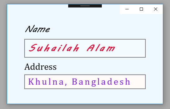
The following Universal Windows Platform application development tutorial demonstrates how we can set or change the TextBox styles. Here we will change two TextBoxes styles. For the first TextBox control, we will change its styles by using XAML properties. And for the second TextBox control, we will change its various style properties programmatically.

The TextBox class FontFamily property gets or sets the font used to display text in the control. This TextBox property is inherited from Control. This property value is a FontFamily which is the font used to display text in the control. So using this property the UWP developers can change the TextBox default font.

The TextBox class FontSize property gets or sets the size of the text in this control. This property value is a Double value which is the size of the text in the Control, in pixels. The default is 11. So using this property the UWP developers can change the TextBox default font size.

The TextBox class FontStyle property gets or sets the style in which the text is rendered. This property value is a FontStyle enumeration value which is one of the values that specifies the style in which the text is rendered. The default value is Normal. The FontStyle enumeration represents the style of a font face, for example, normal or italic.

The TextBox class CharacterSpacing property gets or sets the uniform spacing between characters, in units of 1/1000 of an em.

The TextBox class Background property gets or sets a brush that provides the background of the control. This property value is a Brush that provides the background of the control. The default value of this property is null, a null brush that is evaluated as Transparent for rendering. So using this property the UWP developers can change the TextBox background color.
MainPage.xaml

<Page
    x:Class="UniversalAppTutorials.MainPage"
    xmlns="http://schemas.microsoft.com/winfx/2006/xaml/presentation"
    xmlns:x="http://schemas.microsoft.com/winfx/2006/xaml"
    xmlns:local="using:UniversalAppTutorials"
    xmlns:d="http://schemas.microsoft.com/expression/blend/2008"
    xmlns:mc="http://schemas.openxmlformats.org/markup-compatibility/2006"
    mc:Ignorable="d"
    >
    <StackPanel Padding="50" Background="AliceBlue">
        <TextBox
            x:Name="TextBox1"
            Text="Suhailah Alam"
            Header="Name"
            Margin="5"
            FontFamily="MV Boli"
            FontSize="30"
            FontStyle="Italic"
            Foreground="Crimson"
            FontWeight="Bold"
            CharacterSpacing="200"
            />
        <TextBox
            x:Name="TextBox2"
            Margin="5"
            />
    </StackPanel>
</Page>
MainPage.xaml.cs

using Windows.UI.Xaml.Controls;
using Windows.UI.Xaml.Media;
using Windows.UI.Text;
using Windows.UI;


namespace UniversalAppTutorials
{
    public sealed partial class MainPage : Page
    {
        public MainPage()
        {
            this.InitializeComponent();
            StyleSecondTextBox();
        }

        // Set the second TextBox style programmatically
        void StyleSecondTextBox() {
            // Set TextBox font family
            TextBox2.FontFamily = new FontFamily("Cambria");

            // Set TextBox font/text size
            TextBox2.FontSize = 30;

            // Set TextBox font style
            TextBox2.FontStyle = FontStyle.Normal;

            // Set TextBox character spacing
            TextBox2.CharacterSpacing = 150;

            // Set TextBox background and text color
            TextBox2.Background = new SolidColorBrush(Colors.Snow);
            TextBox2.Foreground = new SolidColorBrush(Colors.BlueViolet);

            // Set TextBox text and header
            TextBox2.Text = "Khulna, Bangladesh";
            TextBox2.Header = "Address";
        }
    }
}
UWP - Select TextBox all text when get focus

UWP - Select TextBox all text on focus
The following Universal Windows Platform application development tutorial demonstrates how we can select all text of a TextBox when the specified TextBox gets focused.

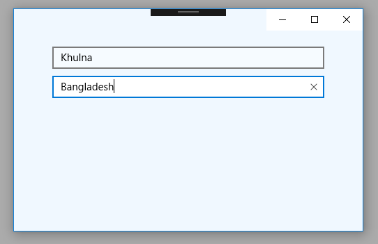
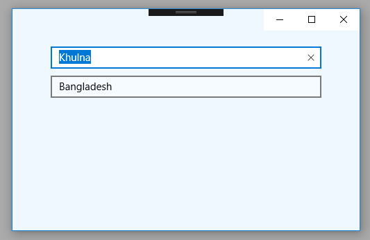
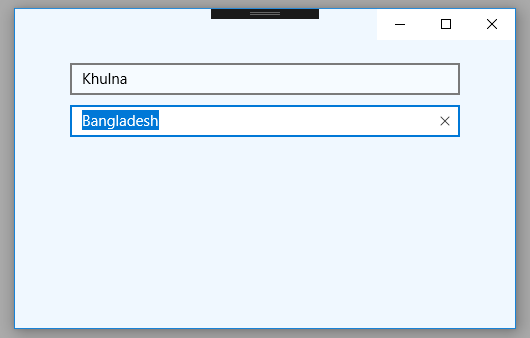
In this UWP tutorial, we will handle the TextBox class GotFocus event to select all text of this TextBox instance. We will use the TextBox class SelectAll() method to select TextBox all text when TextBox is focused.

The TextBox class represents a control that can be used to display and edit plain text. A TextBox can be single or multi-line. The TextBox control enables the UWP app user to enter text into a UWP app. The TextBox is typically used to capture a single line of text but the UWP developers can configure it to capture multiple lines of text. The text displays on the screen in a simple uniform plaintext format.

The TextBox GotFocus event occurs when the TextBox UIElement receives focus. The GotFocus event is raised asynchronously, so the focus can move again before bubbling is complete. The TextBox GotFocus event is inherited from UIElement.

On the TextBox GotFocus event, we will call the TextBox SelectAll() method to select all the text of the specified TextBox control. The TextBox class SelectAll() method selects the entire contents of the text box.
MainPage.xaml

<Page
    x:Class="UniversalAppTutorials.MainPage"
    xmlns="http://schemas.microsoft.com/winfx/2006/xaml/presentation"
    xmlns:x="http://schemas.microsoft.com/winfx/2006/xaml"
    xmlns:local="using:UniversalAppTutorials"
    xmlns:d="http://schemas.microsoft.com/expression/blend/2008"
    xmlns:mc="http://schemas.openxmlformats.org/markup-compatibility/2006"
    mc:Ignorable="d"
    >
    <StackPanel Padding="50" Background="AliceBlue">
        <!--
            GotFocus
                Occurs when a UIElement receives focus.
                (Inherited from UIElement)
        -->
        <TextBox
            x:Name="TextBox1"
            PlaceholderText="Input some text here."
            Margin="5"
            GotFocus="TextBox_GotFocus"
            />
        <TextBox
            x:Name="TextBox2"
            PlaceholderText="Input some text here."
            Margin="5"
            GotFocus="TextBox_GotFocus"
            />
    </StackPanel>
</Page>
MainPage.xaml.cs

using Windows.UI.Xaml.Controls;
using Windows.UI.Xaml;


namespace UniversalAppTutorials
{
    public sealed partial class MainPage : Page
    {
        public MainPage()
        {
            this.InitializeComponent();
        }

        void TextBox_GotFocus(object sender, RoutedEventArgs e)
        {
            // Get the instance of TextBox
            TextBox textBox = sender as TextBox;

            // Select all existing text of TextBox on focus
            textBox.SelectAll();
        }
    }
}
UWP - How to create a multiline TextBox

UWP - Multiline TextBox
The TextBox class represents a control that can be used to display and edit plain text. A TextBox can be single or multi-line. The TextBox control enables the UWP app user to enter text into a UWP app. The TextBox is typically used to capture a single line of text but the UWP developers can configure it to capture multiple lines of text. The text displays on the screen in a simple uniform plaintext format.

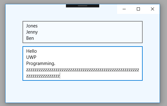
The following Universal Windows Platform application development tutorial demonstrates how we can create/display a multiline TextBox. The AcceptReturns and TextWrapping properties control whether the TextBox displays text on more than one line.

The TextBox class AcceptsReturn property gets or sets the value that determines whether the text box allows and displays the newline or return characters. This property value is a Boolean. The property value is true if the text box allows newline characters otherwise the value is false.

The default value of this property is false. The UWP app developers have to set this AcceptsReturn property value to true to display a multiline TextBox on their app screen.

The UWP developers can enable multi-line text in a TextBox control by using the AcceptsReturn property. They can use ScrollViewer.HorizontalScrollBarVisibility or ScrollViewer.VerticalScrollBarVisibility attached properties to change scrollbar behavior.

The TextBox class TextWrapping property gets or sets how the line breaking occurs if a line of text extends beyond the available width of the text box. This property value is a TextWrapping which is one of the TextWrapping enumeration values. The default value is NoWrap. The TextWrapping enumeration specifies whether text wraps when it reaches the edge of its container.

Here we will set the TextWrapping property value to Wrap to display a multiline TextBox in our UWP app. TextWrapping value Wrap occurs line breaking if a line of text overflows beyond the available width of its container. Line breaking also occurs even if the text logic can't determine any line break opportunity.
MainPage.xaml

<Page
    x:Class="UniversalAppTutorials.MainPage"
    xmlns="http://schemas.microsoft.com/winfx/2006/xaml/presentation"
    xmlns:x="http://schemas.microsoft.com/winfx/2006/xaml"
    xmlns:local="using:UniversalAppTutorials"
    xmlns:d="http://schemas.microsoft.com/expression/blend/2008"
    xmlns:mc="http://schemas.openxmlformats.org/markup-compatibility/2006"
    mc:Ignorable="d"
    >
    <StackPanel Padding="50" Background="AliceBlue">
        <TextBox
            x:Name="TextBox1"
            PlaceholderText="Input some text here."
            AcceptsReturn="True"
            TextWrapping="Wrap"
            Margin="5"
            />
        <TextBox
            x:Name="TextBox2"
            PlaceholderText="Input some text here."
            Margin="5"
            />
    </StackPanel>
</Page>
MainPage.xaml.cs

using Windows.UI.Xaml.Controls;
using Windows.UI.Xaml;


namespace UniversalAppTutorials
{
    public sealed partial class MainPage : Page
    {
        public MainPage()
        {
            this.InitializeComponent();
            UpdateSecondTextBox();
        }

        private void UpdateSecondTextBox() {
            /*
                TextBox.AcceptsReturn
                    Gets or sets the value that determines whether the text
                    box allows and displays the newline or return characters.

                TextBox.TextWrapping
                    Gets or sets how line breaking occurs if a line of text
                    extends beyond the available width of the text box.
            */

            // Programmatically allow multiline input for second TextBox
            TextBox2.AcceptsReturn = true;
            TextBox2.TextWrapping = TextWrapping.Wrap;
        }
    }
}
UWP - How to change TextBox background color

UWP - Change TextBox background color
The TextBox class represents a control that can be used to display and edit plain text. A TextBox can be single or multi-line. The TextBox control enables the UWP app user to enter text into a UWP app. The TextBox is typically used to capture a single line of text but the UWP developers can configure it to capture multiple lines of text. The text displays on the screen in a simple uniform plaintext format.

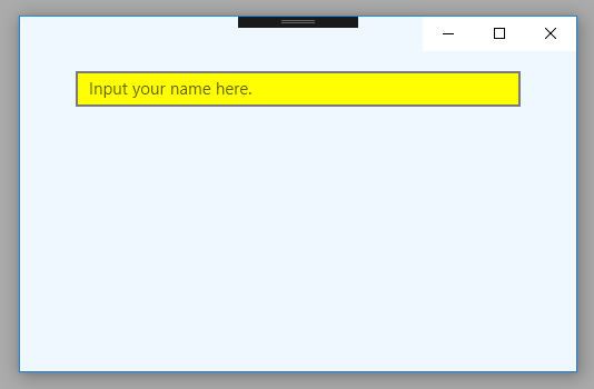
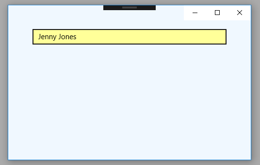
The following Universal Windows Platform application development tutorial demonstrates how we can set or change the TextBox background color. Here we will wrap the TextBox control with a Border control. Then We will set the Border control’s background color. This color will be displayed as the TextBox control’s background color. We will also set the TextBox background color programmatically when it gets focused.

The Border class draws a border, background, or both, around another object. The Border class Background property gets or sets the Brush that fills the background of the border which means the inner area of the border.

The Border is a container control that draws a border, background, or both, around another object. So we can draw a background color to a TextBox control by wrapping the TextBox control with a Border and setting a background color to this Border control.

The TextBox GotFocus event occurs when the TextBox UIElement receives focus. The GotFocus event is raised asynchronously, so the focus can move again before bubbling is complete. The TextBox GotFocus event is inherited from UIElement.

On the TextBox GotFocus event, we will set a background color for the TextBox. The TextBox Background property gets or sets a brush that provides the background of the control. Using this property we will set a background color for the TextBox control when it gets focused.
MainPage.xaml

<Page
    x:Class="UniversalAppTutorials.MainPage"
    xmlns="http://schemas.microsoft.com/winfx/2006/xaml/presentation"
    xmlns:x="http://schemas.microsoft.com/winfx/2006/xaml"
    xmlns:local="using:UniversalAppTutorials"
    xmlns:d="http://schemas.microsoft.com/expression/blend/2008"
    xmlns:mc="http://schemas.openxmlformats.org/markup-compatibility/2006"
    mc:Ignorable="d"
    >
    <StackPanel Padding="50" Background="AliceBlue">
        <!--
            Put TextBox inside a Border and set a background color
            for Border to display it as TextBox background color.
        -->
        <Border Background="Yellow">
        <TextBox
            x:Name="TextBox1"
            PlaceholderText="Input your name here."
            GotFocus="TextBox_GetFocus"
            />
        </Border>
    </StackPanel>
</Page>
MainPage.xaml.cs

using Windows.UI.Xaml.Controls;
using Windows.UI.Xaml.Media;
using Windows.UI;
using Windows.UI.Xaml;


namespace UniversalAppTutorials
{
    public sealed partial class MainPage : Page
    {
        public MainPage()
        {
            this.InitializeComponent();
        }

        private void TextBox_GetFocus(object sender, RoutedEventArgs e) {
            // Set the TexBox focus background color
            TextBox1.Background = new SolidColorBrush(Colors.Yellow);
        }
    }
}

UWP - Vertical FlipView example

MainPage.xaml

<Page
    x:Class="UniversalAppTutorials.MainPage"
    xmlns="http://schemas.microsoft.com/winfx/2006/xaml/presentation"
    xmlns:x="http://schemas.microsoft.com/winfx/2006/xaml"
    xmlns:local="using:UniversalAppTutorials"
    xmlns:d="http://schemas.microsoft.com/expression/blend/2008"
    xmlns:mc="http://schemas.openxmlformats.org/markup-compatibility/2006"
    mc:Ignorable="d"
    >
    <FlipView 
        x:Name="FlipView1" 
        Background="OldLace" 
        Padding="25"
        >
        <!--- Make Vertical FlipView -->
        <FlipView.ItemsPanel>
            <ItemsPanelTemplate>
                <!-- Use vertical stack panel to create vertical flip view -->
                <VirtualizingStackPanel Orientation="Vertical"/>
            </ItemsPanelTemplate>
        </FlipView.ItemsPanel>

        <!-- Item 1 -->
        <Viewbox MaxWidth="200" MaxHeight="200">
            <SymbolIcon Symbol="BackToWindow" Foreground="Navy"/>
        </Viewbox>

        <!-- Item 2 -->
        <Viewbox MaxWidth="200" MaxHeight="200">
            <SymbolIcon Symbol="CalendarReply" Foreground="Crimson"/>
        </Viewbox>

        <!-- Item 3 -->
        <Viewbox MaxWidth="200" MaxHeight="200">
            <SymbolIcon Symbol="DisableUpdates" Foreground="Olive"/>
        </Viewbox>

        <!-- Item 4 -->
        <Viewbox MaxWidth="200" MaxHeight="200">
            <SymbolIcon Symbol="Folder" Foreground="HotPink"/>
        </Viewbox>

        <!-- Item 5 -->
        <Viewbox MaxWidth="200" MaxHeight="200">
            <SymbolIcon Symbol="Document" Foreground="DeepSkyBlue"/>
        </Viewbox>
    </FlipView>
</Page>

UWP - FlipView SelectionChanged event example

MainPage.xaml

<Page
    x:Class="UniversalAppTutorials.MainPage"
    xmlns="http://schemas.microsoft.com/winfx/2006/xaml/presentation"
    xmlns:x="http://schemas.microsoft.com/winfx/2006/xaml"
    xmlns:local="using:UniversalAppTutorials"
    xmlns:d="http://schemas.microsoft.com/expression/blend/2008"
    xmlns:mc="http://schemas.openxmlformats.org/markup-compatibility/2006"
    mc:Ignorable="d"
    >
    <RelativePanel Background="MintCream">
        <TextBlock
            x:Name="TextBlock1"
            RelativePanel.AlignBottomWithPanel="True"
            RelativePanel.AlignHorizontalCenterWithPanel="True"
            Margin="15"
            Foreground="Blue"
            FontFamily="MV Boli"
            FontSize="30"
            FontStyle="Italic"
            />
        <FlipView 
            x:Name="FlipView1" 
            Background="Transparent" 
            Padding="25"
            SelectionChanged="FlipView1_SelectionChanged"
            >
            <!-- Item 1 -->
            <Viewbox MaxWidth="200" MaxHeight="200">
                <SymbolIcon Symbol="BackToWindow" Foreground="Red"/>
            </Viewbox>

            <!-- Item 2 -->
            <Viewbox MaxWidth="200" MaxHeight="200">
                <SymbolIcon Symbol="Calendar" Foreground="Blue"/>
            </Viewbox>

            <!-- Item 3 -->
            <Viewbox MaxWidth="200" MaxHeight="200">
                <SymbolIcon Symbol="Directions" Foreground="Violet"/>
            </Viewbox>

            <!-- Item 4 -->
            <Viewbox MaxWidth="200" MaxHeight="200">
                <SymbolIcon Symbol="Emoji" Foreground="HotPink"/>
            </Viewbox>

            <!-- Item 5 -->
            <Viewbox MaxWidth="200" MaxHeight="200">
                <SymbolIcon Symbol="Favorite" Foreground="OrangeRed"/>
            </Viewbox>
        </FlipView>
    </RelativePanel>
</Page>
MainPage.xaml.cs

using Windows.UI.Xaml.Controls;


namespace UniversalAppTutorials
{
    public sealed partial class MainPage : Page
    {
        public MainPage()
        {
            this.InitializeComponent();
        }

        private void FlipView1_SelectionChanged(object sender, SelectionChangedEventArgs e) {
            // Get the FlipView instance
            FlipView flipView = (FlipView)sender;

            // Get the FlipView number of items
            int items = flipView.Items.Count;

            // Get the FlipView selected item position
            int position = flipView.SelectedIndex + 1;

            // Display the selected item position on TextBlock
            TextBlock1.Text = "Item " + position + " of " + items;
        }
    }
}

UWP - Simple FlipView example

MainPage.xaml

<Page
    x:Class="UniversalAppTutorials.MainPage"
    xmlns="http://schemas.microsoft.com/winfx/2006/xaml/presentation"
    xmlns:x="http://schemas.microsoft.com/winfx/2006/xaml"
    xmlns:local="using:UniversalAppTutorials"
    xmlns:d="http://schemas.microsoft.com/expression/blend/2008"
    xmlns:mc="http://schemas.openxmlformats.org/markup-compatibility/2006"
    mc:Ignorable="d"
    >
    <FlipView Background="Honeydew" Padding="25">
        <!-- Item 1 -->
        <Viewbox MaxWidth="200" MaxHeight="200">
            <SymbolIcon Symbol="Admin" Foreground="Red"/>
        </Viewbox>

        <!-- Item 2 -->
        <Viewbox MaxWidth="200" MaxHeight="200">
            <SymbolIcon Symbol="Account" Foreground="Blue"/>
        </Viewbox>

        <!-- Item 3 -->
        <Viewbox MaxWidth="200" MaxHeight="200">
            <SymbolIcon Symbol="Audio" Foreground="Violet"/>
        </Viewbox>

        <!-- Item 4 -->
        <Viewbox MaxWidth="200" MaxHeight="200">
            <SymbolIcon Symbol="AddFriend" Foreground="HotPink"/>
        </Viewbox>

        <!-- Item 5 -->
        <Viewbox MaxWidth="200" MaxHeight="200">
            <SymbolIcon Symbol="AllApps" Foreground="OrangeRed"/>
        </Viewbox>
    </FlipView>
</Page>

UWP - How to exit an app

UWP - Exit an app
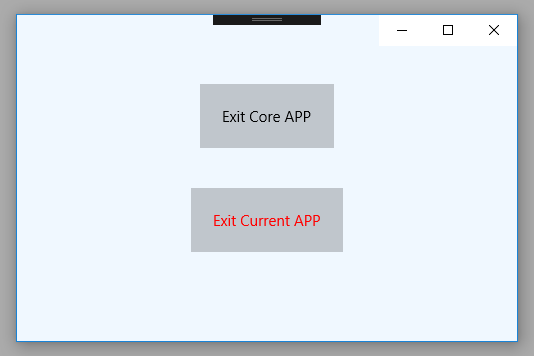
The following Universal Windows Platform application development tutorial demonstrates how we can exit from an app.

In this UWP tutorial, we will call the CoreApplication class Exit() method to exit the app. We also get the current application object and call its Exit() method to exit the app.

The CoreApplication class enables apps to handle state changes, manage windows, and integrate with a variety of UI frameworks. The CoreApplication class Exit() method shuts down the app.

The Application class encapsulates a Windows Presentation Foundation application. The Application implements the singleton pattern to provide shared access to its window, property, and resource scope services. Consequently, only one instance of the Application class can be created per AppDomain.

The Application class Current property gets the Application object for the current AppDomain. This property value is the Application object for the current AppDomain. Here we will call the Exit() method to exit the current application.
MainPage.xaml

<Page
    x:Class="UniversalAppTutorials.MainPage"
    xmlns="http://schemas.microsoft.com/winfx/2006/xaml/presentation"
    xmlns:x="http://schemas.microsoft.com/winfx/2006/xaml"
    xmlns:local="using:UniversalAppTutorials"
    xmlns:d="http://schemas.microsoft.com/expression/blend/2008"
    xmlns:mc="http://schemas.openxmlformats.org/markup-compatibility/2006"
    mc:Ignorable="d"
    >
    <StackPanel Padding="50" Orientation="Vertical" Background="AliceBlue">
        <Button
            x:Name="Button1"
            Content="Exit Core APP"
            HorizontalAlignment="Center"
            Click="Button1_Click"
            Foreground="Black"
            Margin="20"
            Padding="20"
            />
        <Button
            x:Name="Button2"
            Content="Exit Current APP"
            HorizontalAlignment="Center"
            Click="Button2_Click"
            Foreground="Red"
            Margin="20"
            Padding="20"
            />
    </StackPanel>
</Page>
MainPage.xaml.cs

using Windows.UI.Xaml.Controls;
using Windows.UI.Xaml;
using Windows.ApplicationModel.Core;


namespace UniversalAppTutorials
{
    public sealed partial class MainPage : Page
    {
        public MainPage()
        {
            this.InitializeComponent();
        }

        /*
            CoreApplication
                Enables apps to handle state changes, manage windows,
                and integrate with a variety of UI frameworks.

            CoreApplication.Exit
                Shuts down the app.

            Application
                Encapsulates the app and its available services.

            Application.Current
                Gets the Application object for the current application.

            Application.Exit
                Shuts down the app.
        */

        private void Button1_Click(object sender, RoutedEventArgs e)
        {
            // Exit the application
            CoreApplication.Exit();
        }

        private void Button2_Click(object sender, RoutedEventArgs e)
        {
            // Another way to exit the application
            Application.Current.Exit();
        }
    }
}

UWP - How to resize app window during runtime

UWP - Resize app window at runtime
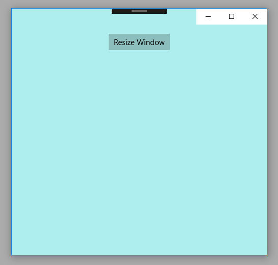
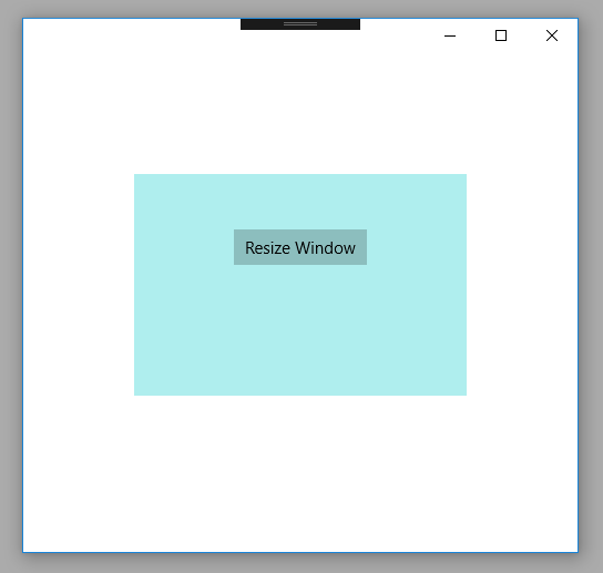
The following Universal Windows Platform application development tutorial demonstrates how we can resize an app window during runtime.

In this UWP tutorial, we will call the ApplicationView class GetForCurrentView() method to get the active application view instance. Then we will call TryResizeView() method to change the app window size during runtime.

The ApplicationView class represents the active application view and associated states and behaviors.

The ApplicationView class GetForCurrentView() method gets the view state and behavior settings of the active application. This method returns an ApplicationView instance that can be used to get and set app display properties.

The ApplicationView class TryResizeView(Size) method attempts to change the size of the view to the specified size in effective pixels. The TryResizeView(Size value) method has a parameter names value. The value parameter is Size which is the new size of the view in effective pixels. This method returns a Boolean. It returns true if the view is resized to the requested size otherwise it returns false.

So finally, the UWP developers can resize an app window during runtime using the ApplicationView TryResizeSize() method for the specified window. The resize request affects only the view it was requested on. Resizing one view does not affect the size of any other views.
MainPage.xaml

<Page
    x:Class="UniversalAppTutorials.MainPage"
    xmlns="http://schemas.microsoft.com/winfx/2006/xaml/presentation"
    xmlns:x="http://schemas.microsoft.com/winfx/2006/xaml"
    xmlns:local="using:UniversalAppTutorials"
    xmlns:d="http://schemas.microsoft.com/expression/blend/2008"
    xmlns:mc="http://schemas.openxmlformats.org/markup-compatibility/2006"
    mc:Ignorable="d"
    >
    <StackPanel Padding="50" Orientation="Vertical" Background="PaleTurquoise">
        <Button
            x:Name="Button1"
            Content="Resize Window"
            VerticalAlignment="Center"
            HorizontalAlignment="Center"
            Click="Button1_Click"
            />
    </StackPanel>
</Page>
MainPage.xaml.cs

using Windows.UI.Xaml.Controls;
using Windows.UI.ViewManagement;
using Windows.Foundation;
using Windows.UI.Xaml;


namespace UniversalAppTutorials
{
    public sealed partial class MainPage : Page
    {
        public MainPage()
        {
            this.InitializeComponent();
        }

        /*
            ApplicationView
                Represents the active application view and
                associated states and behaviors.

            GetForCurrentView
                Gets the view state and behavior settings of the active application.
                Return an ApplicationView instance that can be used to get and set app display properties.

            TryResizeView
                Attempts to change the size of the view to the specified size in effective pixels.
                Return true if the view is resized to the requested size; otherwise, false.
        */

        private void Button1_Click(object sender, RoutedEventArgs e) {
            // Try to resize the app window during runtime
            ApplicationView.GetForCurrentView().TryResizeView(
                new Size(Width = 300, Height=200)
                );
        }
    }
}

UWP - How to launch app in full screen mode

UWP - Launch the app in full-screen mode
The following Universal Windows Platform application development tutorial demonstrates how we can launch an app in full-screen mode.

In this UWP tutorial, we will set the ApplicationView class PreferredLaunchWindowingMode property value to FullScreen to launch the app in full-screen mode.

The ApplicationView class represents the active application view and associated states and behaviors.

The ApplicationView class PreferredLaunchWindowingMode property gets or sets a value that indicates the windowing mode the app launches with. This property value is an ApplicationViewWindowingModeenumeration value that indicates the windowing mode of the app. By default, PreferredLaunchWindowingMode is set to Auto.

The ApplicationViewWindowingMode enumeration defines constants that specify whether the app window is auto-sized, full-screen, or set to a specific size on launch. The enumeration value FullScreen specifies the window is full-screen.

So finally, the UWP developers can launch the app in full-screen mode by setting the ApplicationView class ApplicationViewWindowingMode property value to ApplicationViewWindowingMode.FullScreen.
MainPage.xaml

<Page
    x:Class="UniversalAppTutorials.MainPage"
    xmlns="http://schemas.microsoft.com/winfx/2006/xaml/presentation"
    xmlns:x="http://schemas.microsoft.com/winfx/2006/xaml"
    xmlns:local="using:UniversalAppTutorials"
    xmlns:d="http://schemas.microsoft.com/expression/blend/2008"
    xmlns:mc="http://schemas.openxmlformats.org/markup-compatibility/2006"
    mc:Ignorable="d"
    >
    <StackPanel Padding="50" Background="SkyBlue">
    </StackPanel>
</Page>
MainPage.xaml.cs

using Windows.UI.Xaml.Controls;
using Windows.UI.ViewManagement;


namespace UniversalAppTutorials
{
    public sealed partial class MainPage : Page
    {
        public MainPage()
        {
            this.InitializeComponent();

            /*
                ApplicationView
                    Represents the active application view and
                    associated states and behaviors.

                ApplicationView.PreferredLaunchWindowingMode
                    Gets or sets a value that indicates the windowing mode the app launches with.

                ApplicationViewWindowingMode
                    FullScreen: The window is launched in full-screen mode.
                    Full-screen mode in not the same as maximized.
            */

            // Set app window preferred launch windowing mode to full screen
            ApplicationView.PreferredLaunchWindowingMode = ApplicationViewWindowingMode.FullScreen;
        }
    }
}

UWP - How to set app launch window size

UWP - Set app launch window size
The following Universal Windows Platform application development tutorial demonstrates how we can set the app launch window size programmatically.

In this UWP tutorial, we will set the ApplicationView class PreferredLaunchViewSize property value to set the app window preferred launch view size. We will also set the ApplicationView class PreferredLaunchWindowingMode property value to set the app window preferred launch windowing mode.

The ApplicationView class represents the active application view and associated states and behaviors.

The ApplicationView class PreferredLaunchViewSize property gets or sets the size that the app launches with when the ApplicationView class PreferredLaunchWindowingMode property is set to PreferredLaunchViewSize, except in cases where the system manages the window size directly. The PreferredLaunchViewSize property value is a Size.

The ApplicationView class PreferredLaunchWindowingMode property gets or sets a value that indicates the windowing mode the app launches with. This property value is an ApplicationViewWindowingModeenumeration value that indicates the windowing mode of the app. By default, PreferredLaunchWindowingMode is set to Auto.

The ApplicationViewWindowingMode enumeration defines constants that specify whether the app window is auto-sized, full-screen, or set to a specific size on launch. The PreferredLaunchViewSize value specifies the window is sized as specified by the ApplicationView class PreferredLaunchViewSize property.
MainPage.xaml

<Page
    x:Class="UniversalAppTutorials.MainPage"
    xmlns="http://schemas.microsoft.com/winfx/2006/xaml/presentation"
    xmlns:x="http://schemas.microsoft.com/winfx/2006/xaml"
    xmlns:local="using:UniversalAppTutorials"
    xmlns:d="http://schemas.microsoft.com/expression/blend/2008"
    xmlns:mc="http://schemas.openxmlformats.org/markup-compatibility/2006"
    mc:Ignorable="d"
    >
    <StackPanel Padding="50">
    </StackPanel>
</Page>
MainPage.xaml.cs

using Windows.UI.Xaml.Controls;
using Windows.UI.ViewManagement;
using Windows.Foundation;


namespace UniversalAppTutorials
{
    public sealed partial class MainPage : Page
    {
        public MainPage()
        {
            this.InitializeComponent();

            /*
                ApplicationView
                    Represents the active application view and
                    associated states and behaviors.

                PreferredLaunchViewSize
                    Gets or sets the size that the app launches with when the
                    ApplicationView.PreferredLaunchWindowingMode property is set
                    to PreferredLaunchViewSize, except in cases
                    where the system manages the window size directly.

                ApplicationViewWindowingMode
                    PreferredLaunchViewSize: When launched, the window is sized
                    as specified by the ApplicationView.PreferredLaunchViewSize property.
            */

            // Set the app window preferred launch view size
            ApplicationView.PreferredLaunchViewSize = new Size(Height = 300, Width = 450);

            // Set app window preferred launch windowing mode
            ApplicationView.PreferredLaunchWindowingMode = ApplicationViewWindowingMode.PreferredLaunchViewSize;
        }
    }
}

UWP - How to set app window minimum size

UWP - Set app window minimum size
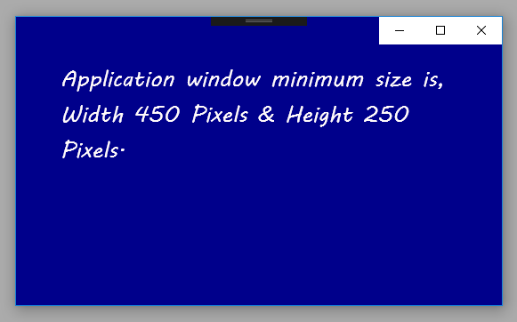
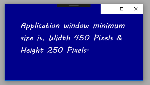
The following Universal Windows Platform application development tutorial demonstrates how we can set the app window minimum size programmatically. Here we will get the current application view. Then we will set the minimum size for this app window using the ApplicationView class SetPreferredMinSize() method.

The ApplicationView class represents the active application view and associated states and behaviors. The ApplicationView class GetForCurrentView() method gets the view state and behavior settings of the active application. This method returns an ApplicationView instance that can be used to get and set app display properties.

The ApplicationView class SetPreferredMinSize(Size) method sets the smallest size, in effective pixels, allowed for the app window. The SetPreferredMinSize(Size minSize) method has a parameter named minSize. The minSize parameter value is a Size that is the smallest size allowed for the app window, or a Size whose height and width are both zero to use the system's default minimum size.

The UWP developers can remove the preferred minimum size and use and system's default minimum size instead by setting the Size value to "0,0".

The smallest allowed app window minimum size is 192 x 48 effective pixels. The largest allowed window minimum size is 500 x 500 effective pixels.

When the UWP app developers set the preferred minimum size, it affects only the view it was requested on, and setting it on one view does not impact the preferred minimum size of the other views. The preferred minimum size is not persisted after the app is closed.
MainPage.xaml

<Page
    x:Class="UniversalAppTutorials.MainPage"
    xmlns="http://schemas.microsoft.com/winfx/2006/xaml/presentation"
    xmlns:x="http://schemas.microsoft.com/winfx/2006/xaml"
    xmlns:local="using:UniversalAppTutorials"
    xmlns:d="http://schemas.microsoft.com/expression/blend/2008"
    xmlns:mc="http://schemas.openxmlformats.org/markup-compatibility/2006"
    mc:Ignorable="d"
    >
    <StackPanel Background="DarkBlue" Padding="50">
        <TextBlock
            x:Name="TextBlock1"
            FontFamily="MV Boli"
            FontSize="25"
            Foreground="Snow"
            TextWrapping="Wrap"
            />
    </StackPanel>
</Page>
MainPage.xaml.cs

using Windows.UI.Xaml.Controls;
using Windows.UI.ViewManagement;
using Windows.Foundation;


namespace UniversalAppTutorials
{
    public sealed partial class MainPage : Page
    {
        public MainPage()
        {
            this.InitializeComponent();

            /*
                ApplicationView
                    Represents the active application view and
                    associated states and behaviors.

                GetForCurrentView
                    Gets the view state and behavior settings of the active application.
            */

            /*
                ApplicationView.SetPreferredMinSize
                    Sets the smallest size, in effective pixels,
                    allowed for the app window.

                    To remove the preferred minimum size and use and system default
                    minimum size instead, set the Size value to "0,0".

                    The smallest allowed minimum size is 192 x 48 effective pixels.
                    The largest allowed minimum size is 500 x 500 effective pixels.
                    If you set a value outside of these bounds, it is coerced
                    to be within the allowed bounds. 
            */

            // Set the application minimum window size
            ApplicationView.GetForCurrentView().SetPreferredMinSize(
                new Size(
                    450, // Width
                    250 // Height
                    )
                );

            // Display the app window minimum size on text block
            TextBlock1.Text = "Application window minimum size is,"
                +" Width 450 Pixels & Height 250 Pixels.";
        }
    }
}

UWP - Get app screen size

MainPage.xaml

<Page
    x:Class="UniversalAppTutorials.MainPage"
    xmlns="http://schemas.microsoft.com/winfx/2006/xaml/presentation"
    xmlns:x="http://schemas.microsoft.com/winfx/2006/xaml"
    xmlns:local="using:UniversalAppTutorials"
    xmlns:d="http://schemas.microsoft.com/expression/blend/2008"
    xmlns:mc="http://schemas.openxmlformats.org/markup-compatibility/2006"
    mc:Ignorable="d"
    >
    <StackPanel Background="Crimson" Padding="50">
        <TextBlock
            x:Name="TextBlock1"
            FontFamily="MV Boli"
            FontSize="30"
            Foreground="Snow"
            TextWrapping="Wrap"
            />
    </StackPanel>
</Page>
MainPage.xaml.cs

using Windows.UI.Xaml.Controls;
using Windows.UI.ViewManagement;
using Windows.Graphics.Display;
using Windows.Foundation;


namespace UniversalAppTutorials
{
    public sealed partial class MainPage : Page
    {
        public MainPage()
        {
            this.InitializeComponent();

            // Get the visible bounds for current view
            var visibleBounds = ApplicationView.GetForCurrentView().VisibleBounds;

            // Get the scale factor from display information
            var scaleFactor = DisplayInformation.GetForCurrentView().RawPixelsPerViewPixel;

            // Get the application screen size
            var size = new Size(visibleBounds.Width * scaleFactor, visibleBounds.Height * scaleFactor);

            // Display the application screen size on text block
            TextBlock1.Text = "Screen Size\nHeight : " + size.Height
                + " Pixels \nWidth : " + size.Width + " Pixels";
        }
    }
}

UWP - How to hide title bar

UWP - Hide the title bar programmatically
The following Universal Windows Platform application development tutorial demonstrates how we can hide the title bar programmatically. Here we will get the application view for the current view. Then we will get the title bar of the application view. After getting the title bar we will set the title bar background color to transparent color. We also extend the core application view into the title bar. As a result, the title bar will be hidden.

The ApplicationView class represents the active application view and associated states and behaviors. The ApplicationView class GetForCurrentView() method gets the view state and behavior settings of the active application. This method returns an ApplicationView instance that can be used to get and set app display properties.

The ApplicationView class TitleBar property gets the title bar of the app. This property value is an ApplicationViewTitleBar which is the title bar of the app.

The ApplicationViewTitleBar class represents the title bar of an app. The ApplicationViewTitleBar BackgroundColor property gets or sets the color of the title bar background. Here we will set this title bar background color to a transparent color that will technically hide the title bar.

The CoreApplication class enables apps to handle state changes, manage windows, and integrate with a variety of UI frameworks. The CoreApplication GetCurrentView() method gets the view corresponding to the current thread.

The CoreApplicationView class represents an app window and its thread. The CoreApplicationView TitleBar property gets the title bar associated with the current view. This property value is a CoreApplicationViewTitleBar which is the title bar associated with the current view.

The CoreApplicationViewTitleBar class enables an app to define a custom title bar that displays in the app's window.

The CoreApplicationViewTitleBar ExtendViewIntoTitleBar property gets or sets a value that specifies whether this title bar should replace the default window title bar. This property value is a Boolean. The UWP developers can set this property value to true to replace the default window title bar. So here we will set this property value to true. Finally, the title bar will be hidden.
MainPage.xaml

<Page
    x:Class="UniversalAppTutorials.MainPage"
    xmlns="http://schemas.microsoft.com/winfx/2006/xaml/presentation"
    xmlns:x="http://schemas.microsoft.com/winfx/2006/xaml"
    xmlns:local="using:UniversalAppTutorials"
    xmlns:d="http://schemas.microsoft.com/expression/blend/2008"
    xmlns:mc="http://schemas.openxmlformats.org/markup-compatibility/2006"
    mc:Ignorable="d"
    >
    <StackPanel Background="PaleGoldenrod" Padding="50">
    </StackPanel>
</Page>
MainPage.xaml.cs

using Windows.UI.Xaml.Controls;
using Windows.UI.ViewManagement;
using Windows.UI;
using Windows.ApplicationModel.Core;


namespace UniversalAppTutorials
{
    public sealed partial class MainPage : Page
    {
        public MainPage()
        {
            this.InitializeComponent();

            // Get the application view title bar
            ApplicationViewTitleBar appTitleBar = ApplicationView.GetForCurrentView().TitleBar;

            // Make the title bar transparent
            appTitleBar.BackgroundColor = Colors.Transparent;

            // Get the core appication view title bar
            CoreApplicationViewTitleBar coreTitleBar = CoreApplication.GetCurrentView().TitleBar;

            /*
                ExtendViewIntoTitleBar
                    Gets or sets a value that specifies whether this title
                    bar should replace the default window title bar.
            */

            // Extend the core application view into title bar
            coreTitleBar.ExtendViewIntoTitleBar = true;
        }
    }
}

UWP - How to change title bar text

UWP - Change the title bar text programmatically
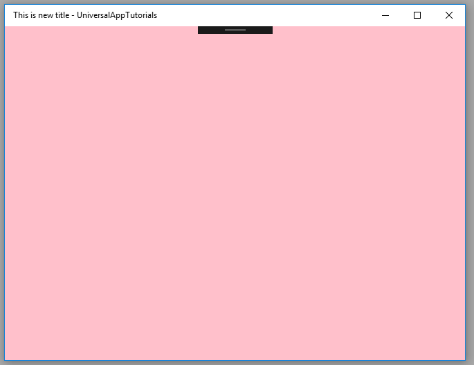
The following Universal Windows Platform application development tutorial demonstrates how we can set or change the title bar text programmatically. Here we will get the application view for the current view. Then we will set the title text for the application view.

The ApplicationView class represents the active application view and associated states and behaviors. The ApplicationView class GetForCurrentView() method gets the view state and behavior settings of the active application. This method returns an ApplicationView instance that can be used to get and set app display properties.

The ApplicationView class Title property gets or sets the displayed title of the window. This Title property value is a String which is the title of the window. So finally, using this ApplicationView Title property the UWP app developers can change the title bar text programmatically.

When the Title property is not set, the system shows the app's display name in the title bar, as specified in the Display name field in the app manifest. When the UWP app developers set the Title property, Windows may choose to append the app display name to the end of the Title value they set.
MainPage.xaml

<Page
    x:Class="UniversalAppTutorials.MainPage"
    xmlns="http://schemas.microsoft.com/winfx/2006/xaml/presentation"
    xmlns:x="http://schemas.microsoft.com/winfx/2006/xaml"
    xmlns:local="using:UniversalAppTutorials"
    xmlns:d="http://schemas.microsoft.com/expression/blend/2008"
    xmlns:mc="http://schemas.openxmlformats.org/markup-compatibility/2006"
    mc:Ignorable="d"
    >
    <StackPanel Background="Pink" Padding="50">
    </StackPanel>
</Page>
MainPage.xaml.cs

using Windows.UI.Xaml.Controls;
using Windows.UI.ViewManagement;


namespace UniversalAppTutorials
{
    public sealed partial class MainPage : Page
    {
        public MainPage()
        {
            this.InitializeComponent();

            // Get the application view
            ApplicationView appView = ApplicationView.GetForCurrentView();

            // Change the application view title text
            appView.Title = "This is new title";
        }
    }
}

UWP - How to change title bar color

UWP - Change TitleBar Color
The following Universal Windows Platform application development tutorial demonstrates how we can programmatically customize/change the title bar color.

Here we will get the application view for the current view. Then we will get the title bar of the application view. After getting the title bar we will change the title bar’s various colors.

The ApplicationView class represents the active application view and associated states and behaviors. The ApplicationView class GetForCurrentView() method gets the view state and behavior settings of the active application. This method returns an ApplicationView instance that can be used to get and set app display properties.

The ApplicationView class TitleBar property gets the title bar of the app. This property value is an ApplicationViewTitleBar which is the title bar of the app.

The ApplicationViewTitleBar class represents the title bar of an app. The ApplicationViewTitleBar class BackgroundColor property gets or sets the color of the title bar background. So using this property the UWP developers can set the title bar background color. The Foreground color gets or sets the color of the title bar foreground.

The ApplicationViewTitleBar class InactiveBackgroundColor property gets or sets the color of the title bar background when it's inactive. The InactiveForegroundColor property gets or sets the color of the title bar foreground when it's inactive.

The ApplicationViewTitleBar class ButtonBackgroundColor property gets or sets the background color of the title bar buttons. The ButtonForegroundColor property gets or sets the foreground color of the title bar buttons.

The ApplicationViewTitleBar class ButtonHoverBackgroundColor property gets or sets the background color of a title bar button when the pointer is over it. The ButtonHoverForegroundColor property gets or sets the foreground color of a title bar button when the pointer is over it.

The ApplicationViewTitleBar class ButtonInactiveBackgroundColor property gets or sets the background color of a title bar button when it's inactive. The ButtonInactiveForegroundColor property gets or sets the foreground color of a title bar button when it's inactive.

The ApplicationViewTitleBar class ButtonPressedBackgroundColor property gets or sets the background color of a title bar button when it's pressed. The ButtonPressedForegroundColor property gets or sets the foreground color of a title bar button when it's pressed.
MainPage.xaml

<Page
    x:Class="UniversalAppTutorials.MainPage"
    xmlns="http://schemas.microsoft.com/winfx/2006/xaml/presentation"
    xmlns:x="http://schemas.microsoft.com/winfx/2006/xaml"
    xmlns:local="using:UniversalAppTutorials"
    xmlns:d="http://schemas.microsoft.com/expression/blend/2008"
    xmlns:mc="http://schemas.openxmlformats.org/markup-compatibility/2006"
    mc:Ignorable="d"
    >
    <StackPanel Orientation="Vertical" Background="AliceBlue" Padding="50">
    </StackPanel>
</Page>
MainPage.xaml.cs

using Windows.UI.Xaml.Controls;
using Windows.UI;
using Windows.UI.ViewManagement;


namespace UniversalAppTutorials
{
    public sealed partial class MainPage : Page
    {
        public MainPage()
        {
            this.InitializeComponent();

            // Get the application view title bar
            ApplicationViewTitleBar appTitleBar = ApplicationView.GetForCurrentView().TitleBar;

            // Set the title bar background and forground color
            appTitleBar.BackgroundColor = Colors.Crimson;
            appTitleBar.ForegroundColor = Colors.Snow;

            // Set the title bar inactive colors
            appTitleBar.InactiveBackgroundColor = Colors.DarkGray;
            appTitleBar.InactiveForegroundColor = Colors.LightGray;

            // Set the title bar button colors
            appTitleBar.ButtonBackgroundColor = Colors.DarkOrange;
            appTitleBar.ButtonForegroundColor = Colors.Gold;

            // Title bar button hover state colors
            appTitleBar.ButtonHoverBackgroundColor = Colors.Green;
            appTitleBar.ButtonHoverForegroundColor = Colors.GreenYellow;

            // Title bar button inctive state colors
            appTitleBar.ButtonInactiveBackgroundColor = Colors.DarkKhaki;
            appTitleBar.ButtonInactiveForegroundColor = Colors.Silver;

            // Title bar button pressed state colors
            appTitleBar.ButtonPressedBackgroundColor = Colors.Navy;
            appTitleBar.ButtonPressedForegroundColor = Colors.WhiteSmoke;
        }
    }
}

UWP - Segoe MDL2 Assets programmatically

MainPage.xaml

<Page
    x:Class="UniversalAppTutorials.MainPage"
    xmlns="http://schemas.microsoft.com/winfx/2006/xaml/presentation"
    xmlns:x="http://schemas.microsoft.com/winfx/2006/xaml"
    xmlns:local="using:UniversalAppTutorials"
    xmlns:d="http://schemas.microsoft.com/expression/blend/2008"
    xmlns:mc="http://schemas.openxmlformats.org/markup-compatibility/2006"
    mc:Ignorable="d"
    >
    <StackPanel Orientation="Vertical" Background="AliceBlue" Padding="50">
        <TextBlock 
            x:Name="TextBlock1"
            />
        <TextBlock 
            x:Name="TextBlock2"
            />
        <TextBlock
            x:Name="TextBlock3"
            />
    </StackPanel>
</Page>
MainPage.xaml.cs

using Windows.UI.Xaml.Controls;
using Windows.UI.Xaml;
using Windows.UI.Xaml.Media;
using Windows.UI.Xaml.Automation;
using Windows.UI;

namespace UniversalAppTutorials
{
    public sealed partial class MainPage : Page
    {
        public MainPage()
        {
            this.InitializeComponent();

            // Set the first text block font family
            TextBlock1.FontFamily = new FontFamily("Segoe MDL2 Assets");

            // Set the first text block text
            TextBlock1.Text = "\uE717";

            // Set the automation properties name for first text block
            TextBlock1.SetValue(AutomationProperties.NameProperty, "Phone");

            // Set the first text block margin
            TextBlock1.Margin = new Thickness(25);

            // Second text block settings
            TextBlock2.FontFamily = new FontFamily("Segoe MDL2 Assets");
            TextBlock2.Text = "\uE909";
            TextBlock2.SetValue(AutomationProperties.NameProperty, "World");
            TextBlock2.Margin = new Thickness(25);
            // Font size
            TextBlock2.FontSize = 100;

            // Third text block settings
            TextBlock3.FontFamily = new FontFamily("Segoe MDL2 Assets");
            TextBlock3.Text = "\uE899";
            TextBlock3.SetValue(AutomationProperties.NameProperty, "Emoji");
            TextBlock3.Margin = new Thickness(25);
            // Font size
            TextBlock3.FontSize = 150;
            // Set text/icon color
            TextBlock3.Foreground = new SolidColorBrush(Colors.Blue);
        }
    }
}