UWP - Change TextBox Style
The TextBox class represents a control that can be used to display and
edit plain text. A TextBox can be single or multi-line. The TextBox control
enables the UWP app user to enter text into a UWP app. The TextBox is
typically used to capture a single line of text but the UWP developers can
configure it to capture multiple lines of text. The text displays on the
screen in a simple uniform plaintext format.
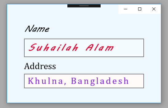
The following Universal Windows Platform application development tutorial demonstrates how we can set or change the TextBox styles. Here we will change two TextBoxes styles. For the first TextBox control, we will change its styles by using XAML properties. And for the second TextBox control, we will change its various style properties programmatically.
The TextBox class FontFamily property gets or sets the font used to display text in the control. This TextBox property is inherited from Control. This property value is a FontFamily which is the font used to display text in the control. So using this property the UWP developers can change the TextBox default font.
The TextBox class FontSize property gets or sets the size of the text in this control. This property value is a Double value which is the size of the text in the Control, in pixels. The default is 11. So using this property the UWP developers can change the TextBox default font size.
The TextBox class FontStyle property gets or sets the style in which the text is rendered. This property value is a FontStyle enumeration value which is one of the values that specifies the style in which the text is rendered. The default value is Normal. The FontStyle enumeration represents the style of a font face, for example, normal or italic.
The TextBox class CharacterSpacing property gets or sets the uniform spacing between characters, in units of 1/1000 of an em.
The TextBox class Background property gets or sets a brush that provides the background of the control. This property value is a Brush that provides the background of the control. The default value of this property is null, a null brush that is evaluated as Transparent for rendering. So using this property the UWP developers can change the TextBox background color.
MainPage.xaml
<Page
    x:Class="UniversalAppTutorials.MainPage"
    xmlns="http://schemas.microsoft.com/winfx/2006/xaml/presentation"
    xmlns:x="http://schemas.microsoft.com/winfx/2006/xaml"
    xmlns:local="using:UniversalAppTutorials"
    xmlns:d="http://schemas.microsoft.com/expression/blend/2008"
    xmlns:mc="http://schemas.openxmlformats.org/markup-compatibility/2006"
    mc:Ignorable="d"
    >
    <StackPanel Padding="50" Background="AliceBlue">
        <TextBox
            x:Name="TextBox1"
            Text="Suhailah Alam"
            Header="Name"
            Margin="5"
            FontFamily="MV Boli"
            FontSize="30"
            FontStyle="Italic"
            Foreground="Crimson"
            FontWeight="Bold"
            CharacterSpacing="200"
            />
        <TextBox
            x:Name="TextBox2"
            Margin="5"
            />
    </StackPanel>
</Page>
MainPage.xaml.cs
using Windows.UI.Xaml.Controls;
using Windows.UI.Xaml.Media;
using Windows.UI.Text;
using Windows.UI;


namespace UniversalAppTutorials
{
    public sealed partial class MainPage : Page
    {
        public MainPage()
        {
            this.InitializeComponent();
            StyleSecondTextBox();
        }

        // Set the second TextBox style programmatically
        void StyleSecondTextBox() {
            // Set TextBox font family
            TextBox2.FontFamily = new FontFamily("Cambria");

            // Set TextBox font/text size
            TextBox2.FontSize = 30;

            // Set TextBox font style
            TextBox2.FontStyle = FontStyle.Normal;

            // Set TextBox character spacing
            TextBox2.CharacterSpacing = 150;

            // Set TextBox background and text color
            TextBox2.Background = new SolidColorBrush(Colors.Snow);
            TextBox2.Foreground = new SolidColorBrush(Colors.BlueViolet);

            // Set TextBox text and header
            TextBox2.Text = "Khulna, Bangladesh";
            TextBox2.Header = "Address";
        }
    }
}