UWP - Set app window minimum size
The following Universal Windows Platform application development
tutorial demonstrates how we can set the app window minimum size
programmatically. Here we will get the current application view. Then we will
set the minimum size for this app window using the ApplicationView class
SetPreferredMinSize() method.
The ApplicationView class represents the active application view and associated states and behaviors. The ApplicationView class GetForCurrentView() method gets the view state and behavior settings of the active application. This method returns an ApplicationView instance that can be used to get and set app display properties.
The ApplicationView class SetPreferredMinSize(Size) method sets the smallest size, in effective pixels, allowed for the app window. The SetPreferredMinSize(Size minSize) method has a parameter named minSize. The minSize parameter value is a Size that is the smallest size allowed for the app window, or a Size whose height and width are both zero to use the system's default minimum size.
The UWP developers can remove the preferred minimum size and use and system's default minimum size instead by setting the Size value to "0,0".
The smallest allowed app window minimum size is 192 x 48 effective pixels. The largest allowed window minimum size is 500 x 500 effective pixels.
When the UWP app developers set the preferred minimum size, it affects only the view it was requested on, and setting it on one view does not impact the preferred minimum size of the other views. The preferred minimum size is not persisted after the app is closed.
MainPage.xaml
<Page
    x:Class="UniversalAppTutorials.MainPage"
    xmlns="http://schemas.microsoft.com/winfx/2006/xaml/presentation"
    xmlns:x="http://schemas.microsoft.com/winfx/2006/xaml"
    xmlns:local="using:UniversalAppTutorials"
    xmlns:d="http://schemas.microsoft.com/expression/blend/2008"
    xmlns:mc="http://schemas.openxmlformats.org/markup-compatibility/2006"
    mc:Ignorable="d"
    >
    <StackPanel Background="DarkBlue" Padding="50">
        <TextBlock
            x:Name="TextBlock1"
            FontFamily="MV Boli"
            FontSize="25"
            Foreground="Snow"
            TextWrapping="Wrap"
            />
    </StackPanel>
</Page>
MainPage.xaml.cs
using Windows.UI.Xaml.Controls;
using Windows.UI.ViewManagement;
using Windows.Foundation;
namespace UniversalAppTutorials
{
public sealed partial class MainPage : Page
{
public MainPage()
{
this.InitializeComponent();
/*
ApplicationView
Represents the active application view and
associated states and behaviors.
GetForCurrentView
Gets the view state and behavior settings of the active application.
*/
/*
ApplicationView.SetPreferredMinSize
Sets the smallest size, in effective pixels,
allowed for the app window.
To remove the preferred minimum size and use and system default
minimum size instead, set the Size value to "0,0".
The smallest allowed minimum size is 192 x 48 effective pixels.
The largest allowed minimum size is 500 x 500 effective pixels.
If you set a value outside of these bounds, it is coerced
to be within the allowed bounds.
*/
// Set the application minimum window size
ApplicationView.GetForCurrentView().SetPreferredMinSize(
new Size(
450, // Width
250 // Height
)
);
// Display the app window minimum size on text block
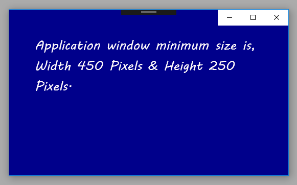
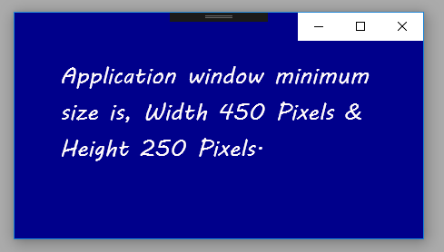
TextBlock1.Text = "Application window minimum size is,"
+" Width 450 Pixels & Height 250 Pixels.";
}
}
}