Compose TextField Hint
The TextField is the text input widget of android jetpack compose library. TextField is an equivalent widget of the android view system’s EditText widget. TextField is used to enter and modify text.
TextField widget constructor has no argument named ‘hint’. But we put a title for this tutorial as ‘TextField hint’? So, what is a hint, and why do we use it for a widget? Hint means to instruct users on what should they do in this widget. Such as a hint for a DropdownMenu widget may be ‘select an item’ and a hint for TextField is ‘put your age here’ to collect the user's age in the specified TextField widget.
The following jetpack compose tutorial will demonstrate how we can display a hint like text/message to the user for a TextField. There are two ways to show a text message to the users inside a TextField layout. One is the TextField constructor’s ‘label’ argument and another one is the ‘placeholder’ argument.
The TextField label argument is optional and displayed inside the TextField container. So we can show a message as a hint to the user about what they should enter in this TextField and how to format the text. Such as, we can collect user email on a TextField and show a label to the user like ‘Input your email address here’. Then this label will act as a hint for this TextField.
The TextField constructor’s ‘placeholder’ argument is also optional. The placeholder is displayed when the TextField is in a focused state and it is empty. So, we can also show a hint message to the user about what they should input in this TextField or what is the rule to put valid text here.
The interesting part of these ‘label’ and ‘placeholder’ arguments is that they both accept composable objects. So we can pass an icon with a text message to this argument. We can show custom colors for these objects. As a result, TextField can display both icon and text for a label or placeholder that acts like a hint.
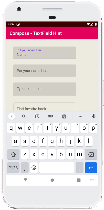
This jetpack compose tutorial is written in an android studio IDE. Copy the code and run it on an emulator device or a real device to test how we show a hint to the user for a specified TextField widget. We also displayed screenshots of this tutorial’s emulator output screen.
TextField widget constructor has no argument named ‘hint’. But we put a title for this tutorial as ‘TextField hint’? So, what is a hint, and why do we use it for a widget? Hint means to instruct users on what should they do in this widget. Such as a hint for a DropdownMenu widget may be ‘select an item’ and a hint for TextField is ‘put your age here’ to collect the user's age in the specified TextField widget.
The following jetpack compose tutorial will demonstrate how we can display a hint like text/message to the user for a TextField. There are two ways to show a text message to the users inside a TextField layout. One is the TextField constructor’s ‘label’ argument and another one is the ‘placeholder’ argument.
The TextField label argument is optional and displayed inside the TextField container. So we can show a message as a hint to the user about what they should enter in this TextField and how to format the text. Such as, we can collect user email on a TextField and show a label to the user like ‘Input your email address here’. Then this label will act as a hint for this TextField.
The TextField constructor’s ‘placeholder’ argument is also optional. The placeholder is displayed when the TextField is in a focused state and it is empty. So, we can also show a hint message to the user about what they should input in this TextField or what is the rule to put valid text here.
The interesting part of these ‘label’ and ‘placeholder’ arguments is that they both accept composable objects. So we can pass an icon with a text message to this argument. We can show custom colors for these objects. As a result, TextField can display both icon and text for a label or placeholder that acts like a hint.
This jetpack compose tutorial is written in an android studio IDE. Copy the code and run it on an emulator device or a real device to test how we show a hint to the user for a specified TextField widget. We also displayed screenshots of this tutorial’s emulator output screen.
MainActivity.kt
package com.cfsuman.jetpackcompose

import androidx.appcompat.app.AppCompatActivity
import android.os.Bundle
import androidx.activity.compose.setContent
import androidx.compose.foundation.background
import androidx.compose.foundation.layout.*
import androidx.compose.foundation.layout.Column
import androidx.compose.material.*
import androidx.compose.material.icons.Icons
import androidx.compose.material.icons.filled.Favorite
import androidx.compose.material.icons.filled.Search
import androidx.compose.runtime.*
import androidx.compose.ui.Modifier
import androidx.compose.ui.graphics.Color
import androidx.compose.ui.text.font.FontWeight
import androidx.compose.ui.text.input.TextFieldValue
import androidx.compose.ui.tooling.preview.Preview
import androidx.compose.ui.unit.dp

class MainActivity : AppCompatActivity() {
    override fun onCreate(savedInstanceState: Bundle?) {
        super.onCreate(savedInstanceState)

        setContent {
            MainContent()
        }
    }


    @Composable
    fun MainContent(){
        Column(
            Modifier
                .background(Color(0xFFEDEAE0))
                .fillMaxSize()
                .padding(32.dp),
            verticalArrangement = Arrangement.spacedBy(24.dp)
        ) {
            var textState by remember { mutableStateOf(TextFieldValue()) }

            TextField(
                value = textState,
                onValueChange = { textState = it },
                label = { Text(text = "Put your name here") },
                placeholder = { Text(text = "Name")}
            )

            TextField(
                value = textState,
                onValueChange = { textState = it },
                label = { Text(text = "Put your name here") },
                colors = TextFieldDefaults.textFieldColors(
                    placeholderColor = Color.Blue,
                    disabledPlaceholderColor = Color.Red
                ),
                placeholder = {
                    Text(
                        text = "Name",
                        fontWeight = FontWeight.Bold
                    )
                }
            )

            TextField(
                value = textState,
                onValueChange = { textState = it },
                label = { Text(text = "Type to search") },
                placeholder = {
                    Row {
                        Text(
                            text = "Search Word",
                            fontWeight = FontWeight.Bold
                        )
                        Icon(
                            imageVector = Icons.Filled.Search,
                            contentDescription = "Localized description"
                        )
                    }
                }
            )

            OutlinedTextField(
                value = textState,
                onValueChange = { textState = it },
                label = { Text(text = "Find favorite book") },
                placeholder = {
                    Row(
                        horizontalArrangement = Arrangement.spacedBy(8.dp)
                    ) {
                        Text(
                            text = "Book Name",
                            fontWeight = FontWeight.Bold
                        )
                        Icon(
                            imageVector = Icons.Filled.Favorite,
                            contentDescription = "Localized description",
                            tint = Color.Blue
                        )
                    }
                }
            )

            OutlinedTextField(
                value = textState,
                onValueChange = { textState = it },
                label = { Text(text = "Put your name here") },
                colors = TextFieldDefaults.outlinedTextFieldColors(
                    focusedLabelColor = Color.Green,
                    unfocusedLabelColor = Color.Blue,
                    disabledLabelColor = Color.DarkGray,
                    errorLabelColor = Color.Red,
                    placeholderColor = Color.Blue,
                    disabledPlaceholderColor = Color.Magenta
                ),
                placeholder = { Text(text = "Name")}
            )
        }
    }


    @Preview
    @Composable
    fun ComposablePreview(){
        //MainContent()
    }
}

- jetpack compose - Infinite float animation
- jetpack compose - Draw circle on canvas
- jetpack compose - Draw rectangle on canvas
- jetpack compose - Canvas withTransform
- jetpack compose - Canvas inset
- jetpack compose - Double tap listener
- jetpack compose - Long press listener
- jetpack compose - Dragging
- jetpack compose - Multiple draggable objects
- jetpack compose - Outlined Button
- jetpack compose - TextButton
- jetpack compose - Button elevation
- jetpack compose - TextField request focus
- jetpack compose - TextField remove underline
- jetpack compose - TextField background color