Introduction
Jetpack Compose, the UI toolkit for building native Android apps with minimal code, offers a unique, declarative approach to creating interactive UIs. With Jetpack Compose, developers can build responsive and flexible layouts efficiently, without relying on XML layouts. One of the powerful features Compose brings to the table is its ability to handle user interactions, including drag gestures, with just a few lines of code. In this example, we’ll dive into a simple yet effective drag-and-drop demonstration using Compose. This example is perfect for developers looking to get hands-on experience with gesture detection and UI updates in a Compose-based layout.
In this walkthrough, we’ll explore how this example leverages various Compose features like detectDragGestures to make a draggable component. This is achieved by defining and updating state variables to keep track of movement. With a clear, step-by-step breakdown of each function and component, you’ll understand how to apply these concepts to create interactive, gesture-enabled UIs in your Android apps.
Description
The example begins in the MainActivity class, where we override the onCreate method to set the content of the activity using the setContent function. This function sets up our Compose UI by invoking the MainContent composable function, which contains all the elements we’ll see on the screen. The MainContent composable uses a Column layout to arrange the content vertically, with each element spaced by 25 dp for a clean and organized look.
Within the MainContent function, two essential variables, offsetX and offsetY, are defined to track the horizontal and vertical positions of a draggable box. These state variables, defined using the remember function, allow Compose to monitor changes in position and recompose the UI as needed. The Column modifier properties help set up a background color, padding, and fill the screen space, ensuring a visually consistent layout across devices.
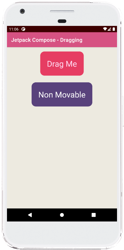
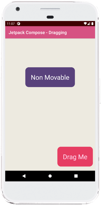
The first Box within the Column is our draggable component. This box is styled with rounded corners and a red background to make it stand out as an interactive element. Its position is dynamically controlled by the offset modifier, which takes IntOffset values for both x and y coordinates. These coordinates are derived by rounding the offsetX and offsetY float values to integers. This box also includes the pointerInput modifier, which enables gesture detection by listening for drag actions through the detectDragGestures method. When a drag is detected, the consumeAllChanges function ensures that the gesture is fully handled by the box, preventing interference with other components. The dragAmount values, which represent changes in x and y during the drag, are then added to the offset variables, smoothly updating the position of the box as it is dragged around.
The draggable box displays the text "Drag Me" in large, centered text, making its purpose clear. This text uses the Text composable with customizable font size, color, and alignment. Positioned in the center of the box, it invites user interaction and offers a straightforward example of handling gestures in Compose.
Below the draggable box, a second Box component serves as a static element labeled "Non Movable." This box has similar styling, with rounded corners and padding, but lacks the gesture detection setup, so it remains in a fixed position. This stationary box demonstrates how to incorporate both interactive and non-interactive elements within the same layout, allowing developers to see how gesture handling can be applied selectively.
Summary
This example provides a straightforward introduction to handling drag gestures in Jetpack Compose. By defining stateful offset variables and using pointerInput with detectDragGestures, it demonstrates how easy it is to make components draggable. This interactivity, achieved with minimal code, highlights the flexibility of Jetpack Compose in handling dynamic, gesture-based layouts. Additionally, the separation between draggable and static elements showcases how you can mix different types of UI components seamlessly.
With this example, developers can start implementing draggable features in their applications, enhancing user engagement and interactivity. It also serves as a foundation for further exploration into complex gestures, like swiping or scaling, within Compose layouts. Whether you're building custom UIs or adding subtle, engaging animations, the principles shown here will help you create responsive and intuitive user experiences.
package com.cfsuman.jetpackcompose

import androidx.appcompat.app.AppCompatActivity
import android.os.Bundle
import androidx.activity.compose.setContent
import androidx.compose.foundation.background
import androidx.compose.foundation.gestures.detectDragGestures
import androidx.compose.foundation.layout.*
import androidx.compose.foundation.layout.Column
import androidx.compose.foundation.shape.RoundedCornerShape
import androidx.compose.material.Text
import androidx.compose.runtime.*
import androidx.compose.ui.Alignment
import androidx.compose.ui.Modifier
import androidx.compose.ui.draw.clip
import androidx.compose.ui.graphics.Color
import androidx.compose.ui.input.pointer.consumeAllChanges
import androidx.compose.ui.input.pointer.pointerInput
import androidx.compose.ui.text.style.TextAlign
import androidx.compose.ui.tooling.preview.Preview
import androidx.compose.ui.unit.IntOffset
import androidx.compose.ui.unit.dp
import androidx.compose.ui.unit.sp
import kotlin.math.roundToInt

class MainActivity : AppCompatActivity() {
    override fun onCreate(savedInstanceState: Bundle?) {
        super.onCreate(savedInstanceState)

        setContent {
            MainContent()
        }
    }


    @Composable
    fun MainContent(){
        Column(
            modifier = Modifier
                .background(Color(0xFFEDEAE0))
                .padding(16.dp)
                .fillMaxSize(),
            verticalArrangement = Arrangement.spacedBy(25.dp),
            horizontalAlignment = Alignment.CenterHorizontally
        ) {
            var offsetX by remember { mutableStateOf(0f) }
            var offsetY by remember { mutableStateOf(0f) }

            Box(
                Modifier
                    .offset {
                        IntOffset(
                            x = offsetX.roundToInt(),
                            y = offsetY.roundToInt()
                        )
                    }
                    .clip(RoundedCornerShape(16.dp))
                    .background(Color(0xFFE63E62))
                    .padding(25.dp)
                    .pointerInput(Unit) {
                        detectDragGestures { change, dragAmount ->
                            change.consumeAllChanges()
                            offsetX += dragAmount.x
                            offsetY += dragAmount.y
                        }
                    }
            ){
                Text(
                    text = "Drag Me",
                    fontSize = 30.sp,
                    color = Color(0xFFFFDDF4),
                    textAlign = TextAlign.Center,
                )
            }

            Box(
                modifier = Modifier
                    .clip(RoundedCornerShape(16.dp))
                    .background(Color(0xFF58427C))
                    .padding(25.dp)
            ){
                Text(
                    text = "Non Movable",
                    fontSize = 30.sp,
                    color = Color(0xFFFFFFFF),
                    textAlign = TextAlign.Center,
                )
            }
        }
    }


    @Preview
    @Composable
    fun ComposablePreview(){
        //MainContent()
    }
}


- jetpack compose - Text custom font
- jetpack compose - LazyColumn scroll to top bottom
- jetpack compose - LazyColumn smooth scrolling
- jetpack compose - Animate content size
- jetpack compose - FadeIn FadeOut animation
- jetpack compose - Animation duration
- jetpack compose - animateFloatAsState
- jetpack compose - Repeatable animation
- jetpack compose - Snap animation
- jetpack compose - Double tap listener
- jetpack compose - Long press listener
- jetpack compose - Multiple draggable objects
- jetpack compose - Swiping
- jetpack compose - Panning zooming rotating
- jetpack compose - Weight modifier