Introduction
Jetpack Compose, Google's modern toolkit for building native Android UIs, allows developers to create complex interfaces with minimal code. One of its strengths is the ease of customizing elements, such as tabs and indicators. In this article, we'll explore an Android Kotlin example that demonstrates how to create a TabRow with a custom tab indicator using Jetpack Compose. This example highlights how to customize the appearance and behavior of tabs, offering a sleek and visually appealing design for users.
This tutorial will break down the provided example code to explain how various Compose elements work together. By the end, you'll understand how to implement and customize a tab layout using Jetpack Compose's declarative UI approach.
MainActivity Structure
The example begins with the MainActivity, which extends ComponentActivity. This activity serves as the entry point for the Android application. In the onCreate method, the setContent function is invoked, setting the Composable content of the activity. The GetScaffold function, a Composable, is passed as the content. This is where the overall layout of the app is defined using Jetpack Compose's Scaffold component, which is ideal for laying out UI components like top bars, tab rows, and content areas.
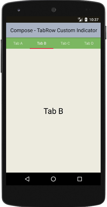
The Scaffold in the GetScaffold function includes a TopAppBar with a title and a custom background color, setting the stage for the app's interface. The main content of the app, provided by the MainContent function, is placed inside the scaffold, with a different background color to distinguish between the content and the app bar. This separation ensures a clear and organized UI structure.
TabRow with Custom Indicator
The core feature of the example is the TabRow, which is used to create a horizontal row of tabs. The MainContent function contains the logic for handling the tabs and their custom indicator. First, a mutable state variable, selectedIndex, is initialized using remember { mutableStateOf(0) }, which tracks the currently selected tab. The list of tab labels is stored in the tabs list.
The TabRow component is responsible for displaying the tabs. It accepts several parameters, including the selectedTabIndex (which highlights the selected tab), backgroundColor, and contentColor. The most notable customization is the indicator parameter, which is where the custom tab indicator is defined. Instead of using the default indicator, a Spacer is used to create a 2.5 dp tall bar beneath the selected tab. This bar is positioned using the tabIndicatorOffset modifier, ensuring it moves with the selected tab. The custom color of the indicator is set to Color(0xFFE30022), giving it a striking red appearance.
Handling Tab Selections
The tabs are dynamically created using a loop over the tabs list, with the forEachIndexed function. For each tab, a Tab Composable is used, which handles the appearance and behavior of individual tabs. The selected parameter determines if the current tab is selected, and the onClick event updates the selectedIndex state when a tab is clicked.
Each tab displays its label using the Text Composable, which is padded for better visual alignment. When a tab is clicked, the selectedIndex is updated, which in turn triggers a recomposition of the TabRow and its indicator, reflecting the new selected tab.
Displaying Tab Content
Below the TabRow, a Box is used to display the content of the selected tab. The Box is centered within its parent container using wrapContentSize(Alignment.Center). Inside the Box, a Text Composable is used to show the label of the selected tab, with a larger font size of 30 sp for emphasis. This content dynamically updates based on the selected tab, offering a simple but effective way to display different content for each tab.
Summary
This example demonstrates how to create a visually customized TabRow in Jetpack Compose, with a focus on implementing a custom tab indicator. The code showcases the declarative nature of Compose, where UI elements are defined in Kotlin code, and updates are automatically handled through state changes.
By using Jetpack Compose's rich set of UI components and modifiers, it's easy to build flexible and customizable user interfaces. The custom tab indicator and dynamic tab content highlight how Compose enables developers to create polished and interactive UIs with minimal effort. Whether you're building a simple tabbed layout or more complex navigation, this approach provides a solid foundation for future customization.
package com.cfsuman.jetpackcompose

import android.os.Bundle
import androidx.activity.ComponentActivity
import androidx.activity.compose.setContent
import androidx.compose.foundation.background
import androidx.compose.foundation.layout.*
import androidx.compose.material.*
import androidx.compose.material.TabRowDefaults.tabIndicatorOffset
import androidx.compose.runtime.*
import androidx.compose.ui.graphics.Color
import androidx.compose.material.Text
import androidx.compose.material.TopAppBar
import androidx.compose.ui.Alignment
import androidx.compose.ui.Modifier
import androidx.compose.ui.text.TextStyle
import androidx.compose.ui.unit.dp
import androidx.compose.ui.unit.sp


class MainActivity : ComponentActivity() {
    override fun onCreate(savedInstanceState: Bundle?) {
        super.onCreate(savedInstanceState)
        setContent {GetScaffold()}
    }


    @Composable
    fun GetScaffold() {
        Scaffold(
            topBar = {TopAppBar(
                title = {Text(text = "Compose - TabRow Custom Indicator")},
                backgroundColor = Color(0xFFA9B2C3),
            )},
            content = { MainContent() },
            backgroundColor = Color(0xFFEDEAE0)
        )
    }


    @Composable
    fun MainContent() {
        var selectedIndex by remember { mutableStateOf(0)}
        val tabs = listOf("Tab A","Tab B","Tab C","Tab D")

        Column(Modifier.fillMaxSize()) {
            TabRow(
                selectedTabIndex = selectedIndex,
                backgroundColor = Color(0xFF7BB661),
                contentColor = Color(0xFFFEFEFA),
                indicator = {
                    Spacer(
                        Modifier
                            .tabIndicatorOffset(it[selectedIndex])
                            .height(2.5.dp)
                            .background(Color(0xFFE30022))
                    )
                }
            ) {
                tabs.forEachIndexed { index, tab ->
                    Tab(
                        selected = selectedIndex == index,
                        onClick = { selectedIndex = index},
                    ) {
                        Text(
                            text = tab,
                            modifier = Modifier.padding(12.dp)
                        )
                    }
                }
            }

            Box(Modifier.fillMaxSize().wrapContentSize(Alignment.Center)) {
                Text(
                    text = tabs[selectedIndex],
                    style = TextStyle(fontSize = 30.sp)
                )
            }
        }
    }
}


- jetpack compose - TopAppBar center title
- jetpack compose - Snackbar action
- jetpack compose - Snackbar dismiss listener
- jetpack compose - How to use AndroidView
- jetpack compose - How to update AndroidView
- jetpack compose - How to use navigation controller
- jetpack compose - Navigate with argument
- jetpack compose - Room add remove update
- jetpack compose - How to use WebView
- jetpack compose - Background brush
- jetpack compose - Combined clickable
- jetpack compose - How to use TabRow
- jetpack compose - TabRow indicator color
- jetpack compose - Get primary language
- jetpack compose - Get screen orientation