Jetpack Compose - Customizing the TabRow Indicator Color in Android Kotlin
In this article, we will explore a simple Android Kotlin project using Jetpack Compose that demonstrates how to create a custom TabRow with a modified indicator color. Jetpack Compose, Android's modern toolkit for building native UI, allows developers to easily create and modify UI components declaratively. This example focuses on customizing a TabRow component, highlighting how to set up tabs and modify the appearance of the tab indicator with minimal effort.
The code we will break down consists of three main parts: the MainActivity, a Scaffold with a TopAppBar, and a MainContent composable where the TabRow is defined. We'll see how Kotlin and Jetpack Compose's declarative approach enable efficient UI creation, including how to dynamically change the selected tab and display corresponding content.
The MainActivity Setup
The MainActivity is the entry point of the application. It extends ComponentActivity and uses Jetpack Compose to set the content of the screen. The onCreate method initializes the activity and calls setContent, a method that injects the UI defined within the GetScaffold composable. This pattern allows for a fully composable UI setup, where the content is managed declaratively within composables.
In this case, the GetScaffold composable organizes the screen structure, including a TopAppBar and the content section where the TabRow is defined. The top bar provides a title, while the scaffold also sets a background color for the entire screen.
The Scaffold Composable
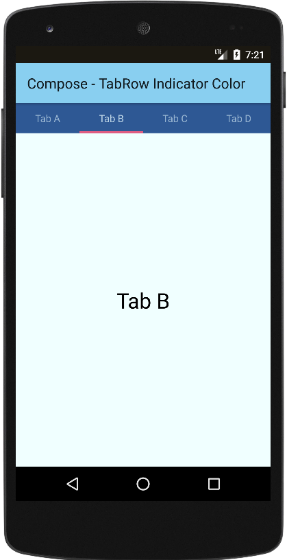
The GetScaffold composable contains the layout structure using Jetpack Compose's Scaffold component, which helps organize common UI elements like the top bar and content. The TopAppBar inside the scaffold sets the title "Compose - TabRow Indicator Color" and defines a light blue background color. Below the top bar, the MainContent composable is called to display the interactive tab row and its corresponding content.
This scaffold structure allows for a clean separation between the top app bar and the content area, ensuring that the UI remains modular and easy to manage.
Customizing the TabRow
The core of this example lies in the MainContent composable, where the TabRow component is defined. A list of tab names (tabs) is created, and the current selected tab index is managed using remember and mutableStateOf, ensuring the UI reacts to changes dynamically.
The TabRow itself is defined with several key customizations. The background color of the TabRow is set to a dark blue (0xFF2E5894), and the content color (the color of the tabs) is set to a light blue (0xFFBCD4E6). The most interesting customization is the indicator, which defines the appearance of the line that highlights the selected tab. The TabRowDefaults.Indicator is used, and its color is changed to a vibrant pink (0xFFDE5D83), with the height increased by 1.5 times the default value for a more prominent look.
Each tab is generated dynamically using forEachIndexed, and a Text composable is used to display the tab label. When a tab is clicked, the selectedIndex is updated, which in turn updates the displayed content.
Displaying Tab Content
Once a tab is selected, the corresponding content is displayed in a Box component, which centers the text of the selected tab in the middle of the screen. The text size is set to 30sp, providing clear feedback to the user on which tab is currently active.
This ensures that the tab interaction is intuitive, and the user is immediately aware of the active tab through both the indicator and the content displayed.
Summary
In summary, this Android Kotlin example demonstrates how to use Jetpack Compose to build a dynamic TabRow with a custom indicator color and layout. By leveraging Jetpack Compose's declarative nature, we can easily create UI components such as tabs, customize their appearance, and manage state efficiently. This example provides a solid foundation for creating more complex tabbed interfaces in your Android applications while taking full advantage of Compose's modern UI toolkit.
The flexibility and simplicity offered by Jetpack Compose make it an excellent choice for developers looking to build responsive, customizable UI components, such as the TabRow, with minimal boilerplate code.
package com.cfsuman.jetpackcompose

import android.os.Bundle
import androidx.activity.ComponentActivity
import androidx.activity.compose.setContent
import androidx.compose.foundation.border
import androidx.compose.foundation.layout.*
import androidx.compose.material.*
import androidx.compose.material.TabRowDefaults.tabIndicatorOffset
import androidx.compose.runtime.*
import androidx.compose.ui.graphics.Color
import androidx.compose.material.Text
import androidx.compose.material.TopAppBar
import androidx.compose.ui.Alignment
import androidx.compose.ui.Modifier
import androidx.compose.ui.text.TextStyle
import androidx.compose.ui.unit.dp
import androidx.compose.ui.unit.sp


class MainActivity : ComponentActivity() {
    override fun onCreate(savedInstanceState: Bundle?) {
        super.onCreate(savedInstanceState)
        setContent {GetScaffold()}
    }


    @Composable
    fun GetScaffold() {
        Scaffold(
            topBar = {TopAppBar(
                title = {Text(text = "Compose - TabRow Indicator Color")},
                backgroundColor = Color(0xFF89CFF0),
            )},
            content = { MainContent() },
            backgroundColor = Color(0xFFF0FFFF)
        )
    }


    @Composable
    fun MainContent() {
        var selectedIndex by remember { mutableStateOf(0)}
        val tabs = listOf("Tab A","Tab B","Tab C","Tab D")

        Column(Modifier.fillMaxSize()) {
            TabRow(
                selectedTabIndex = selectedIndex,
                backgroundColor = Color(0xFF2E5894),
                contentColor = Color(0xFFBCD4E6),
                indicator = {
                    TabRowDefaults.Indicator(
                        modifier = Modifier
                            .tabIndicatorOffset(it[selectedIndex]),
                        color = Color(0xFFDE5D83),
                        height = TabRowDefaults.IndicatorHeight * 1.5F
                    )
                }
            ) {
                tabs.forEachIndexed { index, tab ->
                    Tab(
                        selected = selectedIndex == index,
                        onClick = { selectedIndex = index},
                    ) {
                        Text(
                            text = tab,
                            modifier = Modifier.padding(12.dp)
                        )
                    }
                }
            }

            Box(Modifier.fillMaxSize().wrapContentSize(Alignment.Center)) {
                Text(
                    text = tabs[selectedIndex],
                    style = TextStyle(fontSize = 30.sp)
                )
            }
        }
    }
}


- jetpack compose - How to use TabRow
- jetpack compose - TabRow custon indicator
- jetpack compose - Get primary language
- jetpack compose - Get screen orientation
- jetpack compose - Kotlinx serialization decode josn element
- jetpack compose - How to use kotlin flow
- jetpack compose - Random number flow
- jetpack compose - flowOf flow builder
- jetpack compose - Convert list to flow
- jetpack compose - Count down flow
- jetpack compose - Count up flow by ViewModel
- jetpack compose flow - Room add remove update
- jetpack compose flow - Room implement search
- jetpack compose - ViewModel Room delete clear data
- compose glance - How to create app widget