Introduction
Jetpack Compose is a modern toolkit for building native Android UI, designed to simplify and accelerate UI development with Kotlin. One of the most powerful aspects of Jetpack Compose is how it allows developers to define UI components declaratively and manage state efficiently. In this article, we will explore an Android Kotlin example that demonstrates the use of combinedClickable in Jetpack Compose. The example showcases how different types of click interactions—single click, double click, and long press—can be handled within a single composable function to create a responsive and interactive UI.
This tutorial is perfect for developers who are familiar with the basics of Jetpack Compose but want to take a deeper dive into handling multiple types of gestures with combinedClickable. By the end of this breakdown, you’ll understand how to implement gesture handling in a clean and readable way using Compose's modern features.
Setting Up the Main Activity
The entry point of this Android application is the MainActivity, which inherits from AppCompatActivity. The onCreate() method sets the content of the activity using setContent {}. This block invokes the GetScaffold() composable function, which is responsible for building the main structure of the UI.
In Jetpack Compose, the Scaffold is a layout structure that provides slots for commonly used UI components, like the top app bar, navigation drawer, and content body. Here, the Scaffold contains a TopAppBar that displays a title and a content slot that renders the MainContent() function. The use of Scaffold ensures a consistent material design layout, simplifying the overall structure of the app.
Defining the Main Content
The MainContent() function is where the core interactive elements reside. This function begins by defining two mutableStateOf variables: counter and message. The counter is used to track the number of interactions, while message stores feedback text for the user, such as "Clicked", "Double Clicked", or "Long Clicked". These state variables are wrapped in Jetpack Compose's remember function to ensure they persist across recompositions.
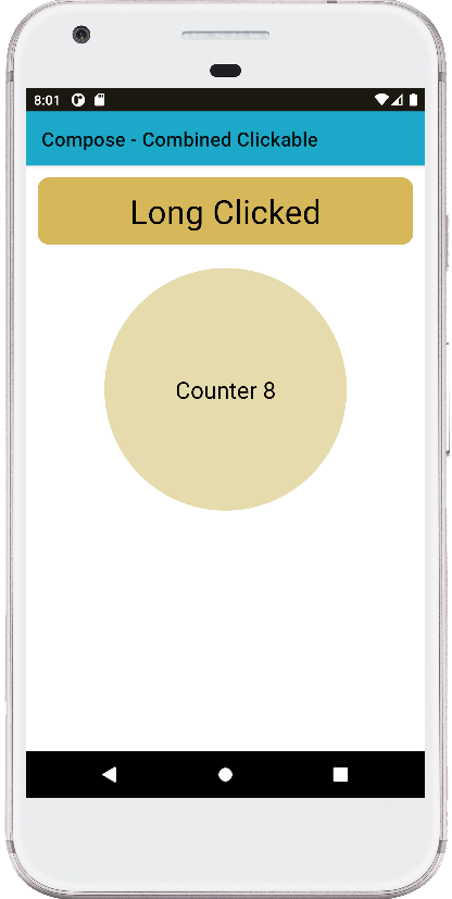
The Column composable arranges the UI elements vertically and centers them. It contains two key components: a Text widget to display the current message and a Box that handles various click interactions. The Text widget is styled using a rounded background and padding, and it is centered horizontally. It displays the current message value, providing real-time feedback to the user based on their interactions with the Box.
Implementing the combinedClickable Modifier
The highlight of this example is the Box composable, which is wrapped with a combinedClickable modifier. This modifier allows the Box to respond to multiple types of click actions: single click, double click, and long click. The combinedClickable modifier is part of Jetpack Compose's ExperimentalFoundationApi, making it a feature that may still undergo changes in future releases.
Inside the combinedClickable block, each type of click interaction is handled with a corresponding lambda function. For a single click, the counter is incremented by one, and the message is updated to "Clicked". For a double-click, the counter increases by two, and for a long click, it jumps by five. Each interaction type updates the message to reflect the action taken, giving the user immediate feedback.
This makes it simple to handle complex interaction scenarios in a single place, reducing the need for multiple nested or conditional click handlers. The Box itself is styled as a circular shape with padding, providing a large, touch-friendly target for users.
Summary
This Android Kotlin example effectively demonstrates how to use Jetpack Compose's combinedClickable modifier to handle multiple gestures within a single UI component. By leveraging state management through remember and mutableStateOf, the app efficiently updates the UI based on user interactions without redundant code. The use of Scaffold for layout management and Column for content organization ensures that the UI remains clean and responsive.
By combining different click actions—single, double, and long click—into one component, this example showcases the flexibility and power of Jetpack Compose in simplifying complex UI interactions. As Compose continues to evolve, these types of patterns will become increasingly essential for building modern Android applications.
package com.cfsuman.jetpackcompose

import androidx.appcompat.app.AppCompatActivity
import android.os.Bundle
import androidx.activity.compose.setContent
import androidx.compose.foundation.*
import androidx.compose.foundation.layout.*
import androidx.compose.foundation.shape.CircleShape
import androidx.compose.foundation.shape.RoundedCornerShape
import androidx.compose.material.*
import androidx.compose.runtime.*
import androidx.compose.ui.graphics.Color
import androidx.compose.material.Text
import androidx.compose.material.TopAppBar
import androidx.compose.ui.Alignment
import androidx.compose.ui.Modifier
import androidx.compose.ui.draw.clip
import androidx.compose.ui.graphics.SolidColor
import androidx.compose.ui.unit.dp


class MainActivity : AppCompatActivity() {
    override fun onCreate(savedObjectState: Bundle?) {
        super.onCreate(savedObjectState)
        setContent {
            GetScaffold()
        }
    }


    @Composable
    fun GetScaffold() {
        Scaffold(
            topBar = {
                TopAppBar(
                    title = {
                        Text(
                            text = "Compose - Combined Clickable"
                        )
                    },
                    backgroundColor = Color(0xFF1ca9c9),
                )
            },
            content = { MainContent() },
        )
    }


    @OptIn(ExperimentalFoundationApi::class)
    @Composable
    fun MainContent() {
        val counter = remember {mutableStateOf(0)}
        val message = remember { mutableStateOf("Click Action")}
        Column(
            horizontalAlignment = Alignment.CenterHorizontally,
            verticalArrangement = Arrangement.spacedBy(24.dp),
            modifier = Modifier.padding(12.dp)
        ) {

            Text(
                text = message.value,
                modifier = Modifier
                    .clip(RoundedCornerShape(12.dp))
                    .background(Color(0xFFD6b75a))
                    .fillMaxWidth()
                    .padding(12.dp)
                    .wrapContentSize(Alignment.Center),
                style = MaterialTheme.typography.h4
            )

            Box(
                modifier = Modifier
                    .size(250.dp)
                    .clip(CircleShape)
                    .background(SolidColor(Color(0xFFE6dbad)))
                    .combinedClickable(
                        enabled = true,
                        onClick = {
                            counter.value++
                            message.value = "Clicked"
                        },
                        onDoubleClick = {
                            counter.value  +=2
                            message.value = "Double Clicked"
                        },
                        onLongClick = {
                            counter.value +=5
                            message.value = "Long Clicked"
                        }
                    )
                    .padding(12.dp),
                contentAlignment = Alignment.Center
            ) {
                Text(
                    text = "Counter ${counter.value}",
                    style = MaterialTheme.typography.h5
                )
            }
        }
    }
}


- jetpack compose - Background brush
- jetpack compose - Double click listener
- jetpack compose - Long click listener
- jetpack compose - Pass onClick event to function
- jetpack compose - TabRow custon indicator
- jetpack compose - Get primary language
- jetpack compose - Get screen orientation
- jetpack compose - How to change StatusBar color
- jetpack compose - How to change NavigationBar color
- jetpack compose - How to change SystemBars color
- jetpack compose - How to hide system bars
- jetpack compose - Detect screen orientation change
- jetpack compose ktor - How to get api data
- jetpack compose - Icon from vector resource