Introduction
Jetpack Compose is Google's modern toolkit for building native Android UI, allowing developers to write less code and make it more readable and maintainable. One of its standout features is how it simplifies handling gestures like taps, swipes, and long presses. In this article, we’ll explore a practical example of handling long-click actions using Jetpack Compose. We'll break down the code in a programmer-friendly way, so even if you're new to Compose, you'll grasp how to implement interactive UI components with long-press gestures.
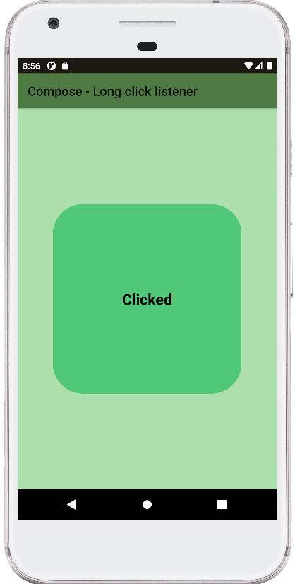
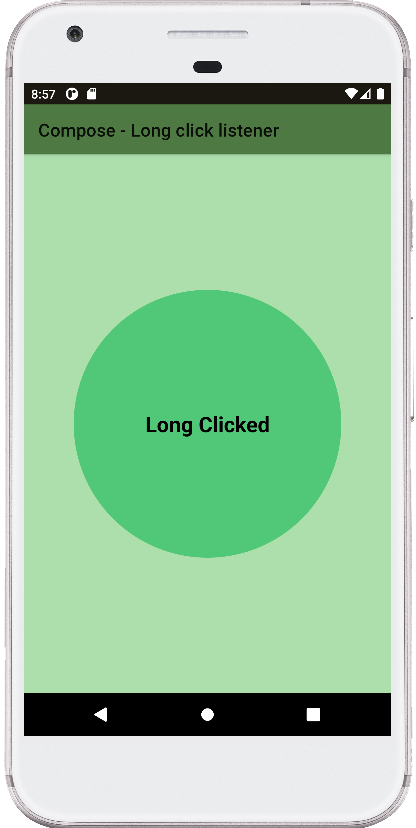
Our example demonstrates a simple long-click listener that changes the shape of a box when either clicked or long-clicked, using Kotlin and Jetpack Compose. Let’s break down the code and understand how this is achieved in an easy-to-follow manner.
Breakdown of the Code: MainActivity Setup
The MainActivity class is where our Compose content begins. In the onCreate method, instead of using XML layouts, Jetpack Compose allows us to define UI directly in Kotlin code. The setContent method is called, and inside it, we load the GetScaffold() composable function, which sets up our main screen layout using a Scaffold.
The Scaffold Layout
Scaffold is a powerful layout in Jetpack Compose that provides a consistent structure for screens. It typically contains a top bar, content area, and other components like bottom navigation or floating action buttons. In our example, the Scaffold contains a TopAppBar with a title that reads "Compose - Long click listener" and a background color of green (0xFF4f7942). The content of the screen is provided by the MainContent() composable, which holds the core logic for handling click and long-click events.
MainContent: Handling Click and Long Click
The heart of the example is within the MainContent composable. Here, we declare two remember states: one for the message displayed in the UI, and another for the shape of the box that changes based on user interaction. The remember function is key in Jetpack Compose as it allows the state to persist across recompositions, ensuring that UI changes are reflected properly when the state updates.
Next, we define a Column that centers its content horizontally and vertically. Inside this column is a Box, which acts as the interactive UI element that responds to clicks and long clicks. The Box is styled with a background color (0xFF50c878), and its shape is initially set to a RoundedCornerShape.
Handling Gestures with CombinedClickable
The key functionality of the code lies in the combinedClickable modifier attached to the Box. This modifier allows us to handle multiple gestures—both click and long-click—on a single UI element. The onClick lambda is triggered when the user performs a standard click, resetting the box’s shape to the default RoundedCornerShape(48.dp) and updating the message to "Clicked." Similarly, the onLongClick lambda handles long presses, changing the shape to a CircleShape and updating the message to "Long Clicked."
The onClickLabel and onLongClickLabel provide accessibility hints, ensuring that the UI remains user-friendly and accessible, particularly for screen readers.
UI Updates with Text and Animation
Inside the Box, a Text composable displays the current value of message. When the user interacts with the Box, the message updates dynamically, providing immediate feedback. Additionally, the size of the box is animated using the animateContentSize() modifier, giving it a smooth transition effect when its shape changes, although this isn't explicitly defined in the example provided.
Summary
This example demonstrates how easily you can handle click and long-click actions in Jetpack Compose using Kotlin. The use of combinedClickable makes it straightforward to differentiate between standard taps and long presses, while remember allows the state to persist across recompositions.
Jetpack Compose’s declarative approach simplifies creating dynamic and interactive UIs like this. By just tweaking a few modifiers and states, we can make a UI component that reacts to user gestures fluidly. Whether you're building a small demo or a full-fledged app, this pattern is a great starting point for adding interactivity to your Android applications.
package com.cfsuman.jetpackcompose

import androidx.appcompat.app.AppCompatActivity
import android.os.Bundle
import androidx.activity.compose.setContent
import androidx.compose.animation.animateContentSize
import androidx.compose.animation.core.tween
import androidx.compose.foundation.*
import androidx.compose.foundation.layout.*
import androidx.compose.foundation.shape.CircleShape
import androidx.compose.foundation.shape.RoundedCornerShape
import androidx.compose.material.*
import androidx.compose.runtime.*
import androidx.compose.ui.graphics.Color
import androidx.compose.material.Text
import androidx.compose.material.TopAppBar
import androidx.compose.ui.Alignment
import androidx.compose.ui.Modifier
import androidx.compose.ui.draw.clip
import androidx.compose.ui.graphics.SolidColor
import androidx.compose.ui.text.font.FontWeight
import androidx.compose.ui.unit.dp


class MainActivity : AppCompatActivity() {
    override fun onCreate(savedObjectState: Bundle?) {
        super.onCreate(savedObjectState)
        setContent {
            GetScaffold()
        }
    }


    @Composable
    fun GetScaffold() {
        Scaffold(
            topBar = {
                TopAppBar(
                    title = {
                        Text(
                            text = "Compose - Long click listener"
                        )
                    },
                    backgroundColor = Color(0xFF4f7942),
                )
            },
            content = { MainContent() },
            backgroundColor = Color(0xFFaddfad)
        )
    }


    @OptIn(ExperimentalFoundationApi::class)
    @Composable
    fun MainContent() {
        val message = remember { mutableStateOf("Click Action")}
        val shape = remember { mutableStateOf(RoundedCornerShape(48.dp))}

        Column(
            horizontalAlignment = Alignment.CenterHorizontally,
            verticalArrangement = Arrangement.Center,
            modifier = Modifier.fillMaxSize().padding(12.dp)
        ) {
            Box(
                modifier = Modifier
                    .size(300.dp)
                    .clip(shape.value)
                    .background(SolidColor(Color(0xFF50c878)))
                    .combinedClickable(
                        enabled = true,
                        onClick = {
                            shape.value = RoundedCornerShape(48.dp)
                            message.value = "Clicked"
                        },
                        onClickLabel = "Click to apply rounded shape",
                        onLongClick = {
                            shape.value = CircleShape
                            message.value = "Long Clicked"
                        },
                        onLongClickLabel = "Long click to apply circle shape",
                    )
                    .padding(12.dp),
                contentAlignment = Alignment.Center
            ) {
                Text(
                    text = message.value,
                    style = MaterialTheme.typography.h5,
                    fontWeight = FontWeight.Bold
                )
            }
        }
    }
}


- jetpack compose - Background brush
- jetpack compose - Combined clickable
- jetpack compose - Double click listener
- jetpack compose - Pass onClick event to function
- jetpack compose - How to use TabRow
- jetpack compose - Get primary language
- jetpack compose - Get screen orientation
- jetpack compose - Get screen width height in dp
- jetpack compose - How to change SystemBars color
- jetpack compose - How to hide status bar
- jetpack compose ktor - How to get api data
- jetpack compose - Get text from url
- jetpack compose - Kotlinx serialization lenient parsing