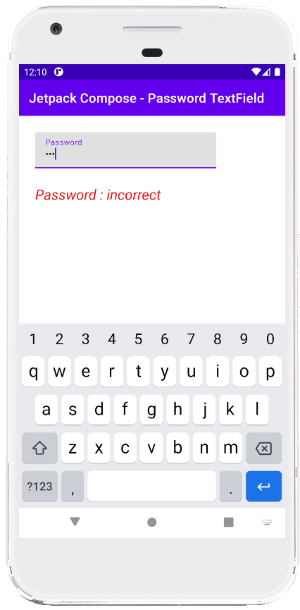
Compose Password TextField
The TextField is the text input widget of android jetpack compose library. TextField is an equivalent widget of the android view system’s EditText widget. TextField is used to enter and modify text.
The TextField widget is used to collect different types of data such as user personal details, age, phone number, email, URL, password and etc. The following jetpack compose example will demonstrate to us how we can use a TextField widget for entering a password in an android application.
We know the password TextField should have some special characteristics such as it should not displaying the user inputted text. A password TextField should display an asterisk symbol or another symbol instead of each character the user input for security purposes. Password TextField should have an option to toggle TextField entered characters' original view and masked view.
But in the jetpack compose library there is no TextField for especially password input. So, we have to add some arguments to convert a simple TextField to a Password compatible TextField.
The TextField constructor’s ‘keyboardOptions’ argument allows us to configure the keyboard for TextField. Here we can specify the keyboard type for TextField. So, we set the keyboard type for a password-related TextField to ‘KeyboardType.Password’.
Next, we have to mask the user-inputted text in our Password TextField widget. The TextField constructor’s ‘visualTransformation’ argument allows us to change the visual output of the text in the input field. We can mask each character of a password TextField with a default symbol using the PasswordVisualTransformation object. To do we have to pass the ‘visualTransformation’ argument value to ‘PasswordVisualTransformation()’.
The PasswordVisualTransformation() function has an optional argument named ‘mask’ whose data type is ‘Char’. The ‘Char’ represent the mask character used instead of the original text. So, we can display another symbol instead the default symbol to mask a Password TextField’s characters.
This jetpack compose example code is written in an android studio IDE. Copy the code and run it on an emulator device or a real device to test how we convert a regular TextField widget to a Password TextField to input the user password. We also displayed screenshots of this tutorial’s emulator screen.
MainActivity.kt
package com.cfsuman.jetpackcompose

import androidx.appcompat.app.AppCompatActivity
import android.os.Bundle
import androidx.activity.compose.setContent
import androidx.compose.foundation.layout.Column
import androidx.compose.foundation.layout.padding
import androidx.compose.foundation.text.KeyboardOptions
import androidx.compose.material.*
import androidx.compose.runtime.Composable
import androidx.compose.runtime.mutableStateOf
import androidx.compose.runtime.remember
import androidx.compose.ui.Modifier
import androidx.compose.ui.graphics.Color
import androidx.compose.ui.text.font.FontFamily
import androidx.compose.ui.text.font.FontStyle
import androidx.compose.ui.text.input.KeyboardType
import androidx.compose.ui.text.input.PasswordVisualTransformation
import androidx.compose.ui.text.input.TextFieldValue
import androidx.compose.ui.tooling.preview.Preview
import androidx.compose.ui.unit.dp
import androidx.compose.ui.unit.sp

class MainActivity : AppCompatActivity() {
    override fun onCreate(savedInstanceState: Bundle?) {
        super.onCreate(savedInstanceState)

        setContent {
            MainContent()
        }
    }


    @Composable
    fun MainContent(){
        Column(Modifier.padding(25.dp)) {
            val password = remember { mutableStateOf(TextFieldValue())}

            TextField(
                value = password.value,
                onValueChange = { password.value = it },
                label = { Text(text = "Password") },
                visualTransformation = PasswordVisualTransformation(),
                keyboardOptions = KeyboardOptions(
                    keyboardType = KeyboardType.Password
                )
            )

            var result = "incorrect"
            var textColor = Color.Red
            if (password.value.text == "secret"){
                result = "correct"
                textColor = Color.Green
            }

            Text(
                text = "Password : $result",
                fontSize = 22.sp,
                color = textColor,
                fontFamily = FontFamily.SansSerif,
                fontStyle = FontStyle.Italic,
                modifier = Modifier.padding(top = 25.dp)
            )
        }
    }


    @Preview
    @Composable
    fun ComposablePreview(){
        //MainContent()
    }
}


- jetpack compose - How to use Text
- jetpack compose - ClickableText example
- jetpack compose - How to use Button
- jetpack compose - How to use TextField
- jetpack compose - OutlinedTextField example
- jetpack compose - Handle changes in a TextField
- jetpack compose - How to use Card
- jetpack compose - How to use Checkbox
- jetpack compose - How to use RadioButton
- jetpack compose - Image from vector
- jetpack compose - Image from bitmap
- jetpack compose - Circular image example
- jetpack compose - Image scale
- jetpack compose - Image background
- jetpack compose - Image from URL