Jetpack Compose - Button Example Breakdown
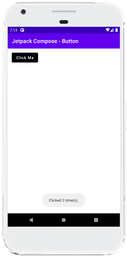
This code demonstrates how to create a simple button using Jetpack Compose in an Android application. It allows users to click the button and displays a toast message indicating the number of times it has been clicked.
Here's a breakdown of the code:
Imports: The code starts by importing necessary libraries, including
androidx.compose.materialfor building the button andandroidx.activity.compose.setContentto set the composable content for the activity.MainActivity: This is the main activity class that extends
AppCompatActivity.onCreate: This lifecycle method sets the content of the activity using
setContentwhich takes a composable function (MainContent) as an argument.MainContent: This composable function defines the UI structure of the app.
countervariable: It initializes a variablecounterto track the number of clicks.Button: This composable creates a button with several properties:
onClick: This defines the action to be performed when the button is clicked. Inside the lambda function, it increments thecountervariable and displays a toast message with the current click count.colors: This sets the background and text color of the button usingButtonDefaults.textButtonColors. Here, the background is set to black and the text color is set to white.modifier: This modifier adds padding of 15dp around the button.
Text: This composable displays the text "Click Me" inside the button.
ComposablePreview: This is a preview function annotated with
@Previewfor visualizing the composable in the Android Studio preview window. It's currently commented out.
Summary
This example showcases the basic functionalities of the Button composable in Jetpack Compose. By leveraging various properties and modifiers, you can customize the appearance and behavior of buttons within your app to create a user-friendly and visually appealing interface.
package com.cfsuman.jetpackcompose

import androidx.appcompat.app.AppCompatActivity
import android.os.Bundle
import android.widget.Toast
import androidx.activity.compose.setContent
import androidx.compose.foundation.layout.padding
import androidx.compose.material.*
import androidx.compose.runtime.Composable
import androidx.compose.ui.Modifier
import androidx.compose.ui.graphics.Color
import androidx.compose.ui.tooling.preview.Preview
import androidx.compose.ui.unit.dp

class MainActivity : AppCompatActivity() {
    override fun onCreate(savedInstanceState: Bundle?) {
        super.onCreate(savedInstanceState)

        setContent {
            MainContent()
        }
    }


    @Composable
    fun MainContent(){
        var counter = 0

        Button(
            onClick = {
                counter++
                  Toast.makeText(
                      this,
                      "Clicked $counter time(s).",
                      Toast.LENGTH_SHORT
                  ).show()
            },

            colors = ButtonDefaults.textButtonColors(
                backgroundColor = Color.Black,
                contentColor = Color.White
            ),

            modifier = Modifier.padding(15.dp)
        ) {
            Text(text = "Click Me")
        }
    }


    @Preview
    @Composable
    fun ComposablePreview(){
        //MainContent()
    }
}

- jetpack compose - How to use Text
- jetpack compose - ClickableText example
- jetpack compose - How to use Card
- jetpack compose - How to use Checkbox
- jetpack compose - How to use RadioButton
- jetpack compose - Radio group example
- jetpack compose - How to use Floating Action Button
- jetpack compose - Extended floating action button example
- jetpack compose - Box layout example
- jetpack compose - How to use AlertDialog
- jetpack compose - Image shape
- jetpack compose - Image tint
- jetpack compose - Image scale
- jetpack compose - Image background
- jetpack compose - Image from URL