Understanding the Box Layout in Jetpack Compose: An Introduction
Jetpack Compose is Google's modern toolkit for building native Android UIs, allowing developers to write more expressive and concise code. One of the core features in Jetpack Compose is its versatile set of layout components, which help structure user interfaces efficiently. Among these components, the Box layout stands out for its simplicity and flexibility, making it ideal for stacking, positioning, and aligning elements.
In this article, we'll delve into how to use the Box layout in Jetpack Compose, demonstrating its ability to position UI elements precisely within a confined space. We will explore an example where multiple buttons are placed at different corners and alignments within a single Box container. This practical use case will help you understand how Box can simplify UI design, particularly when elements need to overlap or be positioned relative to one another.
What is the Box Layout?
The Box layout in Jetpack Compose acts as a container that allows its children to overlap or be positioned freely within its boundaries. Unlike other layouts like Column or Row, which arrange elements either vertically or horizontally, Box focuses on providing a flexible area where components can be aligned as needed. This makes it particularly useful for scenarios where you want to layer items or control their alignment more precisely.
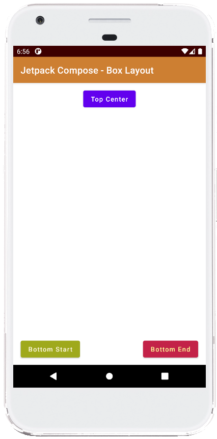
In the example we'll be exploring, the Box container is used to hold three buttons, each aligned to a specific position within the box. The Box component is designed to expand to the full available size of its parent container, allowing us to position its child elements at the top, bottom-left, and bottom-right corners. This is achieved using the align modifier, which provides fine-grained control over where each child should appear.
Setting Up the Main Content
The layout is defined within the MainContent composable function. At its core, the Box container is configured to fill the entire available screen space using the fillMaxSize modifier. Additionally, a padding of 16.dp is applied to ensure that the elements inside do not touch the screen edges directly. This padding helps create a cleaner, more polished layout by adding a bit of breathing room around the components.
Within this Box, we place three buttons. The first button is aligned to the center-top of the container using Alignment.TopCenter. This alignment positions the button precisely at the top center, making it a great spot for headers or action buttons that should grab the user’s attention right away.
Adding Custom Buttons with Colors
The second button is placed at the bottom-left corner using Alignment.BottomStart. This button is customized with distinct colors using ButtonDefaults.textButtonColors. The background color is set to a shade of green (Color(0xFF9FA91F)), while the text color is set to a light cream hue (Color(0xFFFFF8DC)). The use of custom colors helps differentiate this button from the others, making it visually distinct and suitable for secondary actions or options.
Similarly, the third button is aligned to the bottom-right corner of the Box using Alignment.BottomEnd. It also uses the ButtonDefaults.textButtonColors modifier to assign a rich red background (Color(0xFFC32148)) with pale yellow text (Color(0xFFFFFF99)). This vibrant combination ensures the button stands out, making it a good candidate for a prominent call-to-action, such as "Submit" or "Continue."
Previewing the Layout
To make development and testing easier, a ComposablePreview function is included. This preview function allows developers to visualize the layout directly within Android Studio without needing to deploy the app on an emulator or device. The preview acts as a sandbox environment, helping you tweak UI components quickly and see changes in real time. Although the MainContent composable is currently commented out in the preview, uncommenting it would enable a live view of the layout within the IDE.
Summary
In summary, the Box layout in Jetpack Compose is a powerful tool for creating flexible, layered interfaces. By using the align modifier, you can precisely position elements within the Box, making it ideal for layouts that require overlapping components or custom alignments. This example demonstrated how to use Box to organize buttons at specific positions on the screen, customizing their appearance with colors and alignments to create a user-friendly interface.
Mastering the Box layout is essential for Android developers looking to harness the full potential of Jetpack Compose. Whether you’re building complex UIs or simply need a way to control the positioning of elements, Box provides a straightforward yet flexible solution to meet your design needs.
package com.cfsuman.jetpackcompose

import androidx.appcompat.app.AppCompatActivity
import android.os.Bundle
import androidx.activity.compose.setContent
import androidx.compose.foundation.layout.*
import androidx.compose.material.Button
import androidx.compose.material.ButtonDefaults
import androidx.compose.material.Text
import androidx.compose.runtime.Composable
import androidx.compose.ui.Alignment
import androidx.compose.ui.Modifier
import androidx.compose.ui.graphics.Color
import androidx.compose.ui.tooling.preview.Preview
import androidx.compose.ui.unit.dp

class MainActivity : AppCompatActivity() {
    override fun onCreate(savedInstanceState: Bundle?) {
        super.onCreate(savedInstanceState)

        setContent {
            MainContent()
        }
    }


    @Composable
    fun MainContent(){
        Box(
            Modifier
                .fillMaxSize()
                .padding(16.dp)
        ) {
            Button(onClick = {
                // do something
            },
                modifier = Modifier.align(Alignment.TopCenter)
            ) {
                Text(text = "Top Center" )
            }

            Button(onClick = { },
                colors = ButtonDefaults.textButtonColors(
                    backgroundColor = Color(0xFF9FA91F),
                    contentColor = Color(0xFFFFF8DC)
                ),
                modifier = Modifier.align(Alignment.BottomStart)
            ) {
                Text(text = "Bottom Start" )
            }

            Button(onClick = { },
                colors = ButtonDefaults.textButtonColors(
                    backgroundColor = Color(0xFFC32148),
                    contentColor = Color(0xFFFFFF99)
                ),
                modifier = Modifier.align(Alignment.BottomEnd)
            ) {
                Text(text = "Bottom End" )
            }
        }
    }


    @Preview
    @Composable
    fun ComposablePreview(){
        //MainContent()
    }
}

- jetpack compose - Radio group example
- jetpack compose - How to use Floating Action Button
- jetpack compose - Extended floating action button example
- jetpack compose - How to use DropdownMenu
- jetpack compose - How to use IconButton
- jetpack compose - How to use IconToggleButton
- jetpack compose - How to use Column layout
- jetpack compose - How to use Row layout
- jetpack compose - How to use AlertDialog
- jetpack compose - Image size
- jetpack compose - Image shape
- jetpack compose - Image tint
- jetpack compose - Image scale
- jetpack compose - Image background
- jetpack compose - Image from URL