Understanding ClickableText in Jetpack Compose
In the world of modern Android app development, Jetpack Compose stands out as a declarative UI toolkit that simplifies how we build dynamic and responsive user interfaces. Among its powerful components, ClickableText offers an intuitive way to handle text interactions without the need for traditional TextView or OnClickListener methods. This example demonstrates how ClickableText can be used to respond to user clicks on specific parts of the text, showcasing its flexibility and ease of use.
The code we're exploring is a concise yet powerful implementation of ClickableText using Kotlin. This example not only illustrates how to create text elements that respond to user interactions but also demonstrates how to customize the text's appearance using styles like color, font size, and background. By the end of this walkthrough, you'll gain a solid understanding of how ClickableText works in Jetpack Compose and how to incorporate it into your Android projects.
Breaking Down the Main Components
The example code is contained within a single MainActivity file and begins with a standard Android setup using the AppCompatActivity class. The entry point of the application is the onCreate() method, where setContent is used to set up the composable content. This is a key aspect of Jetpack Compose: instead of using traditional XML layouts, the UI is built directly within Kotlin code, making it more readable and easier to maintain.
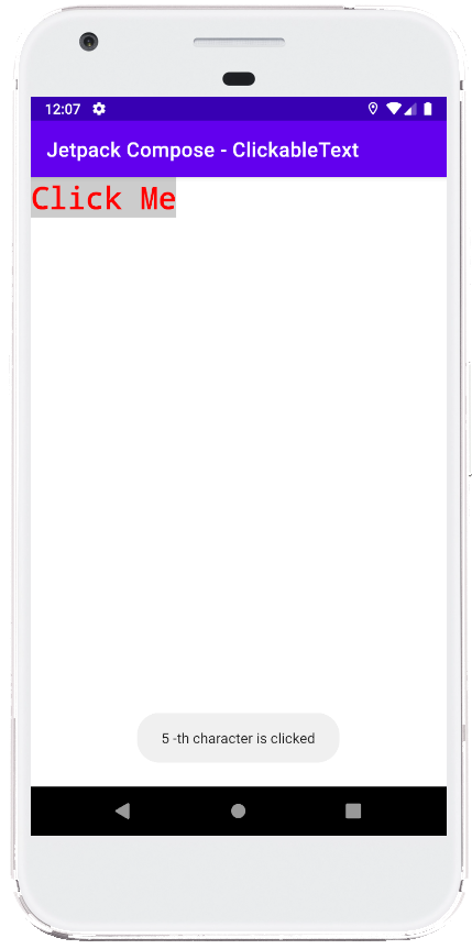
Within the MainContent() composable function, we create an annotated text string using buildAnnotatedString. This function allows developers to apply styles to specific parts of the text. In this example, the text "Click Me" is styled with several attributes: it is displayed in a bold, monospace font with a red color, light gray background, and a font size of 30sp. By using SpanStyle, we gain granular control over the visual aspects of the text, making it stand out prominently on the screen.
Implementing Interactivity with ClickableText
The real power of this example lies in the use of ClickableText. This composable component is perfect for cases where you want parts of your text to be clickable, such as creating hyperlinks, interactive labels, or even custom buttons. In the MainContent() function, the ClickableText composable is given the previously styled annotatedText as its content. The onClick lambda function is triggered whenever the user clicks on the text.
When the user clicks on any character within the text, the onClick lambda receives the position (or offset) of the clicked character. In our example, this information is used to show a Toast message that displays the specific character position that was clicked. This demonstrates how you can use character offsets to create more advanced interactions, like handling clicks on specific words or sections within a longer text block.
Previewing the Composable with @Preview
To make development more efficient, Jetpack Compose provides a @Preview annotation that allows you to see a preview of your composable functions directly in Android Studio. This example includes a ComposablePreview function, which would normally call MainContent() to display a preview of the UI. However, it is commented out in the code to prevent it from running automatically.
By using the @Preview annotation, developers can quickly visualize their UI changes without needing to rebuild or run the entire application on an emulator or physical device. This is especially helpful during the design phase, allowing for rapid iteration and testing of different text styles or interactions.
Conclusion: Leveraging Jetpack Compose for Text Interactions
This example clearly illustrates the capabilities of Jetpack Compose when it comes to creating interactive UIs with minimal code. By using ClickableText along with annotated strings, developers can efficiently handle text-based interactions while also having complete control over the appearance and behavior of their components. This approach reduces the boilerplate code associated with traditional Android development and enhances productivity by keeping everything within a single composable function.
Incorporating ClickableText into your projects can enhance user experience by enabling responsive and interactive content directly within your app’s UI. As Jetpack Compose continues to evolve, mastering these composable elements will become increasingly valuable for developers looking to create modern, dynamic Android applications.
package com.cfsuman.jetpackcompose

import androidx.appcompat.app.AppCompatActivity
import android.os.Bundle
import android.widget.Toast
import androidx.activity.compose.setContent
import androidx.compose.foundation.text.ClickableText
import androidx.compose.runtime.Composable
import androidx.compose.ui.graphics.Color
import androidx.compose.ui.text.SpanStyle
import androidx.compose.ui.text.buildAnnotatedString
import androidx.compose.ui.text.font.FontFamily
import androidx.compose.ui.text.font.FontWeight
import androidx.compose.ui.text.withStyle
import androidx.compose.ui.tooling.preview.Preview
import androidx.compose.ui.unit.sp

class MainActivity : AppCompatActivity() {
    override fun onCreate(savedInstanceState: Bundle?) {
        super.onCreate(savedInstanceState)

        setContent {
            MainContent()
        }
    }


    @Composable
    fun MainContent(){
        val annotatedText = buildAnnotatedString {
            withStyle(style = SpanStyle(
                color = Color.Red,
                fontSize = 30.sp,
                fontWeight = FontWeight.Bold,
                fontFamily = FontFamily.Monospace,
                background = Color.LightGray,
            )){
                append("Click Me")
            }
        }

        ClickableText(
            text = annotatedText,
            onClick = { offset ->
                Toast.makeText(
                    this,
                    "$offset -th character is clicked",
                    Toast.LENGTH_SHORT
                ).show()
            }
        )
    }


    @Preview
    @Composable
    fun ComposablePreview(){
        //MainContent()
    }
}

- jetpack compose - How to use Text
- jetpack compose - How to use Button
- jetpack compose - How to use TextField
- jetpack compose - OutlinedTextField example
- jetpack compose - How to use Column layout
- jetpack compose - How to use Row layout
- jetpack compose - Box layout example
- jetpack compose - How to use AlertDialog
- jetpack compose - How to use Slider
- jetpack compose - How to use Switch
- jetpack compose - How to use Snackbar
- jetpack compose - Indeterminate LinearProgressIndicator
- jetpack compose - Indeterminate CircularProgressIndicator
- jetpack compose - LinearProgressIndicator example
- jetpack compose - CircularProgressIndicator example