Introduction
Jetpack Compose is Google's modern toolkit for building native Android user interfaces with less boilerplate and more intuitive design elements. For Android developers transitioning from the traditional XML-based UI approach, Jetpack Compose offers a fresh perspective with its declarative paradigm. In Jetpack Compose, instead of defining UI elements in XML files, you use Kotlin functions annotated with @Composable to construct the layout directly in code. This approach makes creating dynamic and responsive UIs faster and more efficient.
In this article, we will break down a practical example that demonstrates how to use the Text composable in Jetpack Compose. The example includes several customization options for the Text element, such as color, font style, alignment, background color, and padding. Understanding how to manipulate these properties will allow developers to take full advantage of Jetpack Compose's flexibility when displaying text in their apps.
Overview of the Example
The code we're examining today is a simple Android application built using Jetpack Compose. At its core, the app displays a piece of text with various formatting options applied. It showcases how to leverage Kotlin’s concise syntax to style text elements using the powerful capabilities of Jetpack Compose.
The application's main activity sets up the content view using the setContent function, which is a part of the Compose toolkit. This function allows you to define your entire layout in a Kotlin function rather than relying on XML files. By doing so, the code becomes more maintainable, readable, and concise.
Setting Up the Main Content
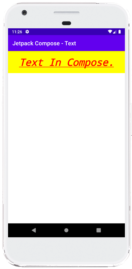
Within the example, the MainContent() composable function is where the text styling magic happens. This function is responsible for displaying a piece of text with customized properties. The Text composable is a fundamental element in Jetpack Compose, used for displaying text in various forms. In this example, the text reads "Text In Compose" and is configured with several attributes that alter its appearance.
To begin with, the text property is straightforward, setting the displayed content. However, it’s the other properties that transform the simple text into something more visually appealing. The color attribute is set to red, which immediately makes the text stand out. The textDecoration attribute is applied to underline the text, adding emphasis. Additionally, the textAlign property centers the text horizontally within its container, ensuring it looks neatly aligned.
Customizing Font and Style
The Text composable in this example also demonstrates various font customization options. The fontSize is set to 35 sp (scaled pixels), making the text larger than the default size, which is ideal for headings or important messages. The fontStyle is set to italic, while fontWeight is set to bold, both of which help draw attention to the text. Furthermore, the fontFamily is set to Monospace, giving the text a distinctive typewriter-like appearance. These properties show the versatility of the Text composable in adapting to different design needs.
Layout and Background Styling
Beyond text customization, the code also showcases how to modify the surrounding layout using the Modifier parameter. This parameter is one of the most powerful features in Jetpack Compose, enabling developers to change the appearance and behavior of composables. In this example, the Modifier is used to apply a yellow background behind the text, making it more visually striking against the red font color. The padding function adds 15 dp of spacing around the text, preventing it from touching the edges of its container. Lastly, the fillMaxWidth() modifier ensures that the text stretches to occupy the full width of its parent container, aligning the text properly within the available space.
Previewing the Composable
The code includes a preview function annotated with @Preview, which allows developers to see how their UI will look directly within Android Studio without needing to run the app on a device or emulator. Although the ComposablePreview() function is currently commented out, developers can uncomment it to quickly visualize the MainContent() composable. This preview feature is an invaluable tool in the Jetpack Compose toolkit, speeding up the development process by offering real-time feedback on UI changes.
Summary
This example provides a clear and practical introduction to using the Text composable in Jetpack Compose. It highlights how to style text using a combination of color, font, alignment, and layout properties. By leveraging Jetpack Compose's declarative approach and the powerful Modifier system, developers can create rich and dynamic user interfaces with minimal effort.
In conclusion, mastering the basics of text customization in Jetpack Compose is essential for any Android developer looking to modernize their app development process. The techniques covered here are just the beginning; Jetpack Compose offers even more possibilities for creating complex layouts and interactive UIs with its extensive set of composables and modifiers.
package com.cfsuman.jetpackcompose

import androidx.appcompat.app.AppCompatActivity
import android.os.Bundle
import androidx.activity.compose.setContent
import androidx.compose.foundation.background
import androidx.compose.foundation.layout.fillMaxWidth
import androidx.compose.foundation.layout.padding
import androidx.compose.material.Text
import androidx.compose.runtime.Composable
import androidx.compose.ui.Modifier
import androidx.compose.ui.graphics.Color
import androidx.compose.ui.text.font.FontFamily
import androidx.compose.ui.text.font.FontStyle
import androidx.compose.ui.text.font.FontWeight
import androidx.compose.ui.text.style.TextAlign
import androidx.compose.ui.text.style.TextDecoration
import androidx.compose.ui.tooling.preview.Preview
import androidx.compose.ui.unit.dp
import androidx.compose.ui.unit.sp

class MainActivity : AppCompatActivity() {
    override fun onCreate(savedInstanceState: Bundle?) {
        super.onCreate(savedInstanceState)

        setContent {
            MainContent()
        }
    }


    @Composable
    fun MainContent(){
        Text(
            text = "Text In Compose.",
            color = Color.Red,
            textDecoration = TextDecoration.Underline,
            textAlign = TextAlign.Center,
            fontSize = 35.sp,
            fontStyle = FontStyle.Italic,
            fontWeight = FontWeight.Bold,
            fontFamily = FontFamily.Monospace,
            modifier = Modifier
                .background(Color.Yellow)
                .padding(15.dp)
                .fillMaxWidth()
        )
    }


    @Preview
    @Composable
    fun ComposablePreview(){
        //MainContent()
    }
}

- jetpack compose - ClickableText example
- jetpack compose - How to use Button
- jetpack compose - How to use TextField
- jetpack compose - OutlinedTextField example
- jetpack compose - Password TextField example
- jetpack compose - Handle changes in a TextField
- jetpack compose - How to use Card
- jetpack compose - How to use Checkbox
- jetpack compose - How to use RadioButton
- jetpack compose - Radio group example
- jetpack compose - How to use Floating Action Button
- jetpack compose - Extended floating action button example
- jetpack compose - How to use DropdownMenu
- jetpack compose - How to use IconButton
- jetpack compose - How to use IconToggleButton