Introduction
This Android Kotlin example demonstrates how to handle click events in Jetpack Compose using the AndroidView composable to integrate traditional Android Views within a Compose-based UI. Specifically, the code showcases how to integrate a MaterialButton and a standard Button to manipulate a counter. As Jetpack Compose represents a modern, declarative way of building UI on Android, this example highlights its interoperability with existing Android Views, making it easier for developers to transition or combine both approaches.
The focus of this example is on providing a clear and modular structure using Kotlin's Compose framework, scaffolding layout components, and creating a simple user interaction with a counter system that increases or decreases based on button clicks.
Activity Setup
In the MainActivity, the onCreate method is overridden to set the content of the activity using setContent { GetScaffold() }. This method is essential for initializing the Jetpack Compose UI within the activity. It calls the composable function GetScaffold(), which sets up the basic structure of the app.
The use of Jetpack Compose eliminates the need for traditional XML layout files, as all UI components are defined directly within Kotlin code. This is a key feature of Compose, enabling the entire UI to be reactive and built in a declarative manner.
Composable Structure: GetScaffold
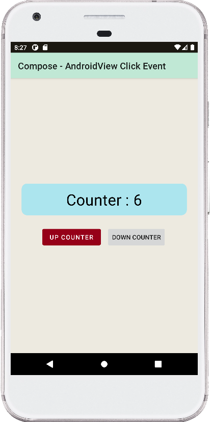
The GetScaffold composable is responsible for providing the app's overall layout structure. It uses the Scaffold component, which is a high-level layout that organizes the screen's content into sections, like a top bar and body content. The top bar (TopAppBar) displays the app's title, "Compose - AndroidView Click Event," giving the user a clear indication of the app's purpose.
The Scaffold also defines the background color using Color(0xFFEDEAE0) and passes its main content to the MainContent() composable. The clean separation of layout elements using Scaffold demonstrates Compose's modular approach, making the UI more maintainable and readable.
MainContent: Counter Logic
The MainContent() composable is where the core functionality resides. It contains a column layout that centers the UI elements. A Text element displays the current value of the counter, which is managed by a remember block that holds a mutable state variable counter. Using remember and mutableStateOf(0) ensures that the state of the counter persists across recompositions, a vital feature in reactive UIs like Compose.
The Text is styled using Material Design components and modifiers like padding, clip, and background. These modifiers enable precise control over the appearance and behavior of the UI elements, allowing developers to customize the look and feel of their components effortlessly.
AndroidView Integration
One of the most important aspects of this example is the integration of traditional Android Views within Jetpack Compose using AndroidView. In the MainContent, two buttons are created: one for incrementing the counter and another for decrementing it.
- The first
AndroidViewusesMaterialButtonfrom the Material Components library. The button is labeled "Up Counter," and itssetOnClickListenerincrements the counter when pressed. - The second
AndroidViewuses a standard AndroidButton. Labeled "Down Counter," it decreases the counter when pressed.
Both buttons demonstrate how AndroidView can wrap existing Android UI components in a Compose environment, ensuring that legacy code or UI elements can be seamlessly integrated without rewriting them in Compose.
State Management and UI Updates
Each button click updates the counter state, which automatically triggers a recomposition of the MainContent composable. This reactive behavior is central to Jetpack Compose's design. The UI is directly tied to the state, meaning that any changes to the state will instantly update the corresponding UI components, in this case, the displayed counter.
This example clearly illustrates how state management in Compose differs from the traditional Android approach. Instead of manually updating views, developers only need to manage the state, and Compose takes care of reflecting those changes in the UI.
Conclusion
This Android Kotlin example demonstrates the power of Jetpack Compose in building modern Android UIs while maintaining compatibility with traditional Android Views through AndroidView. The counter example highlights key Compose concepts such as state management, the declarative nature of Compose, and the seamless integration of existing Android UI components.
By utilizing Jetpack Compose alongside traditional views, developers can modernize their apps incrementally, making this a powerful tool for hybrid UI development. The example provides a clean, scalable approach to handling UI events and interactions, illustrating the flexibility Compose offers.
package com.cfsuman.jetpackcompose

import androidx.appcompat.app.AppCompatActivity
import android.os.Bundle
import androidx.activity.compose.setContent
import androidx.compose.foundation.background
import androidx.compose.foundation.layout.*
import androidx.compose.foundation.shape.RoundedCornerShape
import androidx.compose.material.*
import androidx.compose.runtime.*
import androidx.compose.ui.graphics.Color
import androidx.compose.material.Text
import androidx.compose.material.TopAppBar
import androidx.compose.ui.Alignment
import androidx.compose.ui.Modifier
import androidx.compose.ui.draw.clip
import androidx.compose.ui.unit.dp
import androidx.compose.ui.viewinterop.AndroidView
import com.google.android.material.button.MaterialButton


class MainActivity : AppCompatActivity() {
    override fun onCreate(savedInstanceState: Bundle?) {
        super.onCreate(savedInstanceState)
        setContent {
            GetScaffold()
        }
    }


    @Composable
    fun GetScaffold(){
        Scaffold(
            topBar = {
                TopAppBar(
                    title = { Text(
                        text = "Compose - AndroidView Click Event"
                    )},
                    backgroundColor = Color(0xFFC0E8D5),
                )
            },
            content = {MainContent()},
            backgroundColor = Color(0xFFEDEAE0),
        )
    }


    @Composable
    fun MainContent(){
        var counter by remember { mutableStateOf(0)}

        Column(
            modifier = Modifier
                .fillMaxSize()
                .padding(12.dp),
            verticalArrangement = Arrangement.Center,
            horizontalAlignment = Alignment.CenterHorizontally
        ){

            Text(
                text = "Counter : $counter",
                style = MaterialTheme.typography.h4,
                modifier = Modifier
                    .padding(12.dp)
                    .fillMaxWidth()
                    .clip(RoundedCornerShape(12.dp))
                    .background(Color(0xFFACE5EE))
                    .padding(12.dp)
                    .wrapContentSize(Alignment.Center)
            )

            Row(
                modifier = Modifier.padding(12.dp),
                horizontalArrangement = Arrangement.spacedBy(12.dp)
            ) {
                AndroidView(factory = { context ->
                    MaterialButton(context).apply {
                        text = "Up Counter"
                        setOnClickListener {
                            counter++
                        }
                    }
                })

                AndroidView(factory = { context ->
                    android.widget.Button(context).apply {
                        text = "Down Counter"
                        setOnClickListener {
                            counter--
                        }
                    }
                })
            }
        }
    }
}


- jetpack compose - How to use ModalDrawer
- jetpack compose - How to use BadgeBox
- jetpack compose - Update state of another function variable
- jetpack compose - TopAppBar center title
- jetpack compose - TopAppBar menu
- jetpack compose - Snackbar action
- jetpack compose - Snackbar dismiss listener
- jetpack compose - How to use AndroidView
- jetpack compose - How to update AndroidView
- jetpack compose - AndroidView modifier
- jetpack compose - How to use bottom navigation
- jetpack compose - ViewModel Room delete clear data
- compose glance - How to create app widget
- jetpack compose - Icon from vector resource