Introduction
In the world of Android app development, the Jetpack Compose framework has transformed the way developers design user interfaces, making it more efficient and straightforward. One of the key features of Jetpack Compose is its ability to build modern UI components declaratively, which greatly reduces boilerplate code and allows for more expressive designs. In this article, we explore the implementation of a top app bar with a menu in Jetpack Compose using Kotlin. This is particularly useful for applications that require a sleek and intuitive navigation experience with easy access to commonly used features.
The sample project we are discussing focuses on setting up a TopAppBar that includes a navigation icon, action icons, and a dropdown menu. By understanding this example, you'll gain insights into how to efficiently manage UI components within a scaffold structure while maintaining a clean and readable codebase. Let’s break down the functionality step by step to understand how everything comes together.
Understanding the Scaffold Structure
At the heart of this project is the use of the Scaffold composable, which serves as a foundational layout for screens in Jetpack Compose. The scaffold is responsible for organizing elements like the top app bar, floating action buttons, and other content areas. In our implementation, the Scaffold is set up with three primary components: a TopAppBar, a central content area, and a custom background color to enhance the visual aesthetics.
The Scaffold is initiated in the GetScaffold composable function, which acts as the entry point of the layout. The top bar, defined separately in the TopAppBarContent function, is injected into the scaffold. Meanwhile, the central content is displayed using the MainContent function, which centers a simple text element on the screen. This separation of concerns ensures that each part of the layout is modular, making the code easier to maintain and expand.
Designing the TopAppBar with Icons
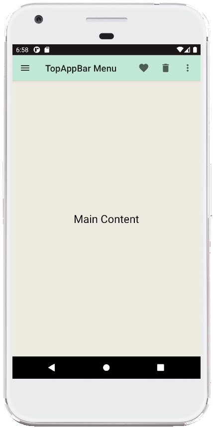
A key highlight of the project is the TopAppBar implementation. The TopAppBar composable includes several UI elements such as a title, navigation icon, and multiple action icons. The title, set to "TopAppBar Menu," provides a descriptive label for the app bar, while the navigation icon is represented by a menu icon using Icons.Filled.Menu. The navigation icon can be customized to trigger various actions, such as opening a navigation drawer.
In addition to the navigation icon, the app bar includes action icons for specific tasks. In our example, we use the favorite and delete icons (Icons.Filled.Favorite and Icons.Filled.Delete, respectively). Each of these icons is wrapped in an IconButton, making them interactive. The onClick listeners for these icons are placeholders, allowing developers to define their own functionality, such as navigating to a different screen or triggering a feature within the app.
Creating a Dropdown Menu for Additional Options
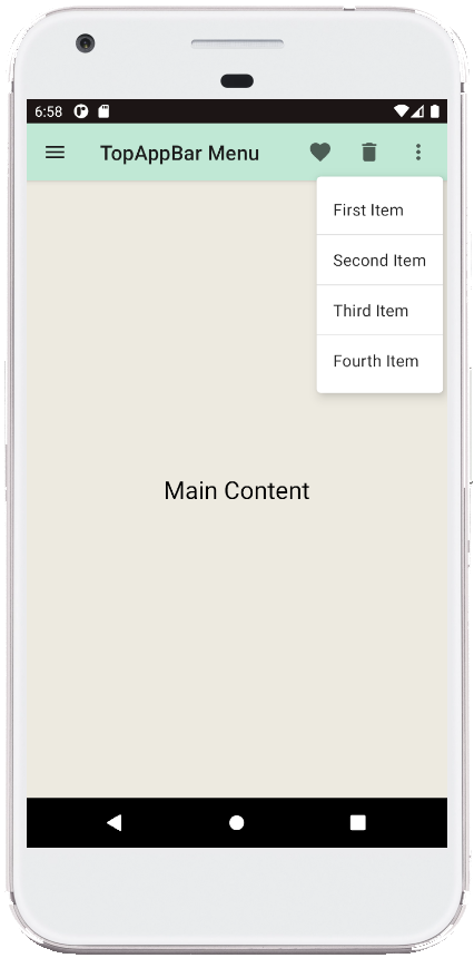
One of the most dynamic elements in this implementation is the dropdown menu, which is built using the DropdownMenu composable. This menu is ideal for displaying additional options that do not fit within the top app bar. The menu is triggered by a vertical dots icon (Icons.Filled.MoreVert) located on the top-right corner of the app bar.
The state of the dropdown menu is controlled by a remember mutable state, which determines whether the menu is currently expanded or collapsed. When the user taps the menu icon, the state changes to show the dropdown options. The menu itself contains several items, each defined using the DropdownMenuItem composable. These items include simple text labels such as "First Item," "Second Item," and so on, separated by dividers to improve readability. Developers can easily extend the menu with additional items or modify the existing ones to suit the needs of their application.
Displaying Main Content
While the top app bar and its menu handle navigation and quick actions, the main body of the screen is kept simple in this example. The MainContent composable uses a Box layout to center a text element that reads "Main Content." This part of the screen can be customized to include more complex content, such as lists, forms, or other interactive UI components, depending on the specific use case of the application.
By keeping the content area modular, this structure allows developers to focus on specific parts of the screen independently. For instance, you can modify the top bar without affecting the main content area, ensuring a smooth development workflow and better code organization.
Summary
The implementation of a TopAppBar with menus in Jetpack Compose demonstrates the flexibility and power of the framework in building intuitive and interactive user interfaces. By leveraging composable functions like Scaffold, TopAppBar, and DropdownMenu, developers can create highly customizable layouts with minimal effort. The project not only shows how to manage top-level navigation and actions but also emphasizes the importance of modular design in app development.
Overall, this example serves as an excellent starting point for those looking to integrate advanced UI elements in their Kotlin-based Android projects. With a solid understanding of these components, you can enhance your applications with polished, responsive, and user-friendly interfaces that stand out in today’s competitive app market.
package com.cfsuman.jetpackcompose

import androidx.appcompat.app.AppCompatActivity
import android.os.Bundle
import androidx.activity.compose.setContent
import androidx.compose.foundation.layout.*
import androidx.compose.material.*
import androidx.compose.runtime.*
import androidx.compose.ui.graphics.Color
import androidx.compose.ui.tooling.preview.Preview
import androidx.compose.material.Text
import androidx.compose.material.TopAppBar
import androidx.compose.material.icons.Icons
import androidx.compose.material.icons.filled.*
import androidx.compose.ui.Alignment
import androidx.compose.ui.Modifier


class MainActivity : AppCompatActivity() {
    override fun onCreate(savedInstanceState: Bundle?) {
        super.onCreate(savedInstanceState)
        setContent {
            GetScaffold()
        }
    }


    @Composable
    fun GetScaffold(){
        Scaffold(
            topBar = { TopAppBarContent() },
            content = {MainContent()},
            backgroundColor = Color(0xFFEDEAE0)
        )
    }


    @Composable
    fun TopAppBarContent() {
        val expanded = remember { mutableStateOf(false)}

        TopAppBar(
            title = { Text(text = "TopAppBar Menu")},
            backgroundColor = Color(0xFFC0E8D5),

            navigationIcon = {
                IconButton(onClick = {
                    // do something here
                }) {
                    Icon(
                        Icons.Filled.Menu,
                        contentDescription = "Localized description"
                    )
                }
            },

            actions = {
                IconButton(onClick = {
                    // do something here
                }) {
                    Icon(
                        Icons.Filled.Favorite,
                        contentDescription = "Localized description"
                    )
                }
                IconButton(onClick = {
                    // do something here
                }) {
                    Icon(
                        Icons.Filled.Delete,
                        contentDescription = "Localized description"
                    )
                }

                Box(
                    Modifier
                        .wrapContentSize(Alignment.TopEnd)
                ) {
                    IconButton(onClick = {
                        expanded.value = true
                    }) {
                        Icon(
                            Icons.Filled.MoreVert,
                            contentDescription = "Localized description"
                        )
                    }

                    DropdownMenu(
                        expanded = expanded.value,
                        onDismissRequest = { expanded.value = false },
                    ) {
                        DropdownMenuItem(onClick = {
                            expanded.value = false
                        }) {
                            Text("First Item")
                        }

                        Divider()

                        DropdownMenuItem(onClick = {
                            expanded.value = false
                        }) {
                            Text("Second Item")
                        }

                        Divider()

                        DropdownMenuItem(onClick = {
                            expanded.value = false
                        }) {
                            Text("Third Item")
                        }

                        Divider()

                        DropdownMenuItem(onClick = {
                            expanded.value = false
                        }) {
                            Text("Fourth Item")
                        }
                    }
                }
            }
        )
    }


    @Composable
    fun MainContent(){
        Box(
            modifier = Modifier.fillMaxSize(),
            contentAlignment = Alignment.Center
        ){
            Text(
                text = "Main Content",
                style = MaterialTheme.typography.h5
            )
        }
    }


    @Preview
    @Composable
    fun ComposablePreview(){
        //GetScaffold()
    }
}


- jetpack compose - TopAppBar center title
- jetpack compose - Scaffold with Drawer
- jetpack compose - Open close drawer in code
- jetpack compose - Scaffold with Snackbar
- jetpack compose - WebView ProgressIndicator
- jetpack compose - WebView progress percentage
- jetpack compose - Backdrop scaffold
- jetpack compose - Double click listener
- jetpack compose - Long click listener
- jetpack compose - Pass onClick event to function
- jetpack compose - How to hide system bars
- jetpack compose - Detect screen orientation change
- jetpack compose ktor - How to get api data
- jetpack compose - Icon from vector resource