Compose Box Content Alignment
The Box is a layout widget of the android jetpack compose library. The Box layout size itself fits the content. When a Box layout size is bigger than the content size, then we have to align the content. Such as a Box layout may be filled the screen size, in this situation we need to show the content widget at the specified position of the Box layout.
The following jetpack compose tutorial will demonstrate to us how we can align Box content in an android application. The Box widget constructor has an argument name ‘contentAlignment’ whose data type is ‘Alignment’. So, using this argument we can set the Box content alignment.
Alignment is an interface to calculate the position of a sized box inside an available space. The ‘Alignment’ is often used to define the alignment of a layout inside a parent layout.
The default value of this ‘contentAlignment’ argument is ‘Alignment.TopStart’. There are many available values for the ‘contentAlignment’ argument such as Alignment.Center, Alignment.TopEnd, Alignment.BottomStart, Alignment.CenterStart, etc. Those names are self-describing. So, if we want to put an element at the exact center of the Box layout, then we can simply pass the ‘contentAlignment’ argument value to ‘Alignment.Center’.
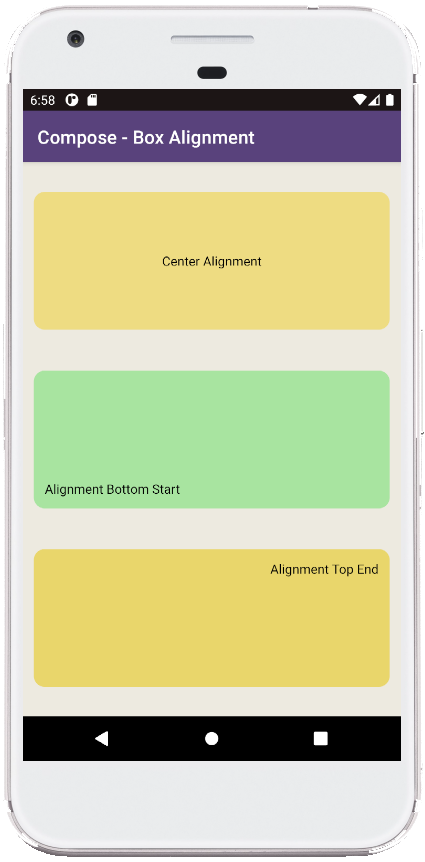
This jetpack compose tutorial code is written in an android studio IDE. Copy the code and run it on an emulator device or a real device to test how we define the Box layout content alignment. We also displayed a screenshot of this tutorial’s emulator screen at the bottom of this tutorial.
The following jetpack compose tutorial will demonstrate to us how we can align Box content in an android application. The Box widget constructor has an argument name ‘contentAlignment’ whose data type is ‘Alignment’. So, using this argument we can set the Box content alignment.
Alignment is an interface to calculate the position of a sized box inside an available space. The ‘Alignment’ is often used to define the alignment of a layout inside a parent layout.
The default value of this ‘contentAlignment’ argument is ‘Alignment.TopStart’. There are many available values for the ‘contentAlignment’ argument such as Alignment.Center, Alignment.TopEnd, Alignment.BottomStart, Alignment.CenterStart, etc. Those names are self-describing. So, if we want to put an element at the exact center of the Box layout, then we can simply pass the ‘contentAlignment’ argument value to ‘Alignment.Center’.
This jetpack compose tutorial code is written in an android studio IDE. Copy the code and run it on an emulator device or a real device to test how we define the Box layout content alignment. We also displayed a screenshot of this tutorial’s emulator screen at the bottom of this tutorial.
MainActivity.kt
package com.cfsuman.jetpackcompose

import android.annotation.SuppressLint
import androidx.appcompat.app.AppCompatActivity
import android.os.Bundle
import androidx.activity.compose.setContent
import androidx.compose.foundation.background
import androidx.compose.foundation.layout.*
import androidx.compose.foundation.shape.RoundedCornerShape
import androidx.compose.material.*
import androidx.compose.runtime.*
import androidx.compose.ui.Alignment
import androidx.compose.ui.Modifier
import androidx.compose.ui.draw.clip
import androidx.compose.ui.graphics.Color
import androidx.compose.ui.tooling.preview.Preview
import androidx.compose.ui.unit.dp

class MainActivity : AppCompatActivity() {
    override fun onCreate(savedInstanceState: Bundle?) {
        super.onCreate(savedInstanceState)

        setContent {
            GetScaffold()
        }
    }


    @SuppressLint("UnusedMaterialScaffoldPaddingParameter")
    @Composable
    fun GetScaffold(){
        Scaffold(
            topBar = {TopAppBar(
                title = {Text(
                    "Compose - Box Alignment",
                    color = Color.White)},
                backgroundColor = Color(0xFF58427C)) },
            content = {MainContent()},
            backgroundColor = Color(0xFFEDEAE0)
        )
    }


    @Composable
    fun MainContent(){
        Column(
            modifier = Modifier
                .fillMaxSize(),
            verticalArrangement = Arrangement.SpaceEvenly,
            horizontalAlignment = Alignment.CenterHorizontally
        ){
            Box(
                Modifier
                    .padding(12.dp)
                    .fillMaxWidth()
                    .height(150.dp)
                    .clip(RoundedCornerShape(12.dp))
                    .background(Color(0xFFEEDC82))
                    .padding(12.dp),
                contentAlignment = Alignment.Center
            ){
                Text(text = "Center Alignment")
            }

            Box(
                Modifier
                    .padding(12.dp)
                    .fillMaxWidth()
                    .height(150.dp)
                    .clip(RoundedCornerShape(12.dp))
                    .background(Color(0xFFA8E4A0))
                    .padding(12.dp),
                contentAlignment = Alignment.BottomStart
            ){
                Text(text = "Alignment Bottom Start")
            }

            Box(
                Modifier
                    .padding(12.dp)
                    .fillMaxWidth()
                    .height(150.dp)
                    .clip(RoundedCornerShape(12.dp))
                    .background(Color(0xFFE9D66B))
                    .padding(12.dp),
                contentAlignment = Alignment.TopEnd
            ){
                Text(text = "Alignment Top End")
            }
        }
    }


    @Preview
    @Composable
    fun ComposablePreview(){
        //GetScaffold()
    }
}
- jetpack compose - Column align bottom
- jetpack compose - Card shadow
- jetpack compose - Card border
- jetpack compose - Card clickable
- jetpack compose - ModalDrawer example
- jetpack compose - TopAppBar navigation
- jetpack compose - TopAppBar actions
- jetpack compose - Open close drawer in code
- jetpack compose - Scaffold with Snackbar
- jetpack compose - Snackbar host state
- jetpack compose - Scaffold Snackbar host
- jetpack compose - How to use bottom navigation