Introduction
In modern Android development, Jetpack Compose has emerged as a powerful toolkit for building user interfaces with a more declarative approach. Developers no longer need to manage complex UI hierarchies and state changes manually. Instead, Compose enables creating highly responsive and interactive UI elements in a simplified and intuitive manner. One of the key elements in any Android application is the top app bar, which provides a space for the app's title and actionable icons such as navigation, search, and other contextual actions.
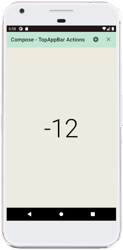
This example demonstrates the implementation of a TopAppBar with action buttons using Jetpack Compose in Kotlin. The TopAppBar allows users to increase or decrease a counter value by interacting with the icons on the app bar. It highlights how Jetpack Compose simplifies building UI components, handling state management, and providing real-time feedback to users.
Detailed Breakdown
The example begins by setting up the MainActivity, which inherits from AppCompatActivity. Upon creation, the setContent function is called to define the UI layout using Compose. This function is crucial as it replaces the traditional setContentView and allows Compose to manage the entire UI.
The main composable function in this example is GetScaffold(). The Scaffold composable is a layout component in Jetpack Compose that allows for creating structured layouts by defining slots for various UI elements, such as the TopAppBar, floating action buttons, and content. In this case, the TopAppBar and a central content area are defined within the Scaffold. A state variable counter is declared using remember { mutableStateOf(0) } to store the current count, ensuring that any changes to this state will trigger a UI update.
The TopAppBarContent composable is responsible for rendering the top app bar with a title and two action buttons. The app bar has a custom background color and uses icons from the Icons.Filled set. Each IconButton is associated with a specific action: incrementing and decrementing the counter value. The counter.value++ and counter.value-- expressions modify the counter, demonstrating how the app bar's actions can manipulate shared state in the app.
The main content of the screen is handled by the MainContent composable. This composable arranges the UI elements within a Box layout, ensuring that the counter value is displayed at the center of the screen. The Text composable inside it updates dynamically, reflecting the current value of the counter as users interact with the action buttons in the app bar. The typography is styled using MaterialTheme.typography.h1 to provide a large, bold display of the counter value.
A ComposablePreview function is also included, which provides a preview of the GetScaffold UI in Android Studio without running the app on a device. This is particularly useful for developers to iterate quickly over their designs and verify how the UI components are rendered.
Summary
This example illustrates how Jetpack Compose streamlines the process of building UI components and managing state in Android applications. By using a Scaffold to define the layout and a TopAppBar to handle user interactions, the code becomes more readable and maintainable compared to traditional XML-based UI development. The use of composable functions to manage different parts of the UI, such as the app bar and content, demonstrates the modular nature of Jetpack Compose, making it easier to manage state and UI updates.
Overall, this example is a practical demonstration of how Jetpack Compose empowers developers to create interactive, responsive applications with less boilerplate code and a more declarative approach to UI development.
package com.cfsuman.jetpackcompose

import androidx.appcompat.app.AppCompatActivity
import android.os.Bundle
import androidx.activity.compose.setContent
import androidx.compose.foundation.layout.*
import androidx.compose.material.*
import androidx.compose.runtime.*
import androidx.compose.ui.graphics.Color
import androidx.compose.ui.tooling.preview.Preview
import androidx.compose.material.Text
import androidx.compose.material.TopAppBar
import androidx.compose.material.icons.Icons
import androidx.compose.material.icons.filled.*
import androidx.compose.ui.Alignment
import androidx.compose.ui.Modifier


class MainActivity : AppCompatActivity() {
    override fun onCreate(savedInstanceState: Bundle?) {
        super.onCreate(savedInstanceState)
        setContent {
            GetScaffold()
        }
    }


    @Composable
    fun GetScaffold(){
        val counter:MutableState<Int> = remember{ mutableStateOf(0)}

        Scaffold(
            topBar = { TopAppBarContent(counter) },
            content = {MainContent(counter)},
            backgroundColor = Color(0xFFEDEAE0)
        )
    }


    @Composable
    fun TopAppBarContent(counter: MutableState<Int>) {
        TopAppBar(
            title = { Text(text = "Compose - TopAppBar Actions")},
            backgroundColor = Color(0xFFC0E8D5),
            actions = {
                IconButton(onClick = {
                    counter.value++;
                }) {
                    Icon(
                        Icons.Filled.AddCircle,
                        contentDescription = "Localized description"
                    )
                }

                IconButton(onClick = {
                    counter.value--;
                }) {
                    Icon(
                        Icons.Filled.Close,
                        contentDescription = "Localized description"
                    )
                }
            }
        )
    }


    @Composable
    fun MainContent(counter: MutableState<Int>){
        Box(
            modifier = Modifier.fillMaxSize(),
            contentAlignment = Alignment.Center
        ){
            Text(
                text = "${counter.value}",
                style = MaterialTheme.typography.h1
            )
        }
    }


    @Preview
    @Composable
    fun ComposablePreview(){
        //GetScaffold()
    }
}


- jetpack compose - Row onClick
- jetpack compose - Row weight
- jetpack compose - Column weight
- jetpack compose - Row gravity
- jetpack compose - Row background
- jetpack compose - Column align bottom
- jetpack compose - Box gravity
- jetpack compose - Card center
- jetpack compose - Card padding
- jetpack compose - Card background color
- jetpack compose - How to use ModalDrawer
- jetpack compose - How to use BadgeBox
- jetpack compose - Update state of another function variable
- jetpack compose - TopAppBar navigation