Flutter - ToggleButtons Vertical
The ToggleButtons class represents a set of toggle buttons. The ToggleButton’s
children are laid out along direction. The state of each button in a
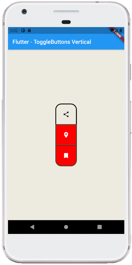
ToggleButton widget is controlled by the isSelected property, which is a list
of bools that determine if a button is in an unselected or selected state. The
flutter developers can configure the ToggleButtons widget’s each toggle
behavior by the onPressed callback, which can update the isSelected list
however it wants to. The ToggleButtons widget has a solid, 1 logical pixel
border surrounding itself by default and separating each button.
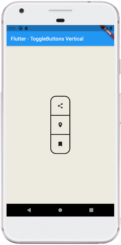
The following flutter app development tutorial will demonstrate how to display ToggleButtons vertically aligned. Here we used the ToggleButtons widget’s direction property to lay out buttons in the vertical direction.
The ToggleButtons class’s direction property value is an Axis enum value which is the direction along which the buttons are rendered. The default value of the ToggleButtons class’s direction property is Axis.horizontal. So by default, the ToggleButtons widget’s buttons are aligned in the horizontal direction.
The Axis enum represents the two cardinal directions in two dimensions. The axis is always relative to the current coordinate space. The Axis.horizontal value determines the left and right direction. And the Axis.vertical value determines the up and down direction.
In this flutter tutorial, we will display the ToggleButtons widget’s buttons in the vertical direction. We can simply do it by using the ToggleButtons class’s direction property. We just have to set this property value to Axis.vertical.
main.dart
import 'package:flutter/material.dart';

void main() => runApp(const FlutterExample());

class FlutterExample extends StatelessWidget {
  const FlutterExample({Key? key}) : super(key: key);

  @override
  Widget build(BuildContext context) {
    return MaterialApp(
        title: 'Flutter Example',
        theme: ThemeData(primarySwatch: Colors.blue),
        home: const StateExample()
    );
  }
}

class StateExample extends StatefulWidget {
  const StateExample({Key? key}) : super(key: key);

  @override
  _StateExampleState createState() => _StateExampleState();
}

class _StateExampleState extends State<StateExample> {
  final List<bool> _selections = List.generate(3, (index) => false);

  @override
  Widget build(BuildContext context) {
    return Scaffold(
        backgroundColor: const Color(0xFFEDEAE0),
        appBar: AppBar(
            title: const Text("Flutter - ToggleButtons Vertical")
        ),
        body: bodyContent()
    );
  }


  bodyContent() {
    return Center(
        child: ToggleButtons(
            children: const [
              Icon(Icons.share),
              Icon(Icons.add_location),
              Icon(Icons.bookmark),
            ],
            onPressed: (int index){
              setState(() {
                _selections[index] = !_selections[index];
              });
            },
            isSelected: _selections,
            constraints: const BoxConstraints(
                minWidth: 70,
                minHeight: 70
            ),
            borderRadius: BorderRadius.circular(20),
            borderWidth: 3,
            borderColor: Colors.black,
            selectedBorderColor: const Color(0xFF4B3621),
            fillColor: const Color(0xFFFF0800),
            selectedColor: Colors.white,
            direction: Axis.vertical,
            verticalDirection: VerticalDirection.down
        )
    );
  }
}