Switch Button
The following kotlin tutorial will demonstrate to us how we can use a Switch button in an android application. And how we can implement the Switch button checked change listener using the kotlin programming language. We used the SwicthCompat widget in this tutorial instead the Switch/SwitchMaterial widget.
Android Developers also can use the SwitchMaterial widget instead the Switch/SwicthCompat widget. The SwitchMaterial widget used attributes from the material theme. The SwitchMaterial behaves identically to the SwitchCompat widget.
The SwicthCompat is a complete backport of the core Switch widget. The SwitchCompat widget brings the visuals and functionality of the Switch widget to older versions of the android platform. We have to put the SwicthCompat widget in our XML layout file to use it instead Switch button in an android application. We have to explicitly use the SwicthCompat widget.
Android application developers can change the Switch button thumb and track color. We can tint both the thumb and track color using API methods and XML attributes.
The Switch button OnCheckedChangeListener registers a callback to be invoked when the Switch button checked state is changed. So when users change the Switch button checked state, the developers can get the change in real time using this listener. They can perform the required action when the Switch button is checked and unchecked.
Android developers also can get the Switch button checked and unchecked state programmatically using the ‘isChecked’ property. Even the developers can change the Switch button checked state programmatically using this ‘isChecked’ property/method.
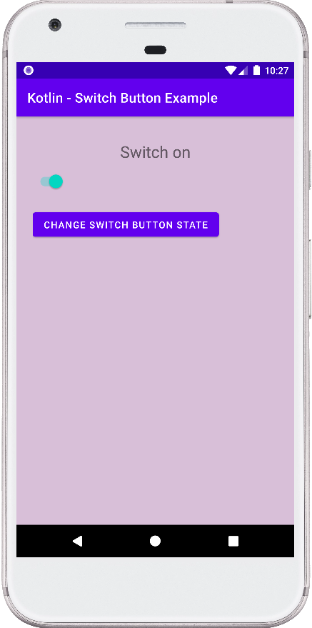
This android kotlin tutorial code is written in an android studio IDE. Copy the code and paste it into your android studio IDE and run it on an emulator to see how we use a Switch/SwicthCompat button in an android application.
And how we implemented the Switch button checked change listener and how we get the Switch button checked status programmatically in an application. We displayed screenshots of the emulator screen, which also help you to understand the code without running it on an android device or emulator.
MainActivity.kt
package com.cfsuman.kotlintutorials

import android.content.Context
import android.graphics.Color
import android.os.Bundle
import android.widget.*
import androidx.appcompat.app.AppCompatActivity
import androidx.appcompat.widget.SwitchCompat
import androidx.constraintlayout.widget.ConstraintLayout


class MainActivity : AppCompatActivity() {
    private lateinit var context: Context

    override fun onCreate(savedInstanceState: Bundle?) {
        super.onCreate(savedInstanceState)
        setContentView(R.layout.activity_main)

        // Get the context
        context = this;

        // Get the widgets from XML layout
        val rootLayout = findViewById<ConstraintLayout>(R.id.rootLayout);
        val button = findViewById<Button>(R.id.button);
        val textView = findViewById<TextView>(R.id.textView);
        val switchButton = findViewById<SwitchCompat>(R.id.switchButton);

        // Set the layout initial background color
        rootLayout.setBackgroundColor(
            Color.parseColor(
                if (switchButton.isChecked)"#D8BFD8" else "#F8F8F8")
        )

        // Set the initial status on text view
        textView.text = if (switchButton.isChecked )
            "Switch on" else "Switch off"

        // Set an checked change listener for switch button
        switchButton.setOnCheckedChangeListener { buttonView, isChecked ->
            if (isChecked) {
                // The switch is enabled/checked
                textView.text = "Switch on"
                // Change the app background color
                rootLayout.setBackgroundColor(
                    Color.parseColor("#D8BFD8")
                )
            } else {
                // The switch is disabled
                textView.text = "Switch off"
                // Set the app background color
                rootLayout.setBackgroundColor(
                    Color.parseColor("#F8F8F8")
                )
            }
        }

        // Set a click listener for root layout object
        rootLayout.setOnClickListener{
            // Get the switch button state programmatically
            if(switchButton.isChecked){
                // If switch button is checked/on then
                // The switch is enabled/checked
                textView.text = "Switch is on"
            }else{
                // The switch is unchecked
                textView.text = "Switch is off"
            }
        }

        // Set a click listener for the button widget
        button.setOnClickListener{
            // Change the switch button checked state on button click
            switchButton.isChecked = !switchButton.isChecked
        }
    }
}
activity_main.xml
<?xml version="1.0" encoding="utf-8"?>
<androidx.constraintlayout.widget.ConstraintLayout
    xmlns:android="http://schemas.android.com/apk/res/android"
    xmlns:app="http://schemas.android.com/apk/res-auto"
    xmlns:tools="http://schemas.android.com/tools"
    android:layout_width="match_parent"
    android:layout_height="match_parent"
    android:id="@+id/rootLayout"
    android:padding="24dp">

    <TextView
        android:id="@+id/textView"
        android:layout_width="wrap_content"
        android:layout_height="wrap_content"
        android:fontFamily="sans-serif"
        android:textSize="24sp"
        android:padding="12dp"
        app:layout_constraintEnd_toEndOf="parent"
        app:layout_constraintStart_toStartOf="parent"
        app:layout_constraintTop_toTopOf="parent" />

    <androidx.appcompat.widget.SwitchCompat
        android:id="@+id/switchButton"
        android:layout_width="wrap_content"
        android:layout_height="wrap_content"
        android:layout_marginTop="48dp"
        app:layout_constraintStart_toStartOf="parent"
        app:layout_constraintTop_toTopOf="parent" />

    <Button
        android:id="@+id/button"
        android:layout_width="wrap_content"
        android:layout_height="wrap_content"
        android:layout_marginTop="16dp"
        android:text="Change Switch Button State"
        app:layout_constraintStart_toStartOf="parent"
        app:layout_constraintTop_toBottomOf="@+id/switchButton" />

</androidx.constraintlayout.widget.ConstraintLayout>