Kotlin Spinner
The Spinner is a list widget of native android SDK. The Spinner widget display one child at a time, which means the Spinner list widget display one list item at a time. Only the selected item is visible and all other items are invisible. Android app users can expand the Spinner to see all available items and can select one among them.
The following android application development tutorial will demonstrate how we can create and use a Spinner widget in an android app. This tutorial code is written in Kotlin programming language.
Android developers can add a Spinner widget to the XML layout file using the Spinner tag. Developers can populate a Spinner widget with items using an ArrayAdapter.
The ArrayAdapter provides views for an AdapterView. It returns a view for each object in a collection of data objects. ArrayAdapter can be used with a list-based user interface such as a ListView or Spinner.
In this kotlin tutorial, we create an array of String values. Then we build an instance of the ArrayAdapter using this String array. Next, We define the ArrayAdapter drop-down view resource. Finally, we bind the ArrayAdapter with the Spinner widget. So the Spinner displays the items which came from the String array.
The AdapterView.OnItemSelectedListener interface callback invokes when an item in the Spinner widget has been selected. So we can get Spinner selected item details when users select an item from the Spinner widget or they change their selection. This interface gives us selected item details on the Spinner selection change event.
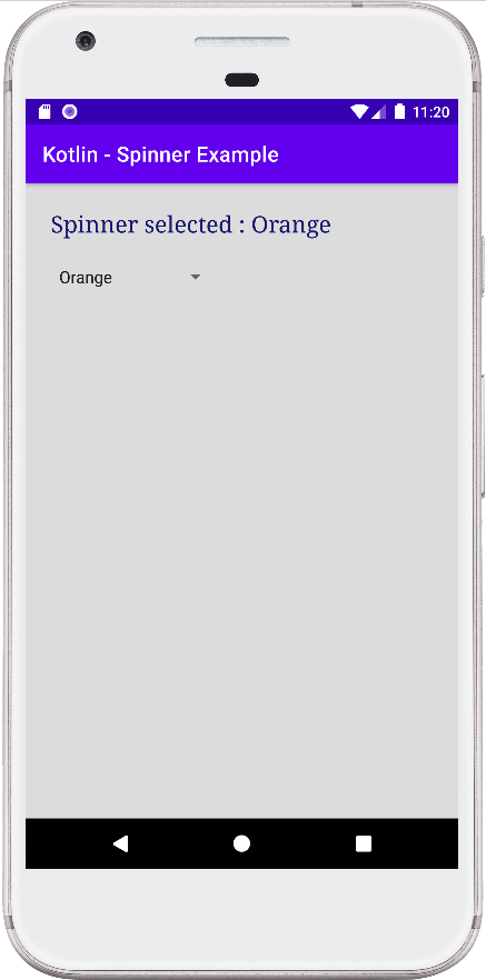
This android kotlin tutorial code is written in an android studio IDE. Copy the code and paste it into your android studio IDE and run it on an emulator to see how we create a Spinner widget and populate it with items using ArrayAdapter in an android application.
And how we implemented the Spinner on item selected listener in this android application. We displayed screenshots of the emulator screen, which also help you to understand the code without running it on an android device or emulator.
MainActivity.kt
package com.cfsuman.kotlintutorials

import android.os.Bundle
import android.view.View
import android.widget.*
import androidx.appcompat.app.AppCompatActivity


class MainActivity : AppCompatActivity() {
    override fun onCreate(savedInstanceState: Bundle?) {
        super.onCreate(savedInstanceState)
        setContentView(R.layout.activity_main)

        // Get the widgets reference from XML layout
        val textView = findViewById<TextView>(R.id.textView)
        val spinner = findViewById<Spinner>(R.id.spinner)

        // Initializing a String Array
        val colors = arrayOf(
            "Antique white", "Blue",
            "Yellow", "Crimson",
            "Orange", "Black coral"
        )

        // Initializing an ArrayAdapter
        val adapter = ArrayAdapter(
            this, // Context
            android.R.layout.simple_spinner_item, // Layout
            colors // Array
        )

        // Set the drop down view resource
        adapter.setDropDownViewResource(
            android.R.layout.simple_dropdown_item_1line
        )

        // Finally, data bind the spinner object with adapter
        spinner.adapter = adapter;

        // Set an on item selected listener for spinner object
        spinner.onItemSelectedListener = object: AdapterView
        .OnItemSelectedListener{
            override fun onItemSelected(
                parent:AdapterView<*>,
                view: View, position: Int, id: Long){
                // Display the selected item text on text view
                textView.text = "Spinner selected : " +
                        "${parent.getItemAtPosition(position)}"
            }

            override fun onNothingSelected(parent: AdapterView<*>){
                // Another interface callback
            }
        }
    }
}
activity_main.xml
<?xml version="1.0" encoding="utf-8"?>
<androidx.constraintlayout.widget.ConstraintLayout
    xmlns:android="http://schemas.android.com/apk/res/android"
    xmlns:app="http://schemas.android.com/apk/res-auto"
    android:id="@+id/rootLayout"
    android:layout_width="match_parent"
    android:layout_height="match_parent"
    android:padding="24dp"
    android:background="#DCDCDD">

    <TextView
        android:id="@+id/textView"
        android:layout_width="0dp"
        android:layout_height="wrap_content"
        android:textColor="#191970"
        android:textSize="22sp"
        android:fontFamily="serif"
        app:layout_constraintEnd_toEndOf="parent"
        app:layout_constraintStart_toStartOf="parent"
        app:layout_constraintTop_toTopOf="parent" />

    <Spinner
        android:id="@+id/spinner"
        android:layout_width="wrap_content"
        android:layout_height="wrap_content"
        android:layout_marginTop="24dp"
        app:layout_constraintStart_toStartOf="parent"
        app:layout_constraintTop_toBottomOf="@id/textView" />

</androidx.constraintlayout.widget.ConstraintLayout>