Kotlin SeekBar
The SeekBar is a native android SDK widget. The SeekBar widget is an extension of android SDKs ProgressBar widget. SeekBar adds a druggable thumb to the ProgressBar to build itself.
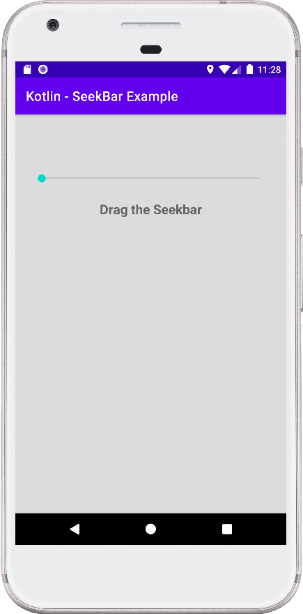
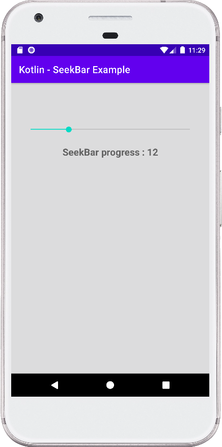
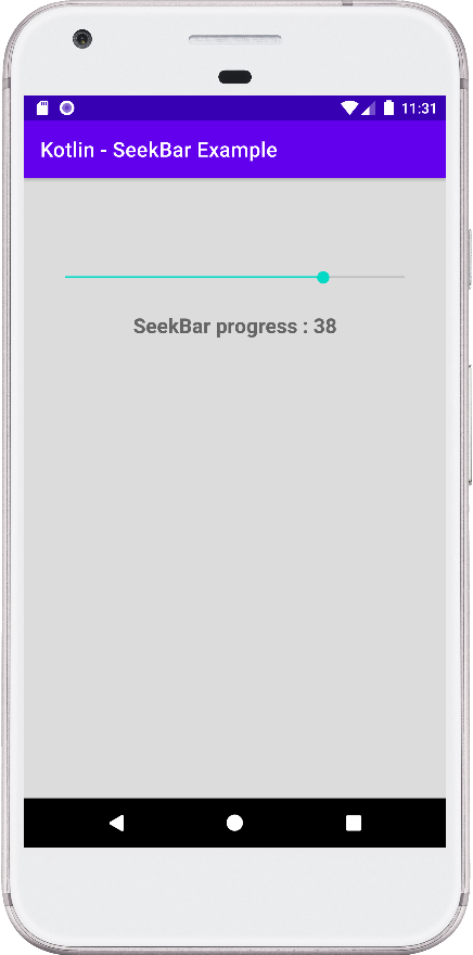
Android app users can touch the SeekBar thumb and drag left or right to set the current progress level. They also can tap on SeekBar to select the specified position value.
The following android kotlin tutorial will demonstrate how we can add a SeekBar widget to our app. And how we can allow users to select a value using the SeekBar component.
The SeekBar.onSeekBarChangeListener is an interface for SeekBar widget. This callback notifies clients when the progress level has been changed. So, we can handle the SeekBar progress change events using this interface. We can do some tasks when the app user changes the SeekBar value.
The SeekBar progress level is in the range of min and max. Android developers can set the SeekBar minimum and maximum values. Android SDK allows developers to set the min and max values both in code and XML layout. The progress range default minimum value is 0 and the maximum is 100.
The SeekBar.onSeekBarChangeListener interface onProgressChanged() notifies that the SeekBar progress level has changed. It allows us to show the current progress value on the app screen. And do the related task.
The onStartTrackingTouch() method notifies that the android app user has started the SeekBar touch gesture. The onStopTrackingTouch() method notifies that the app user finished the SeekBar touch gesture.
This android kotlin tutorial code is written in an android studio IDE. Copy the code into your android studio IDE and run it on an emulator to test how we implemented a SeekBar widget in an android application. We displayed screenshots of the emulator screen, which also help you to understand the code without running it on an android device or emulator.
MainActivity.kt
package com.cfsuman.kotlintutorials

import android.os.Bundle
import androidx.appcompat.app.AppCompatActivity
import android.widget.*


class MainActivity : AppCompatActivity() {
    private lateinit var context:MainActivity

    override fun onCreate(savedInstanceState: Bundle?) {
        super.onCreate(savedInstanceState)
        setContentView(R.layout.activity_main)

        // Get the context
        context = this;

        // Get the widgets reference from XML layout
        val seekBar = findViewById<SeekBar>(R.id.seekBar)
        val textView = findViewById<TextView>(R.id.textView)

        // Set a SeekBar change listener
        seekBar.setOnSeekBarChangeListener(
            object : SeekBar.OnSeekBarChangeListener {

            override fun onProgressChanged(
                seekBar: SeekBar, i: Int, b: Boolean) {
                // Display the current progress of SeekBar
                textView.text = "SeekBar progress : $i"
            }

            override fun onStartTrackingTouch(seekBar: SeekBar) {
                // Do something
                showToast("Tracking started")
            }

            override fun onStopTrackingTouch(seekBar: SeekBar) {
                // Do something
                showToast("Tracking stopped.")
            }
        })
    }


    // Function to show  toast message
    private fun showToast(message:String){
        Toast.makeText(context,message,Toast.LENGTH_SHORT).show()
    }
}
activity_main.xml
<?xml version="1.0" encoding="utf-8"?>
<androidx.constraintlayout.widget.ConstraintLayout
    xmlns:android="http://schemas.android.com/apk/res/android"
    xmlns:app="http://schemas.android.com/apk/res-auto"
    xmlns:tools="http://schemas.android.com/tools"
    android:id="@+id/rootLayout"
    android:layout_width="match_parent"
    android:layout_height="match_parent"
    android:padding="24dp"
    android:background="#DCDCDD">

    <SeekBar
        android:id="@+id/seekBar"
        android:layout_width="0dp"
        android:layout_height="wrap_content"
        android:max="50"
        android:layout_marginTop="64dp"
        app:layout_constraintTop_toTopOf="parent"
        app:layout_constraintStart_toStartOf="parent"
        app:layout_constraintEnd_toEndOf="parent"/>

    <TextView
        android:id="@+id/textView"
        android:layout_width="wrap_content"
        android:layout_height="wrap_content"
        app:layout_constraintTop_toBottomOf="@id/seekBar"
        app:layout_constraintStart_toStartOf="parent"
        app:layout_constraintEnd_toEndOf="parent"
        android:layout_marginTop="24dp"
        android:text="Drag the Seekbar"
        android:textSize="20sp"
        android:textStyle="bold"/>

</androidx.constraintlayout.widget.ConstraintLayout>