Kotlin ListView
The ListView is a list widget of android native SDK. The ListView widget displays a vertically scrollable collection of views. Each view represents a list item. And each view is positioned immediately below the previous view. The listVIew is used to display a simple list of items.
The following android tutorial will demonstrate to us how we can use a ListView widget in an android application using the Kotlin programming language. Here we will display a simple list of items inside the ListView widget and also implement the item click handler.
Android developers can easily add a ListView widget using the ListView tag to an XML layout file. The ListView tag has several useful attributes to tweak a ListView configuration such as divider, dividrHeight, entries, etc.
The ListView ‘entries’ attribute reference an array resource that will populate the ListView with items. The ‘divider’ attribute value may be a drawable or color to draw between list items. The ‘dividerHeight’ attribute defines the divider height of ListView.
In this android tutorial, we populated a ListView with items using kotlin code. To do that, at first we create a simple list of string values where each item holds a color name. Next, we build an ArrayAdapter instance with this newly created list. Now we bind this ArrayAdapter with ListView. This ArrayAdapter populates the ListView with items that came from the list of string values.
At last, we set a click listener for the ListView items so that when a user clicks an item from the ListView then we can determine the clicked item.
The AdapterView.onItemClickListener interface callback is invoked when an item in this AdapterView has been clicked. So, using this interface we can get the ListView clicked item’s position and text. Finally, we can display the users clicked item position and text to the app interface.
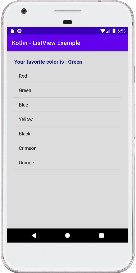
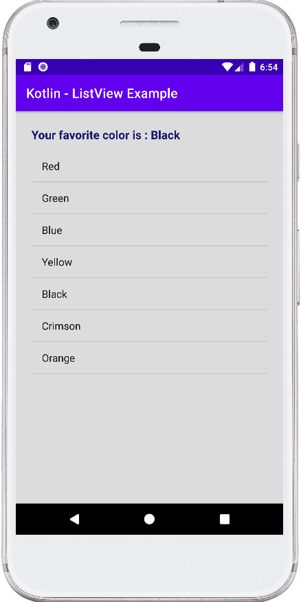
This android kotlin tutorial code is written in an android studio IDE. Copy the code into your android studio IDE and run it on an emulator to test how we populate a ListView widget with items in an android application. And how we implemented the ListView item click listener. We displayed screenshots of the emulator screen, which also help you to understand the code without running it on an android device or emulator.
MainActivity.kt
package com.cfsuman.kotlintutorials

import android.os.Bundle
import android.widget.*
import androidx.appcompat.app.AppCompatActivity


class MainActivity : AppCompatActivity() {
    override fun onCreate(savedInstanceState: Bundle?) {
        super.onCreate(savedInstanceState)
        setContentView(R.layout.activity_main)

        // Get the widgets reference from XML layout
        val textView = findViewById<TextView>(R.id.textView)
        val listView = findViewById<ListView>(R.id.listView)

        // Initializing a list of string
        val colors = listOf(
            "Red", "Green", "Blue",
            "Yellow", "Black", "Crimson",
            "Orange"
        )

        // Create an ArrayAdapter from List
        val adapter = ArrayAdapter<String>(
            this, // Context
            android.R.layout.simple_list_item_1, // Layout
            colors // List
        )

        // Finally, data bind the list view object with adapter
        listView.adapter = adapter;

        // Set an item click listener for ListView
        listView.onItemClickListener = AdapterView
            .OnItemClickListener { parent, view, position, id ->
            // Get the selected item text from ListView
            val selectedItem = parent.getItemAtPosition(position) as String

            // Display the selected item text on TextView
            textView.text = "Your favorite color is : $selectedItem"
        }
    }
}
activity_main.xml
<?xml version="1.0" encoding="utf-8"?>
<androidx.constraintlayout.widget.ConstraintLayout
    xmlns:android="http://schemas.android.com/apk/res/android"
    xmlns:app="http://schemas.android.com/apk/res-auto"
    xmlns:tools="http://schemas.android.com/tools"
    android:id="@+id/rootLayout"
    android:layout_width="match_parent"
    android:layout_height="match_parent"
    android:padding="24dp"
    android:background="#DCDCDD">

    <TextView
        android:id="@+id/textView"
        android:layout_width="match_parent"
        android:layout_height="wrap_content"
        android:text="Select your favorite color"
        android:textColor="#191970"
        android:textSize="18sp"
        android:textStyle="bold"
        app:layout_constraintEnd_toEndOf="parent"
        app:layout_constraintStart_toStartOf="parent"
        app:layout_constraintTop_toTopOf="parent" />

    <ListView
        android:id="@+id/listView"
        android:layout_width="0dp"
        android:layout_height="0dp"
        android:layout_marginTop="12dp"
        app:layout_constraintBottom_toBottomOf="parent"
        app:layout_constraintEnd_toEndOf="parent"
        app:layout_constraintStart_toStartOf="parent"
        app:layout_constraintTop_toBottomOf="@+id/textView" />

</androidx.constraintlayout.widget.ConstraintLayout>