Android Kotlin - Implementing Button Click Listeners
This code demonstrates various ways to implement click listeners for buttons in an Android application written with Kotlin. The code includes a MainActivity class and the corresponding layout file activity_main.xml.
MainActivity.kt Breakdown:
- Imports: The code starts by importing necessary libraries like
View,TextView,Button, andAppCompatActivity. - Activity Class: The
MainActivityclass inherits fromAppCompatActivity, which is the base class for most activities in Android. - onCreate Method: This method is called when the activity is first created. It performs the following:
- Sets the layout using
setContentView(R.layout.activity_main). - Finds the UI elements (TextView and Buttons) using
findViewById. - Initializes a counter variable to keep track of button clicks.
- Sets the layout using
- Setting Click Listeners: The code demonstrates four ways to set click listeners for different buttons:
- Using a lambda expression: This is the most concise approach. When the button is clicked, the counter is incremented, the TextView text is updated to display the click count, and no further action is taken for this specific button.
- Using an anonymous class: This is a more verbose approach that achieves the same result as the lambda expression. It defines an anonymous class that implements the
View.OnClickListenerinterface and overrides theonClickmethod. - Using a lambda expression with receiver: Similar to the first approach, but it uses the
itkeyword to directly access the clicked button (useful when performing actions specific to that button). - Using a lambda expression with explicit receiver: This is similar to the previous approach, but it explicitly uses the
itparameter to access the clicked button.
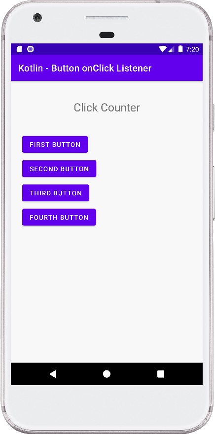
activity_main.xml Breakdown:
This file defines the layout of the activity using ConstraintLayout. It includes:
- A TextView to display the click counter.
- Four buttons with unique IDs.
MainActivity.kt
package com.cfsuman.kotlintutorials

import android.graphics.Color
import android.os.Bundle
import android.view.View
import android.widget.*
import androidx.appcompat.app.AppCompatActivity


class MainActivity : AppCompatActivity() {
    override fun onCreate(savedInstanceState: Bundle?) {
        super.onCreate(savedInstanceState)
        setContentView(R.layout.activity_main)

        // Get the widgets from XML layout
        val textView = findViewById<TextView>(R.id.text_view)
        val button = findViewById<Button>(R.id.button);
        val button2 = findViewById<Button>(R.id.button2);
        val button3 = findViewById<Button>(R.id.button3);
        val button4 = findViewById<Button>(R.id.button4);

        // Counter to count button click
        var counter: Int = 0;

        // Set a click listener for button widget
        button.setOnClickListener{
            counter++
            textView.text = "Click counter : $counter"
        }

        // Another way to set button click listener
        button2.setOnClickListener(object: View.OnClickListener {
            override fun onClick(v: View?) {
                counter++
                textView.text = "Click counter : $counter"
                v?.setBackgroundColor(
                    Color.parseColor("#7C0A02")
                )
            }
        })

        // Another way to set button click listener
        button3.setOnClickListener({ v->
            counter++
            textView.text = "Click counter : $counter"
            v.setBackgroundColor(
                Color.parseColor("#2E5894")
            )
        })

        // Another way to set button click listener
        button4.setOnClickListener{
            counter++;
            textView.text = "Click counter : $counter"
            it.setBackgroundColor(
                Color.parseColor("#4B6F44")
            )
        }
    }
}
activity_main.xml
<?xml version="1.0" encoding="utf-8"?>
<androidx.constraintlayout.widget.ConstraintLayout
    xmlns:android="http://schemas.android.com/apk/res/android"
    xmlns:app="http://schemas.android.com/apk/res-auto"
    android:layout_width="match_parent"
    android:layout_height="match_parent"
    android:id="@+id/rootLayout"
    android:padding="24dp"
    android:background="#F8F8F8">

    <TextView
        android:id="@+id/text_view"
        android:layout_width="wrap_content"
        android:layout_height="wrap_content"
        android:fontFamily="sans-serif"
        android:padding="16dp"
        android:text="Click Counter"
        android:textSize="24sp"
        app:layout_constraintEnd_toEndOf="parent"
        app:layout_constraintStart_toStartOf="parent"
        app:layout_constraintTop_toTopOf="parent" />

    <Button
        android:id="@+id/button"
        android:layout_width="wrap_content"
        android:layout_height="wrap_content"
        android:layout_marginTop="24dp"
        android:text="First Button"
        app:layout_constraintStart_toStartOf="parent"
        app:layout_constraintTop_toBottomOf="@+id/text_view" />

    <Button
        android:id="@+id/button2"
        android:layout_width="wrap_content"
        android:layout_height="wrap_content"
        android:layout_marginTop="4dp"
        android:text="Second Button"
        app:layout_constraintStart_toStartOf="@+id/button"
        app:layout_constraintTop_toBottomOf="@+id/button" />

    <Button
        android:id="@+id/button3"
        android:layout_width="wrap_content"
        android:layout_height="wrap_content"
        android:layout_marginTop="4dp"
        android:text="Third Button"
        app:layout_constraintStart_toStartOf="@+id/button2"
        app:layout_constraintTop_toBottomOf="@+id/button2" />

    <Button
        android:id="@+id/button4"
        android:layout_width="wrap_content"
        android:layout_height="wrap_content"
        android:layout_marginTop="4dp"
        android:text="Fourth Button"
        app:layout_constraintStart_toStartOf="@+id/button3"
        app:layout_constraintTop_toBottomOf="@+id/button3" />

</androidx.constraintlayout.widget.ConstraintLayout>