Compose TopAppBar
The TopAppBar is a popular widget of an android jetpack compose application. The most android application contains a TopAppBar component. The TopAppBar widget displays information for the current screen and it also displays actions relating to the screen subject.
The TopAppBar widget has several slots for inside components. There is a slot for showing a title on the top app bar and a slot for the navigation icon. Another predefined slot for showing some actions. Navigation icon used to open and close drawer navigation. The ‘actions’ slot has a Row scope, so action IconButtons inside the slot are displayed horizontally side by side.
TopAppBar ‘title’ parameter allows us to pass a Text object to show a title on it. And the ‘navigationIcon’ parameter is used to display a navigation icon typically an IconButton on a TopAppBar. The ‘actions’ parameter is for passing some action IconButtons to do some task for screen content.
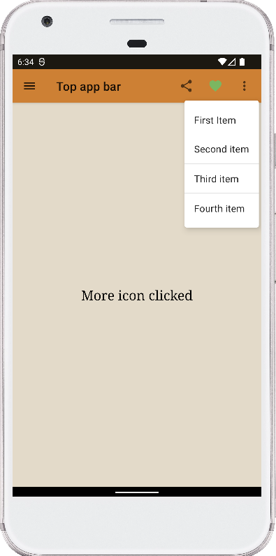
Android jetpack developers can display a DropdownMenu at the end of TopAppBar using its ‘actions’ slot. They can expand a DropdownMenu by clicking a MoreVert IconButton. TopAppBar ‘backgroundColor’ help us to set a background color for the top app bar. The ‘elevation’ can set or change elevation for the TopAppBar. The TopAppBar ‘contentColor’ parameter value changes the default color for its content such as the title text color. After all modifier object’s various elements help us to modify the TopAppBar properties.
The following kotlin code snippets demonstrate to us how can we use a TopAppBar in our android jetpack compose application. It also shows, how we can show a title on it and place the navigation icon button at the start. The way to display some actions icon buttons on the top app bar. And how we can display a DropdownMenu widget at the end of the top app bar.
The TopAppBar widget has several slots for inside components. There is a slot for showing a title on the top app bar and a slot for the navigation icon. Another predefined slot for showing some actions. Navigation icon used to open and close drawer navigation. The ‘actions’ slot has a Row scope, so action IconButtons inside the slot are displayed horizontally side by side.
TopAppBar ‘title’ parameter allows us to pass a Text object to show a title on it. And the ‘navigationIcon’ parameter is used to display a navigation icon typically an IconButton on a TopAppBar. The ‘actions’ parameter is for passing some action IconButtons to do some task for screen content.
Android jetpack developers can display a DropdownMenu at the end of TopAppBar using its ‘actions’ slot. They can expand a DropdownMenu by clicking a MoreVert IconButton. TopAppBar ‘backgroundColor’ help us to set a background color for the top app bar. The ‘elevation’ can set or change elevation for the TopAppBar. The TopAppBar ‘contentColor’ parameter value changes the default color for its content such as the title text color. After all modifier object’s various elements help us to modify the TopAppBar properties.
The following kotlin code snippets demonstrate to us how can we use a TopAppBar in our android jetpack compose application. It also shows, how we can show a title on it and place the navigation icon button at the start. The way to display some actions icon buttons on the top app bar. And how we can display a DropdownMenu widget at the end of the top app bar.
MainActivity.kt
package com.cfsuman.jetpackcompose

import android.annotation.SuppressLint
import androidx.appcompat.app.AppCompatActivity
import android.os.Bundle
import androidx.activity.compose.setContent
import androidx.compose.animation.animateColorAsState
import androidx.compose.foundation.background
import androidx.compose.foundation.layout.*
import androidx.compose.material.*
import androidx.compose.material.icons.Icons
import androidx.compose.material.icons.filled.*
import androidx.compose.runtime.Composable
import androidx.compose.runtime.getValue
import androidx.compose.runtime.mutableStateOf
import androidx.compose.runtime.remember
import androidx.compose.ui.Alignment
import androidx.compose.ui.Modifier
import androidx.compose.ui.graphics.Color
import androidx.compose.ui.text.font.FontFamily
import androidx.compose.ui.tooling.preview.Preview
import androidx.compose.ui.unit.dp
import androidx.compose.ui.unit.sp

class MainActivity : AppCompatActivity() {
    override fun onCreate(savedInstanceState: Bundle?) {
        super.onCreate(savedInstanceState)

        setContent {
            MainContent()
        }
    }


    @SuppressLint("UnusedMaterialScaffoldPaddingParameter")
    @Composable
    fun MainContent(){
        val result = remember { mutableStateOf("") }
        val expanded = remember { mutableStateOf(false)}
        val liked = remember { mutableStateOf(true) }

        Scaffold(
            topBar = {
                TopAppBar(
                    title = {
                        Text(text = "Top app bar")
                    },

                    navigationIcon = {
                        // show drawer icon
                        IconButton(
                            onClick = {
                                result.value = "Drawer icon clicked"
                            }
                        ) {
                            Icon(Icons.Filled.Menu, contentDescription = "")
                        }
                    },

                    actions = {
                        IconButton(onClick = {
                            result.value = " Share icon clicked"
                        }) {
                            Icon(Icons.Filled.Share, contentDescription = "")
                        }

                        IconToggleButton(
                            checked = liked.value,
                            onCheckedChange = {
                                liked.value = it
                                if (liked.value){
                                    result.value = "Liked"
                                }else{
                                    result.value = "Unliked"
                                }
                            }
                        ) {
                            val tint by animateColorAsState(
                                if (liked.value) Color(0xFF7BB661)
                                else Color.LightGray
                            )
                            Icon(
                                Icons.Filled.Favorite,
                                contentDescription = "Localized description",
                                tint = tint
                            )
                        }

                        Box(
                            Modifier
                                .wrapContentSize(Alignment.TopEnd)
                        ) {
                            IconButton(onClick = {
                                expanded.value = true
                                result.value = "More icon clicked"
                            }) {
                                Icon(
                                    Icons.Filled.MoreVert,
                                    contentDescription
                                    = "Localized description"
                                )
                            }

                            DropdownMenu(
                                expanded = expanded.value,
                                onDismissRequest = { expanded.value = false },
                            ) {
                                DropdownMenuItem(onClick = {
                                    expanded.value = false
                                    result.value = "First item clicked"
                                }) {
                                    Text("First Item")
                                }

                                DropdownMenuItem(onClick = {
                                    expanded.value = false
                                    result.value = "Second item clicked"
                                }) {
                                    Text("Second item")
                                }

                                Divider()

                                DropdownMenuItem(onClick = {
                                    expanded.value = false
                                    result.value = "Third item clicked"
                                }) {
                                    Text("Third item")
                                }

                                Divider()

                                DropdownMenuItem(onClick = {
                                    expanded.value = false
                                    result.value = "Fourth item clicked"
                                }) {
                                    Text("Fourth item")
                                }
                            }
                        }
                    },

                    backgroundColor = Color(0xFDCD7F32),
                    elevation = AppBarDefaults.TopAppBarElevation
                )
            },

            content = {
                Box(
                    Modifier
                        .background(Color(0XFFE3DAC9))
                        .padding(16.dp)
                        .fillMaxSize(),
                ) {
                    Text(
                        text = result.value,
                        fontSize = 22.sp,
                        fontFamily = FontFamily.Serif,
                        modifier = Modifier.align(Alignment.Center)
                    )
                }
            }
        )
    }


    @Preview
    @Composable
    fun ComposablePreview(){
        //MainContent()
    }
}

- jetpack compose - How to use Slider
- jetpack compose - How to use Switch
- jetpack compose - How to use Snackbar
- jetpack compose - Indeterminate LinearProgressIndicator
- jetpack compose - Indeterminate CircularProgressIndicator
- jetpack compose - LinearProgressIndicator example
- jetpack compose - CircularProgressIndicator example
- jetpack compose - How to use BottomAppBar
- jetpack compose - BottomAppBar with FAB example
- jetpack compose - TextField clear focus
- jetpack compose - TextField focus change listener
- jetpack compose - Box rounded corners
- jetpack compose - Box center
- jetpack compose - Row spacing
- jetpack compose - Row scrolling