Flutter - DropdownButton Height
The DropdownButton class represents a material design button for selecting
from a list of items. The DropdownButton allows the user to select from a
number of items. The DropdownButton shows the currently selected item as well
as an arrow that opens a menu for selecting another item. The DropdownButton’s
all entries in a menu must represent values with consistent types. Commonly,
the flutter developers use an enum. The DropdownButton class’s onChanged
callback should update a state variable that defines the dropdown's value.
When the flutter developers set the onChanged callback to null or the list of
items to null then the dropdown button will be disabled.
The following flutter app development tutorial will demonstrate how to set or change the height of a DropdownButton widget. But there is no built-in property or method in DropdownButton class to set or change its height. There is a simple trick, flutter developers can wrap a DropdownButton widget with another widget and set the parent widget height to define the child DopdownButton height.
Flutter developers can wrap the DropdownButton widget with a SizedBox or a Container to specify the child DropdownButton widget’s width and height. The SizedBox class represents a box with a specified size. The SizedBox widget forces its child widget to have a specific width and/or height. If either the width or height is null, the SizedBox widget will try to size itself to match the child's size in that dimension. So we can set the SizedBox height to change the DropdownButton height. And we don’t set the width of SizedBox so that the DropdownButton width remains unchanged.
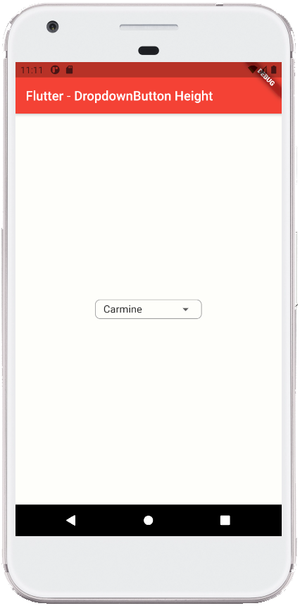
Here we wrapped the DropdownButton widget with a Container widget to specify the child DropdownButton widget’s height. When we set the Container widget’s height then it will also define the DropdownButton widget’s height.
The flutter Container class represents a Container widget which is a convenience widget that combines common painting, positioning, and sizing widgets. The Container class’s height property value is a double instance that specifies the height of the Container widget itself and its child widget.
In this example code, we also add a border to the Container widget so the border seems to draw around the DropdownButton widget. This border helps us to clearly visible the DropdownButton size (height and width). So when we set the DropdownButton new height then it will help us to compare it with the original size of the DropdownButton widget.
So finally, the flutter app developers can set or change the height of a DropdownButton widget by wrapping it with a Container widget or a SizedBox widget and setting its height property value to specify the DropdownButton widget height.
The following flutter app development tutorial will demonstrate how to set or change the height of a DropdownButton widget. But there is no built-in property or method in DropdownButton class to set or change its height. There is a simple trick, flutter developers can wrap a DropdownButton widget with another widget and set the parent widget height to define the child DopdownButton height.
Flutter developers can wrap the DropdownButton widget with a SizedBox or a Container to specify the child DropdownButton widget’s width and height. The SizedBox class represents a box with a specified size. The SizedBox widget forces its child widget to have a specific width and/or height. If either the width or height is null, the SizedBox widget will try to size itself to match the child's size in that dimension. So we can set the SizedBox height to change the DropdownButton height. And we don’t set the width of SizedBox so that the DropdownButton width remains unchanged.
Here we wrapped the DropdownButton widget with a Container widget to specify the child DropdownButton widget’s height. When we set the Container widget’s height then it will also define the DropdownButton widget’s height.
The flutter Container class represents a Container widget which is a convenience widget that combines common painting, positioning, and sizing widgets. The Container class’s height property value is a double instance that specifies the height of the Container widget itself and its child widget.
In this example code, we also add a border to the Container widget so the border seems to draw around the DropdownButton widget. This border helps us to clearly visible the DropdownButton size (height and width). So when we set the DropdownButton new height then it will help us to compare it with the original size of the DropdownButton widget.
So finally, the flutter app developers can set or change the height of a DropdownButton widget by wrapping it with a Container widget or a SizedBox widget and setting its height property value to specify the DropdownButton widget height.
main.dart
import 'package:flutter/material.dart';
void main() => runApp(const FlutterExample());
class FlutterExample extends StatelessWidget {
const FlutterExample({Key? key}) : super(key: key);
@override
Widget build(BuildContext context) {
return MaterialApp(
title: 'Flutter Example',
theme: ThemeData(primarySwatch: Colors.red),
home: const StateExample()
);
}
}
class StateExample extends StatefulWidget {
const StateExample({Key? key}) : super(key: key);
@override
_StateExampleState createState() => _StateExampleState();
}
class _StateExampleState extends State<StateExample>{
String dropdownValue = "Carmine";
@override
Widget build(BuildContext context) {
return Scaffold(
backgroundColor: const Color(0xFFFEFEFA),
appBar: AppBar(
title: const Text("Flutter - DropdownButton Height")
),
body: bodyContent(),
);
}
bodyContent() {
return Center(
child: Container(
height: 30,
padding: const EdgeInsets.symmetric(horizontal: 12.0),
decoration: BoxDecoration(
border: Border.all(
color: Colors.grey,
width: 1,
style: BorderStyle.solid
),
borderRadius: BorderRadius.circular(8)
),
child: DropdownButton<String>(
value: dropdownValue,
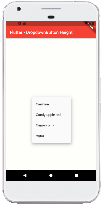
items: <String>[
'Carmine','Candy apple red','Cameo pink','Aqua'
]
.map<DropdownMenuItem<String>>((String value){
return DropdownMenuItem<String>(
value: value,
child:Text(value)
);
}).toList(),
onChanged: (String? newValue){
// do something here
setState(() {
dropdownValue = newValue??dropdownValue;
});
},
underline: DropdownButtonHideUnderline(child: Container())
)
)
);
}
}