UWP - ScrollViewer Scroll To Bottom
The ScrollViewer class represents a scrollable area that can contain
other visible elements. The ScrollViewer control enables content to be
displayed in a smaller area than its actual size. The ScrollViewer displays
scrollbars when its content is not entirely visible.
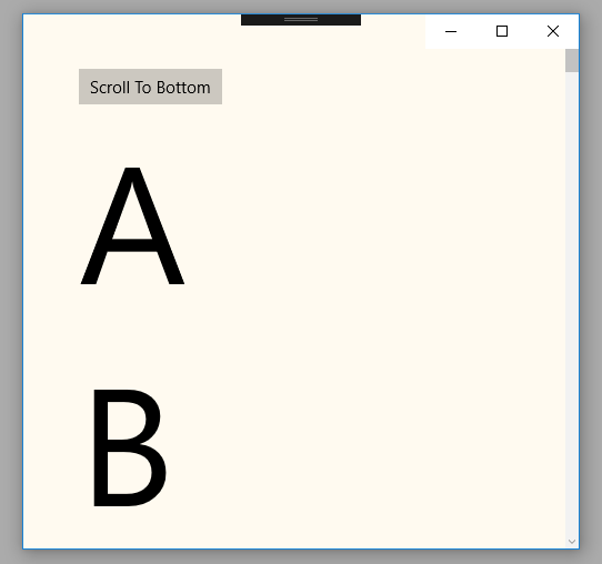
In the following UWP tutorial code, we put multiple TextBlock in a StackPanel control whose orientation is vertical. Then we wrap the StackPanel control with a ScrollViewer, so the users can scroll through the bottom of StackPanel content. The UWP developers use ScrollViewer container control to lets the user pan and zoom its content.
But in this UWP tutorial code, we will demonstrate how we can scroll to the bottom of ScrollViewer content programmatically. Here we use a Button control and its click event to programmatically scroll to the bottom of StackPanel contents. In this tutorial, we also set the ScrollViewer control’s HorizontalScrollBarVisibility and VerticalScrollBarVisibility properties value to Auto which means a ScrollBar appears only when the viewport cannot display all of the content.
The ScrollViewer class’s ChangeView(horizontalOffset, verticalOffset, zoomFactor) method overload causes the ScrollViewer to load a new view into the viewport using the specified offsets and zoom factor.
The horizontalOffset argument value data type is Double this value is between 0 and ScrollableWidth specifies the distance the content should be scrolled horizontally. The verticalOffset argument value data type is also a Double which is a value between 0 and ScrollableHeight that specifies the distance the content should be scrolled vertically.
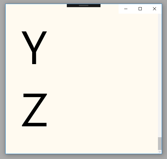
And lastly, the zoomFactor argument value is a Single which is a value between MinZoomFactor and MaxZoomFactor that specifies the required target ZoomFactor. Using this ChangeView() method we can programmatically scroll to the bottom of this container content. Here we set the verticalOffset parameter value to double.MaxValue which indicates the bottom of the content.
In the following UWP tutorial code, we put multiple TextBlock in a StackPanel control whose orientation is vertical. Then we wrap the StackPanel control with a ScrollViewer, so the users can scroll through the bottom of StackPanel content. The UWP developers use ScrollViewer container control to lets the user pan and zoom its content.
But in this UWP tutorial code, we will demonstrate how we can scroll to the bottom of ScrollViewer content programmatically. Here we use a Button control and its click event to programmatically scroll to the bottom of StackPanel contents. In this tutorial, we also set the ScrollViewer control’s HorizontalScrollBarVisibility and VerticalScrollBarVisibility properties value to Auto which means a ScrollBar appears only when the viewport cannot display all of the content.
The ScrollViewer class’s ChangeView(horizontalOffset, verticalOffset, zoomFactor) method overload causes the ScrollViewer to load a new view into the viewport using the specified offsets and zoom factor.
The horizontalOffset argument value data type is Double this value is between 0 and ScrollableWidth specifies the distance the content should be scrolled horizontally. The verticalOffset argument value data type is also a Double which is a value between 0 and ScrollableHeight that specifies the distance the content should be scrolled vertically.
And lastly, the zoomFactor argument value is a Single which is a value between MinZoomFactor and MaxZoomFactor that specifies the required target ZoomFactor. Using this ChangeView() method we can programmatically scroll to the bottom of this container content. Here we set the verticalOffset parameter value to double.MaxValue which indicates the bottom of the content.
MainPage.xaml
<Page
    x:Class="UniversalAppTutorials.MainPage"
    xmlns="http://schemas.microsoft.com/winfx/2006/xaml/presentation"
    xmlns:x="http://schemas.microsoft.com/winfx/2006/xaml"
    xmlns:local="using:UniversalAppTutorials"
    xmlns:d="http://schemas.microsoft.com/expression/blend/2008"
    xmlns:mc="http://schemas.openxmlformats.org/markup-compatibility/2006"
    mc:Ignorable="d"
    >
    <ScrollViewer
        x:Name="ScrollViewer1"
        Background="FloralWhite"
        HorizontalScrollBarVisibility="Auto"
        VerticalScrollBarVisibility="Auto"
        >
        <StackPanel Orientation="Vertical" Padding="50">
            <Button
                x:Name="Button1"
                Content="Scroll To Bottom"
                Click="Button1_Click"
                />
            <TextBlock Text="A" FontSize="150"/>
            <TextBlock Text="B" FontSize="150"/>
            <TextBlock Text="C" FontSize="150"/>
            <TextBlock Text="D" FontSize="150"/>
            <TextBlock Text="E" FontSize="150"/>
            <TextBlock Text="F" FontSize="150"/>
            <TextBlock Text="G" FontSize="150"/>
            <TextBlock Text="H" FontSize="150"/>
            <TextBlock Text="I" FontSize="150"/>
            <TextBlock Text="J" FontSize="150"/>
            <TextBlock Text="K" FontSize="150"/>
            <TextBlock Text="L" FontSize="150"/>
            <TextBlock Text="M" FontSize="150"/>
            <TextBlock Text="N" FontSize="150"/>
            <TextBlock Text="O" FontSize="150"/>
            <TextBlock Text="P" FontSize="150"/>
            <TextBlock Text="Q" FontSize="150"/>
            <TextBlock Text="R" FontSize="150"/>
            <TextBlock Text="S" FontSize="150"/>
            <TextBlock Text="T" FontSize="150"/>
            <TextBlock Text="U" FontSize="150"/>
            <TextBlock Text="V" FontSize="150"/>
            <TextBlock Text="W" FontSize="150"/>
            <TextBlock Text="X" FontSize="150"/>
            <TextBlock Text="Y" FontSize="150"/>
            <TextBlock Text="Z" FontSize="150"/>
        </StackPanel>
    </ScrollViewer>
</Page>
MainPage.xaml.cs
using Windows.UI.Xaml.Controls;
using Windows.UI.Xaml;


namespace UniversalAppTutorials
{
    public sealed partial class MainPage : Page
    {
        public MainPage()
        {
            this.InitializeComponent();
        }

        private void Button1_Click(object sender, RoutedEventArgs e)
        {
            /*
                UIElement.UpdateLayout
                    Ensures that all positions of child objects of
                    a UIElement are properly updated for layout.
            */

            ScrollViewer1.UpdateLayout();

            /*
                ScrollViewer.ChangeView
                    Causes the ScrollViewer to load a new view into
                    the viewport using the specified offsets and zoom factor.
            */

            // Programmatically scroll to bottom
            ScrollViewer1.ChangeView(
                0.0f, // horizontalOffset
                double.MaxValue, // verticalOffset
                1.0f // zoomFactor
                );

            // Another way to programmatically scroll to bottom
            // But above way is better
            //ScrollViewer1.ScrollToVerticalOffset(ScrollViewer1.ScrollableHeight);
        }
    }
}