UWP TimePicker
The TimePicker class represents a control that allows a UWP app user to
pick a time value. The TimePicker widget gives the app developers a
standardized way to let UWP app users pick a time value using touch, mouse, or
keyboard input.
The Windows UWP app developers can use a TimePicker to let a user enter a single time value. The developers can customize the TimePicker to use a 12-hour or 24-hour clock.
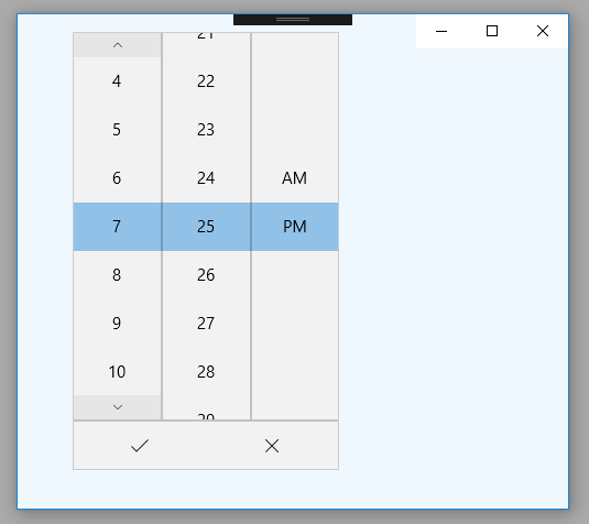
The UWP TimePicker control shows a 12-hour clock with an AM PM selector by default. The Windows app developers can set the TimePicker class’s ClockIdentifier property to 24HourClock to show a 24-hour clock instead.
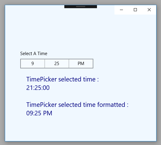
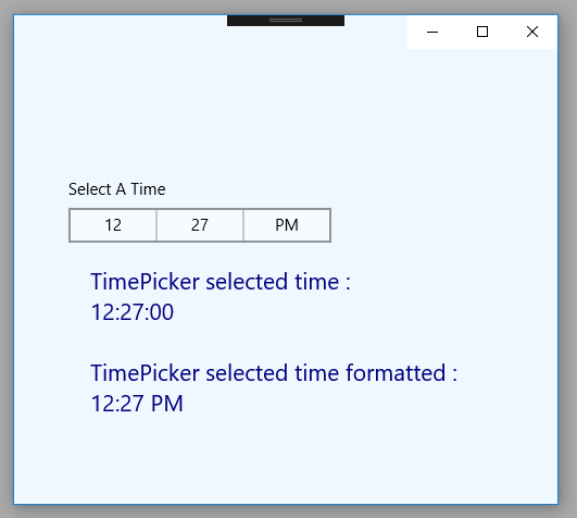
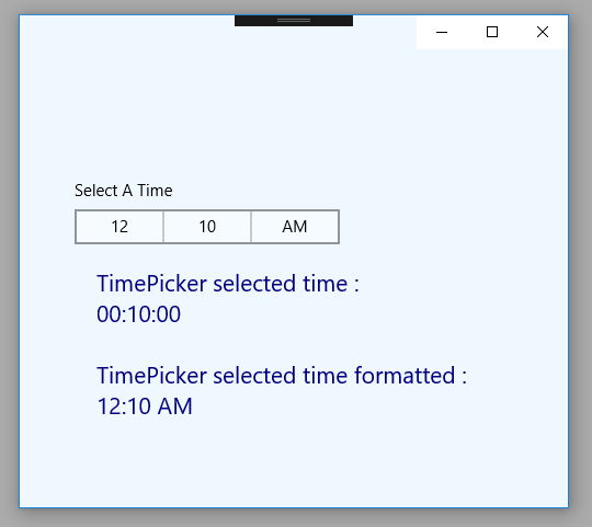
The TimePicker class’s TimeChanged event occurs when the value of the Time property is changed. So using this event, the Windows UWP developers can instantly get the TimePicker control’s selected time.
The TimePicker class’s Time property allows us to get or set the time currently set in the TimePicker control. This Time property value type is TimeSpan which represents the time currently set in the TimePicker widget.
The following Windows UWP app development tutorial will demonstrate how to use the TimePicker control and how the Windows developers can get the TimePicker control’s selected time while a user makes a change. In this tutorial code, we also format the TimePicker control’s selected time to display AM PM state.
The Windows UWP app developers can use a TimePicker to let a user enter a single time value. The developers can customize the TimePicker to use a 12-hour or 24-hour clock.
The UWP TimePicker control shows a 12-hour clock with an AM PM selector by default. The Windows app developers can set the TimePicker class’s ClockIdentifier property to 24HourClock to show a 24-hour clock instead.
The TimePicker class’s TimeChanged event occurs when the value of the Time property is changed. So using this event, the Windows UWP developers can instantly get the TimePicker control’s selected time.
The TimePicker class’s Time property allows us to get or set the time currently set in the TimePicker control. This Time property value type is TimeSpan which represents the time currently set in the TimePicker widget.
The following Windows UWP app development tutorial will demonstrate how to use the TimePicker control and how the Windows developers can get the TimePicker control’s selected time while a user makes a change. In this tutorial code, we also format the TimePicker control’s selected time to display AM PM state.
MainPage.xaml
<Page
    x:Class="UniversalAppTutorials.MainPage"
    xmlns="http://schemas.microsoft.com/winfx/2006/xaml/presentation"
    xmlns:x="http://schemas.microsoft.com/winfx/2006/xaml"
    xmlns:local="using:UniversalAppTutorials"
    xmlns:d="http://schemas.microsoft.com/expression/blend/2008"
    xmlns:mc="http://schemas.openxmlformats.org/markup-compatibility/2006"
    mc:Ignorable="d">
    <StackPanel
        x:Name="stack_panel1"
        Orientation="Vertical"
        Background="AliceBlue"
        Padding="50,150,50,25"
        >
        <TimePicker
            x:Name="TimePicker1"
            TimeChanged="TimePicker1_TimeChanged"
            Header="Select A Time"
            />
        <TextBlock
            x:Name="TextBlock1"
            Foreground="Navy"
            FontSize="21"
            TextWrapping="Wrap"
            Margin="20"
            />
    </StackPanel>
</Page>
MainPage.xaml.cs
using Windows.UI.Xaml.Controls;


namespace UniversalAppTutorials
{
    public sealed partial class MainPage : Page
    {
        public MainPage()
        {
            this.InitializeComponent();
        }

        private void TimePicker1_TimeChanged(object sender, TimePickerValueChangedEventArgs e)
        {
            // Get the instance of TimePicker object
            TimePicker timePicker = sender as TimePicker;

            // Get the TimePicker selected date
            TextBlock1.Text = "TimePicker selected time :\n";
            TextBlock1.Text += "" + timePicker.Time;

            // Format TimePicker selected time and display it
            TextBlock1.Text += "\n\nTimePicker selected time formatted :";
            TextBlock1.Text += "\n" + formatTime(
                timePicker.Time.Hours,
                timePicker.Time.Minutes
                );
        }

        // Custom method to format time
        private string formatTime(int hours, int minutes) {
            // Put minutes in a string to format it
            string minutesString = minutes.ToString();

            // Determine the AM PM state
            bool isPM = hours > 11;
            string aMPMString = "AM";

            if (isPM)
            {
                aMPMString = "PM";
                if (hours != 12)
                {
                    hours -= 12;
                }
            }

            if (hours == 0)
            {
                hours = 12;
            }

            // Padding minutes with zero
            if (minutesString.Length == 1)
            {
                minutesString = minutesString.PadLeft(2, '0');
            }

            // Put hours in a string to format it
            string hoursString = hours.ToString();

            // Padding hours with zero
            if (hoursString.Length == 1)
            {
                hoursString = hoursString.PadLeft(2, '0');
            }

            // Put the formatted time in a string
            string formattedTime = hoursString + ":"+ minutesString + " " + aMPMString;

            // Finally, retrun the formatted time as a string
            return formattedTime;
        }
    }
}