UWP - Set ComboBox Default Selected Item
The ComboBox class represents a selection control that combines a
non-editable text box and a drop-down list box that allows UWP app users to
select an item from a list. The ComboBox starts in a compact state and it
expands to display a list of selectable items. The ComoboBox control is also
known as a drop-down list.
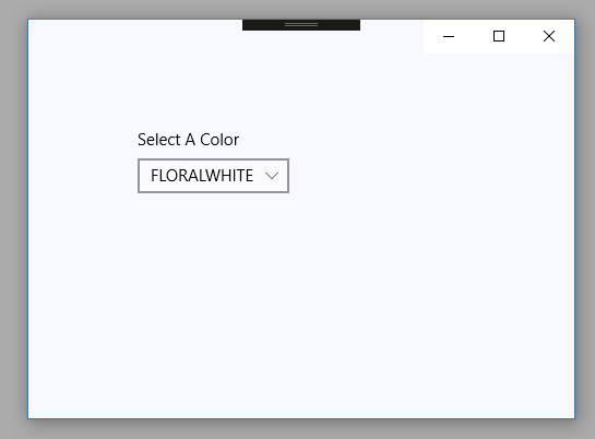
The following UWP app development tutorial code demonstrates how we can set the ComboBox default selected item. That means we will set an item of ComboBox as its pre-selected item. In this UWP example code, we populate the ComboBox with items from a String data type list.
The ItemsControl class’s ItemsSource property gets or sets an object source used to generate the content of the ItemsControl such as a ComboBox control. So we data bind the ComboBox control with a list of String values using this ItemsSource property.
Now the part is how we can make an item the default selected item of the ComboBox control. The UWP app developers can do that in two ways. They can set ComboBox’s selected index after data binding. Or they can set the selected item of the ComboBox at the initializing period.
The Selector class’s SelectedIndex property gets or sets the index of the selected item. This property value is an Int32 instance that is the index of the selected item. The default value of this property is -1, which indicates that no item is selected. So using this property we can initially set an item selected in a ComboBox control.
The Selector class’s SelectedItem property gets or sets the selected item. This property value is an Object instance that is the selected item. The default value is null. The UWP app developers can use this property to set the ComboBox default selected item.
MainPage.xaml
<Page
    x:Class="UniversalAppTutorials.MainPage"
    xmlns="http://schemas.microsoft.com/winfx/2006/xaml/presentation"
    xmlns:x="http://schemas.microsoft.com/winfx/2006/xaml"
    xmlns:local="using:UniversalAppTutorials"
    xmlns:d="http://schemas.microsoft.com/expression/blend/2008"
    xmlns:mc="http://schemas.openxmlformats.org/markup-compatibility/2006"
    mc:Ignorable="d">
    <StackPanel
        x:Name="stack_panel1"
        Orientation="Horizontal"
        Background="GhostWhite"
        Padding="100"
        >
        <ComboBox
            x:Name="ComboBox1"
            Header="Select A Color"
            >
        </ComboBox>
    </StackPanel>
</Page>
MainPage.xaml.cs
using Windows.UI.Xaml.Controls;
using System.Collections.Generic;
namespace UniversalAppTutorials
{
public sealed partial class MainPage : Page
{
public MainPage()
{
this.InitializeComponent();
// Initialize a new list of colors
List<string> colors = new List<string>();
// Put some colors to the list
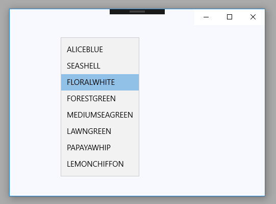
colors.Add("ALICEBLUE");
colors.Add("SEASHELL");
colors.Add("FLORALWHITE");
colors.Add("FORESTGREEN");
colors.Add("MEDIUMSEAGREEN");
colors.Add("LAWNGREEN");
colors.Add("PAPAYAWHIP");
colors.Add("LEMONCHIFFON");
// Finally, Specify the ComboBox items source
ComboBox1.ItemsSource = colors;
/*
SelectedIndex
Gets or sets the index of the selected item.
(Inherited from Selector)
*/
// Set the default selected item of ComboBox
ComboBox1.SelectedIndex = 2;
// Alternate way to specify a default selected item
//ComboBox1.SelectedItem = "LAWNGREEN";
}
}
}