Flutter - IconButton Remove Padding
The IconButton class represents a material design icon button. IconButton is a
picture printed on a material widget that reacts to touches by filling with
color. The flutter developers commonly used the Icon buttons in the AppBar
actions field, but IconButtons can be used in many other places as well. The
flutter app developers can leave the onPressed callback null to disable an
IconButton, then it will not react to touch.
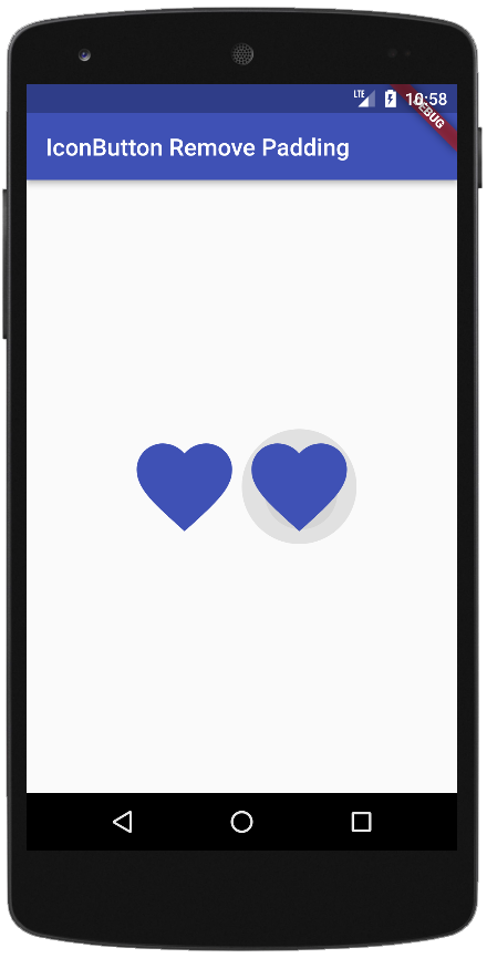
The following flutter app development tutorial will demonstrate how to remove the padding from an IconButton widget. In this example code, we used the IconButon class’s padding property to remove the padding of an InconButton widget. Here we also change the icon button’s splash radius by using the IconButton class’s splashRadius property.
The IconButton class’s padding property defines the padding around the button's icon. The entire padded icon will react to input gestures. The padding property can be null. If null, it defaults to 8.0 padding on all sides.
The IconButton class’s padding property value is an EdgeInsetsGeometry instance. The EdgeInsetsGeometry class is the base class for EdgeInsets that allows for text-direction-aware resolution.
The EdgeInsets class represents an immutable set of offsets in each of the four cardinal directions. The EdgeInsets class specifies offsets in terms of visual edges, left, top, right, and bottom. The EdgeInsets.zero constant defines an EdgeInsets with zero offsets in each direction.
So finally, the flutter developers can pass the EdgeInsets.Zero constant to the IconButton class’s padding parameter value to remove the padding from an InconButton widget.
main.dart
import 'package:flutter/material.dart';

void main(){
  runApp(
    MaterialApp(
      theme: ThemeData(primarySwatch: Colors.indigo),
      home: Scaffold(
          appBar: AppBar(
              title: const Text("IconButton Remove Padding")
          ),
          body: Center(
              child: Row(
                mainAxisAlignment: MainAxisAlignment.center,
                crossAxisAlignment: CrossAxisAlignment.center,
                children: [
                  IconButton(
                      iconSize: 96,
                      icon: const Icon(Icons.favorite,),
                      onPressed: (){},
                      color: Colors.indigo,
                      splashRadius: 48, // half of icon size
                      padding: EdgeInsets.zero
                  ),
                  IconButton(
                      iconSize: 96, // default 24
                      icon: const Icon(Icons.favorite,),
                      onPressed: (){},
                      color: Colors.indigo,
                      splashRadius: 48,
                      padding: EdgeInsets.zero
                  )
                ],
              )
          )
      ),
    ),
  );
}