Flutter - PopupMenuButton Shape
The PopupMenuButton class allows us to display a menu when pressed and calls
onSelected when the menu is dismissed because an item was selected. The value
passed to onSelected is the value of the selected menu item. The flutter
developers can provide one of a child or an icon but not both. If developers
provide an icon then PopupMenuButton behaves like an IconButton. If both child
and icon are null, then a standard overflow icon is created depending on the
platform.
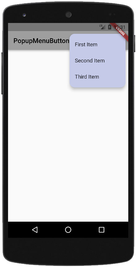
The following flutter app development tutorial will demonstrate how to set or change the PopupMenuButton widget shape. Here we used the PopupMenuButton class’s shape property to specify the shape of a PopupMenuButton widget. We rendered a rounded corners PopupMenuButton in this flutter example.
The PopupMenuButton class’s shape property value is a ShapeBorder instance that defines the shape of the menu. When flutter developers leave the shape property value to null then PopupMenuThemeData.shape is used. If PopupMenuThemeData.shape is also null, then the default shape for MaterialType.card is used. The PopupMenuButton default shape is a rectangle with rounded edges of border radius circular 2.0.
The ShapeBorder class is the base class for shape outlines. The ShapeBorder class handles how to add multiple borders together. Subclasses define various shapes, like circles, rounded rectangles, continuous rectangles, or beveled rectangles. In this example code, we build a rounded rectangle PopupMenuButton whose border radius is 16.
So finally, the flutter app developers can set or change the PopupMenuButton widget’s shape by providing a ShapeBorder instance to its shape property value. The ShapeBorder allows the flutter developers to change the PopupMenuButton widget’s default shape.
main.dart
import 'package:flutter/material.dart';

void main(){
  runApp(
    MaterialApp(
      theme: ThemeData(primarySwatch: Colors.grey),
      home: Scaffold(
        appBar: AppBar(
          title: const Text("PopupMenuButton Shape"),
          actions: [
            PopupMenuButton(
              itemBuilder: (context) => [
                const PopupMenuItem(child: Text("First Item")),
                const PopupMenuItem(child: Text("Second Item")),
                const PopupMenuItem(child: Text("Third Item"))
              ],
              color: Colors.indigo.shade100,
              shape: RoundedRectangleBorder(
                  borderRadius: BorderRadius.circular(16)
              ),
            )
          ],
        ),
      ),
    ),
  );
}
