Flutter - ToggleButtons onPressed
The ToggleButtons class represents a set of toggle buttons. The ToggleButton’s
children are laid out along direction. The state of each button in a
ToggleButton widget is controlled by the isSelected property, which is a list
of bools that determine if a button is in an unselected or selected state. The
ToggleButton widget has a solid, 1 logical pixel border surrounding itself by
default and separating each button. The flutter app developers can completely
remove the ToggleButtons border by setting the renderBorder property value to
false.
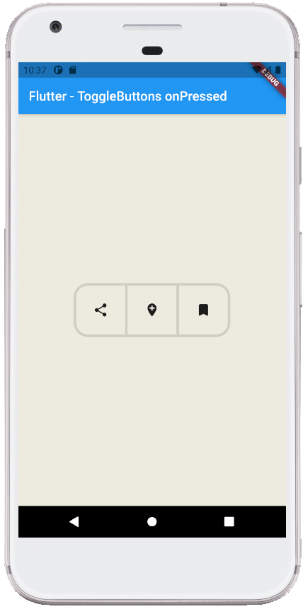
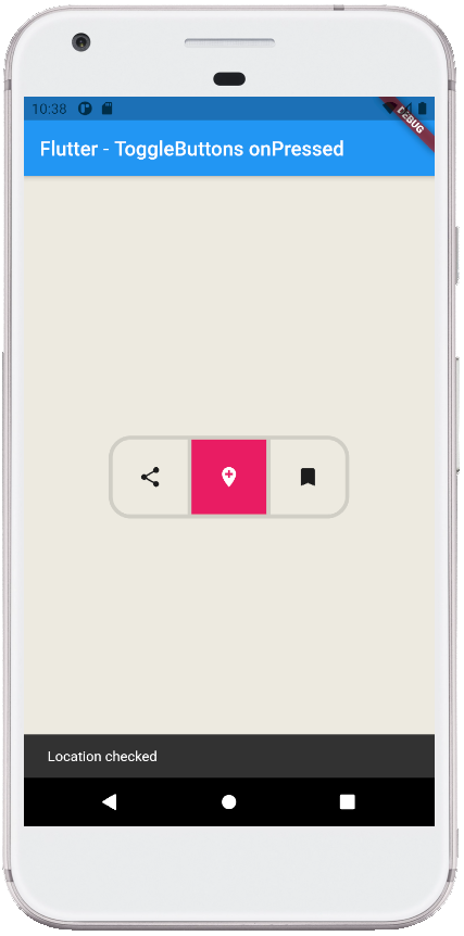
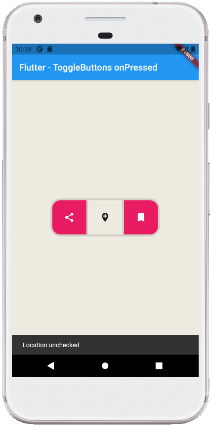
The following flutter app development tutorial will demonstrate how to set the pressed callback for the ToggleButtons widget. Here we used the ToggleButtons widget’s onPressed property to set the pressed callback for the ToggleButtons widget’s buttons.
The flutter developers can configure the ToggleButtons widget’s each toggle behavior by the onPressed callback, which can update the isSelected list however it wants to.
The ToggleButtons class’s onPressed property set the callback that is called when a button is tapped. The onPressed property value is a Void which is the callback that is called when a button is tapped. The index parameter of the callback is the index of the button that is tapped or otherwise activated. When the ToggleButton’s onPressed callback is null, all toggle buttons will be disabled.
In this flutter example code, we determine the user-pressed button from the ToggleButton widget and display the specified button’s selected and unselected state in a message on SnackBar. We also update the specified button’s selected state in this scope.
main.dart
import 'package:flutter/material.dart';

void main() => runApp(const FlutterExample());

class FlutterExample extends StatelessWidget {
  const FlutterExample({Key? key}) : super(key: key);

  @override
  Widget build(BuildContext context) {
    return MaterialApp(
        title: 'Flutter Example',
        theme: ThemeData(primarySwatch: Colors.blue),
        home: const StateExample()
    );
  }
}

class StateExample extends StatefulWidget {
  const StateExample({Key? key}) : super(key: key);

  @override
  _StateExampleState createState() => _StateExampleState();
}

class _StateExampleState extends State<StateExample> {
  final List<bool> _selections = List.generate(3, (index) => false);

  @override
  Widget build(BuildContext context) {
    return Scaffold(
        backgroundColor: const Color(0xFFEDEAE0),
        appBar: AppBar(
            title: const Text("Flutter - ToggleButtons onPressed")
        ),
        body: bodyContent()
    );
  }


  bodyContent() {
    return Center(
        child: ToggleButtons(
          children: const [
            Icon(Icons.share),
            Icon(Icons.add_location),
            Icon(Icons.bookmark),
          ],
          onPressed: (int index){
            setState(() {
              _selections[index] = !_selections[index];
              if(index == 0){
                if(_selections[index]){
                  showSnackBar("Share checked");
                }else{
                  showSnackBar("Share unchecked");
                }
              }else if(index == 1){
                if(_selections[index]){
                  showSnackBar("Location checked");
                }else{
                  showSnackBar("Location unchecked");
                }
              }else if(index == 2){
                if(_selections[index]){
                  showSnackBar("Bookmark checked");
                }else{
                  showSnackBar("Bookmark unchecked");
                }
              }
            });
          },
          isSelected: _selections,
          constraints: const BoxConstraints(
              minWidth: 75,
              minHeight: 75
          ),
          borderRadius: BorderRadius.circular(20),
          borderWidth: 4,
          fillColor: Colors.pink,
          selectedColor: Colors.white,
        )
    );
  }


  showSnackBar(String message){
    SnackBar snackBar = SnackBar(
        content: Text(message)
    );
    ScaffoldMessenger.of(context).showSnackBar(snackBar);
  }
}