Flutter - ToggleButtons Rounded Corners
The ToggleButtons class represents a set of toggle buttons. The ToggleButton’s
children are laid out along direction. The state of each button in a
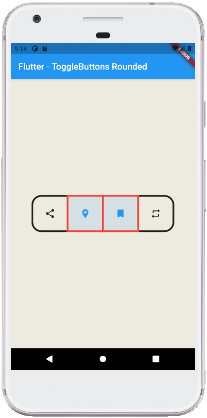
ToggleButton widget is controlled by the isSelected property, which is a list
of bools that determine if a button is in an unselected or selected state. The
flutter developers can configure the ToggleButtons widget’s each toggle
behavior by the onPressed callback, which can update the isSelected list
however it wants to. The ToggleButtons widget has a solid, 1 logical pixel
border surrounding itself by default and separating each button.
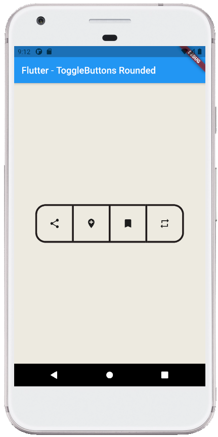
The following flutter app development tutorial will demonstrate how to create and show rounded corners ToggleButtons widget. Here we used the ToggleButtons widget’s borderRadius property to display the rounded corners ToggleButtons widget in a flutter app.
In this flutter example code, we will also specify the ToggleButtos widget’s enabled border color, disabled border color, selected border color, and border thickness by using its corresponding properties.
The ToggleButtons class’s borderRadius property value is a BorderRadius instance that specifies the radii of the border's corners.
The BorderRadius class represents an immutable set of radii for each corner of a rectangle. The BorderRadius class specifies offsets in terms of visual corners, e.g. topLeft.
The BorderRadius.circular(double radius) constructor creates a border radius where all radii are Radius.circular(radius). Here we used this constructor to create a rounded corners border for the ToggleButtons widget.
The ToggleButtons class’s borderWidth property determines the width of the border surrounding each toggle button. The borderColor property specifies the border color to display when the toggle button is enabled and not selected.
The disabledBorderColor property determines the border color to display when the toggle button is disabled. And the selectedBorderColor property helps us to set the border color to display when the toggle button is selected.
So finally, the flutter app developers can create a rounded corners ToggleButtons widget by using its borderRadius property. And they also can customize the border appearance by other border-related properties.
main.dart
import 'package:flutter/material.dart';

void main() => runApp(const FlutterExample());

class FlutterExample extends StatelessWidget {
  const FlutterExample({Key? key}) : super(key: key);

  @override
  Widget build(BuildContext context) {
    return MaterialApp(
        title: 'Flutter Example',
        theme: ThemeData(primarySwatch: Colors.blue),
        home: const StateExample()
    );
  }
}

class StateExample extends StatefulWidget {
  const StateExample({Key? key}) : super(key: key);

  @override
  _StateExampleState createState() => _StateExampleState();
}

class _StateExampleState extends State<StateExample> {
  final List<bool> _selections = List.generate(4, (index) => false);

  @override
  Widget build(BuildContext context) {
    return Scaffold(
        backgroundColor: const Color(0xFFEDEAE0),
        appBar: AppBar(
            title: const Text("Flutter - ToggleButtons Rounded")
        ),
        body: bodyContent()
    );
  }


  bodyContent() {
    return Center(
        child: ToggleButtons(
            children: const [
              Icon(Icons.share),
              Icon(Icons.add_location),
              Icon(Icons.bookmark),
              Icon(Icons.repeat)
            ],
            onPressed: (int index){
              setState(() {
                _selections[index] = !_selections[index];
              });
            },
            isSelected: _selections,
            constraints: const BoxConstraints(
                minWidth: 75,
                minHeight: 75
            ),
            borderRadius: BorderRadius.circular(20),
            borderWidth: 4,
            borderColor: Colors.black87,
            selectedBorderColor: Colors.red,
            disabledBorderColor: Colors.blueGrey
        )
    );
  }
}