Flutter OutlinedButton
The OutlinedButton class represents a material design Outlined Button that is
essentially a TextButton with an outlined border.
The Outlined buttons are medium-emphasis buttons. In a flutter application, the OutlinedButtons contain actions that are important, but they are not the primary action in an app.
An OutlinedButton widget’s default style is defined by defaultStyleOf. The flutter application developers can override the OutlinedButton’s style with its style parameter.
An OutlinedButton has a default ButtonStyle.side which defines the appearance of the outline. The flutter app developers can specify an OutlinedButton's shape and the appearance of its outline by specifying both the ButtonStyle.shape and ButtonStyle.side properties.
The OutlinedButton() constructor creates an OutlinedButton. And the OutlinedButton.icon() constructor creates a text button from a pair of widgets that serve as the button's icon and label.
The OutlinedButton class has several useful properties to customize an OtlinedButton widget’s appearance and behaviors such as autofocus, clipBehavior, onFocusChange, onPressed, onLongPress, and style.
The OutlinedButton class styleFrom() static method is a static convenience method that constructs an outlined button ButtonStyle given simple values.
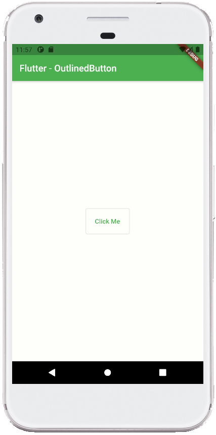
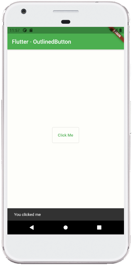
The following flutter application development tutorial will demonstrate how to use an OutlinedButton in a flutter application. Here we show a simple text message on the Snackbar when a user pressed the OutlinedButton.
main.dart
import 'package:flutter/material.dart';

void main() => runApp(const FlutterExample());

class FlutterExample extends StatelessWidget {
  const FlutterExample({Key? key}) : super(key: key);

  @override
  Widget build(BuildContext context) {
    return MaterialApp(
        title: 'Flutter Example',
        theme: ThemeData(primarySwatch: Colors.green),
        home: const StateExample()
    );
  }
}

class StateExample extends StatefulWidget {
  const StateExample({Key? key}) : super(key: key);

  @override
  _StateExampleState createState() => _StateExampleState();
}

class _StateExampleState extends State<StateExample>{
  @override
  Widget build(BuildContext context) {
    return Scaffold(
      backgroundColor: const Color(0xFFFEFEFA),
      appBar: AppBar(
          title: const Text("Flutter - OutlinedButton")
      ),
      body: bodyContent(),
    );
  }


  bodyContent() {
    return Center(
        child: OutlinedButton(
          onPressed: (){
            SnackBar snackBar = const SnackBar(
                content: Text("You clicked me")
            );
            ScaffoldMessenger.of(context).showSnackBar(snackBar);
          },
          child: const Text("Click Me"),
          style: OutlinedButton.styleFrom(
              padding: const EdgeInsets.all(20)
          ),
        )
    );
  }
}

