Flutter ElevatedButton
The ElevatedButton class represents a material design elevated button. The
flutter developers can use elevated buttons to add dimension to otherwise
mostly flat layouts such as in long busy lists of content, or in wide spaces.
The flutter developers should avoid using elevated buttons on already-elevated content such as dialogs or cards. An ElevatedButton widget is a label child displayed on a Material widget whose Material.elevation increases when the button is pressed.
The label's Text and Icon widgets are displayed in style's ButtonStyle.foregroundColor and the button's filled background is the ButtonStyle.backgroundColor.
The ElevatedButton widget's default style is defined by defaultStyleOf. The style of this ElevatedButton can be overridden with its style parameter. The static styleFrom method is a convenient way to create an ElevatedButton ButtonStyle from simple values.
If the ElevatedButton widget’s onPressed and onLongPress callbacks are null then the elevated button will be disabled.
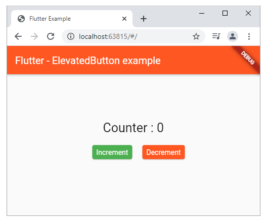
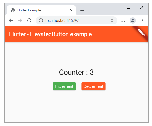
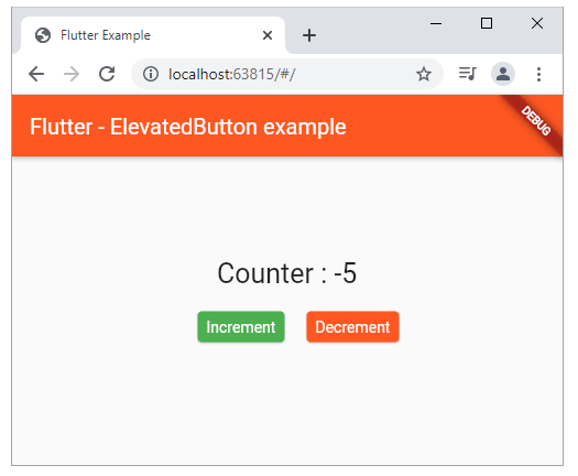
In the following flutter application development tutorial code, we put two ElevatedButton widget instances. Here we create a simple counter. When the first button is pressed the counter is up. And when users press the second button the counter is down. We also change the first button’s background color.
The flutter developers should avoid using elevated buttons on already-elevated content such as dialogs or cards. An ElevatedButton widget is a label child displayed on a Material widget whose Material.elevation increases when the button is pressed.
The label's Text and Icon widgets are displayed in style's ButtonStyle.foregroundColor and the button's filled background is the ButtonStyle.backgroundColor.
The ElevatedButton widget's default style is defined by defaultStyleOf. The style of this ElevatedButton can be overridden with its style parameter. The static styleFrom method is a convenient way to create an ElevatedButton ButtonStyle from simple values.
If the ElevatedButton widget’s onPressed and onLongPress callbacks are null then the elevated button will be disabled.
In the following flutter application development tutorial code, we put two ElevatedButton widget instances. Here we create a simple counter. When the first button is pressed the counter is up. And when users press the second button the counter is down. We also change the first button’s background color.
main.dart
import 'package:flutter/material.dart';

void main() => runApp(const FlutterExample());

class FlutterExample extends StatelessWidget {
  const FlutterExample({Key? key}) : super(key: key);

  @override
  Widget build(BuildContext context) {
    return MaterialApp(
        title: 'Flutter Example',
        theme: ThemeData(primarySwatch: Colors.deepOrange),
        home: const StateExample());
  }
}

class StateExample extends StatefulWidget {
  const StateExample({Key? key}) : super(key: key);

  @override
  _StateExampleState createState() => _StateExampleState();
}

class _StateExampleState extends State<StateExample> {
  int counter = 0;

  void _increment() {
    setState(() {
      counter++;
    });
  }

  void _decrement() {
    setState(() {
      counter--;
    });
  }

  @override
  Widget build(BuildContext context) {
    return Scaffold(
      appBar: AppBar(
        title: const Text("Flutter - ElevatedButton example"),
      ),
      body: bodyContent(),
    );
  }

  bodyContent() {
    return Center(
        child: Column(
          mainAxisAlignment: MainAxisAlignment.center,
          children: [
            Text(
              "Counter : $counter",
              style: const TextStyle(fontSize: 25),
            ),
            Row(
              mainAxisAlignment: MainAxisAlignment.center,
              children: [
                Padding(
                  padding: const EdgeInsets.all(20),
                  child: ElevatedButton(
                    onPressed: _increment,
                    child: const Text("Increment"),
                    style: ElevatedButton.styleFrom(
                      primary: Colors.green,
                    ),
                  ),
                ),
                ElevatedButton(
                    onPressed: _decrement,
                    child: const Text("Decrement")
                )
              ],
            )
          ],
        )
    );
  }
}