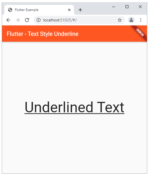
Flutter - Text Style Underline
The Text widget displays a string of text with a single style in a flutter
app. But depending on the layout constraints the string might break across
multiple lines or might all be displayed on the same line. The style argument
is optional in a Text instance. When the style argument is omitted then the
text will use the style from the closest enclosing DefaultTextStyle. By
default, the Text is not selectable. But flutter developers can make a Text
selectable by wrapping a subtree with a SelectionArea widget.
In the following flutter application development tutorial, we will demonstrate how we can underline text. Here we will use the TextStyle class decoration property to decorate the Text by putting an underline.
The TextStyle class represents an immutable style describing how to format and paint text. The TextStyle class decoration property is used to apply decorations to paint near the text such as an underline. The flutter app developer can apply multiple decorations with TextDecoration.combine.
The TextDecoration class represents a linear decoration to draw near the text. The TextDecoration class’s underline const draws a line underneath each line of text.
So finally, the flutter app developers can put an underline on a Text by using the TextStyle class’s decoration property. And they also have to set the decoration property value to the underline constant as TextDecoration.underline.
main.dart
import 'package:flutter/material.dart';

void main() => runApp(const FlutterExample());

class FlutterExample extends StatelessWidget{
  const FlutterExample({Key? key}) : super(key: key);

  @override
  Widget build(BuildContext context){
    return MaterialApp(
      title: 'Flutter Example',
      theme: ThemeData(primarySwatch: Colors.deepOrange),
      home: Scaffold(
        appBar: AppBar(
          title: const Text("Flutter - Text Style Underline"),
        ),
        body: const BodyContents(),
      ),
    );
  }
}

class BodyContents extends StatelessWidget{
  const BodyContents({Key? key}) : super(key: key);

  @override
  Widget build(BuildContext context) {
    {
      return const Center(
        child: Text(
          'Underlined Text',
          style: TextStyle(
              fontSize: 50,
              decoration: TextDecoration.underline
          ),
        ),
      ) ;
    }
  }
}