UWP - TextBlock Underline Text
The TextBlock is the primary control for displaying read-only text in
UWP apps. The UWP app developers can use it to display single-line or
multi-line text, inline hyperlinks, and text with formatting like bold,
italic, or underlined. The TextBlock is designed to display a single paragraph
and it does not support text indentation.
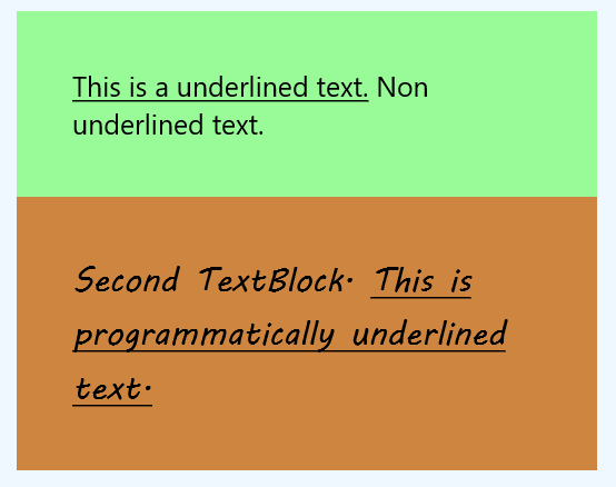
The following Universal Windows Platform application development tutorial demonstrates how we can underline the TextBlock text. Here we will display underlining on two TextBlock texts.
For the first TextBlock control, we will underline some text using the XAML language. And for another TextBlock control, we will underline parts of its text programmatically.
For the first TextBlock control, we will use inline Run and Underline instances to make some text underlined. And for the second TextBlock control, we will create and apply the Run and Underline instances programmatically.
The Run class represents a discrete section of formatted or unformatted text. The UWP developers can use a Run instance in a TextBlock or RichTextBlock. The UWP app developers even can place multiple Run elements inside of a Span. The UWP developers should typically use the Run element only when they want to format a discrete section of text within the TextBlock.
The Run class Text property gets or sets the text contents of the Run.
The Underline class provides an inline-level content element that causes content to render with an underlined text decoration.
The Underline class Inlines property gets an InlineCollection containing the top-level inline elements that include the contents of Span. This property is inherited from Span.
The TextBlock class Inlines property gets the collection of inline text elements within a TextBlock. This property value is an InlineCollectionwhich is a collection that holds all inline text elements from the TextBlock. The default value of this property is an empty collection.
MainPage.xaml
<Page
    x:Class="UniversalAppTutorials.MainPage"
    xmlns="http://schemas.microsoft.com/winfx/2006/xaml/presentation"
    xmlns:x="http://schemas.microsoft.com/winfx/2006/xaml"
    xmlns:local="using:UniversalAppTutorials"
    xmlns:d="http://schemas.microsoft.com/expression/blend/2008"
    xmlns:mc="http://schemas.openxmlformats.org/markup-compatibility/2006"
    mc:Ignorable="d">
    <StackPanel
        x:Name="StackPanel1"
        Margin="50"
        Orientation="Vertical"
        Background="AliceBlue"
        Padding="50"
        >
        <Border Background="PaleGreen">
            <TextBlock
                x:Name="TextBlock1"
                Margin="50"
                TextWrapping="Wrap"
                FontSize="25"
                >
                <Underline>
                    <Run>
                        This is a underlined text.
                    </Run>
                </Underline>
                <Run>
                    Non underlined text.
                </Run>
            </TextBlock>
        </Border>
        <Border Background="Peru">
            <TextBlock
                x:Name="TextBlock2"
                Margin="50"
                FontSize="30"
                TextWrapping="Wrap"
                FontFamily="MV Boli"
                Text="Second TextBlock. "
                />
        </Border>
    </StackPanel>
</Page>
MainPage.xaml.cs
using Windows.UI.Xaml.Controls;
using Windows.UI.Xaml.Documents;


namespace UniversalAppTutorials
{
    public sealed partial class MainPage : Page
    {
        public MainPage()
        {
            this.InitializeComponent();

            // Initialize a new Underline instance
            Underline underline = new Underline();

            // Initialize a new Run instance
            Run run = new Run();

            // Set the text for run
            run.Text = "This is programmatically underlined text.";

            // Add the Run to Underline
            underline.Inlines.Add(run);

            // Finally, show the underlined text on second text block
            TextBlock2.Inlines.Add(underline);
        }
    }
}