UWP - ListView Item Margin
The ListView class represents a control that displays data items in a
vertical stack. The UWP app developers can use ListView to display a
collection of items stacked vertically or horizontally. The ListView is an
ItemsControl, so the ListView can contain a collection of items of any type.
To populate a ListView the UWP developers have to add items to the Items
collection or set the ItemsSource property to a data source. The ListView data
item is displayed as the string representation by default.
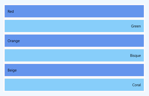
The following Universal Windows Platform application development tutorial demonstrates how we can add margin to items in a ListView. Here we will add margin to all of the items in a ListView control.
In the beginning, we populate an array with elements. Then we loop through the array. While looping through the array elements, we create a ListViewItem instance for each array item. We also set the ListViewItem content from the corresponding array element. We also specify the item height programmatically in the c# code section.
Now we add a margin to the ListViewItem instance. Then we add the ListViewItem instance to the ListView item collection. Finally, the ListView shows the margin around each item.
The ListViewItem class represents the container for an item in a ListView control. The ListViewItem class provides the container for items displayed in a ListView control.
The ListViewItem class Margin property gets or sets the outer margin of a FrameworkElement. The ListView Margin property is inherited from FrameworkElement.
The FrameworkElement class provides a base element class for Windows Runtime UI objects. FrameworkElement defines a common API that supports UI interaction and the automatic layout system.
The FrameworkElement class Margin property gets or sets the outer margin of a FrameworkElement. This property value is a Thickness that provides margin values for the object. The default value of this property is a default Thickness with all properties (dimensions) equal to 0.
A margin value greater than 0 applies space outside the item’s actual width and actual height. In this UWP tutorial code, we also set different background colors for ListView alternate items.
MainPage.xaml
<Page
    x:Class="UniversalAppTutorials.MainPage"
    xmlns="http://schemas.microsoft.com/winfx/2006/xaml/presentation"
    xmlns:x="http://schemas.microsoft.com/winfx/2006/xaml"
    xmlns:local="using:UniversalAppTutorials"
    xmlns:d="http://schemas.microsoft.com/expression/blend/2008"
    xmlns:mc="http://schemas.openxmlformats.org/markup-compatibility/2006"
    mc:Ignorable="d">
    <StackPanel
        x:Name="stack_panel1"
        Margin="50"
        Orientation="Vertical"
        Background="AliceBlue"
        Padding="25"
        >
        <ListView
            x:Name="ListView1"
            Background="Snow"
            >
        </ListView>
    </StackPanel>
</Page>
MainPage.xaml.cs
using Windows.UI.Xaml.Controls;
using Windows.UI.Xaml.Media;
using Windows.UI;
using Windows.UI.Xaml;


namespace UniversalAppTutorials
{
    public sealed partial class MainPage : Page
    {
        public MainPage()
        {
            this.InitializeComponent();

            // Initialize a new string array
            string[] colors = {
                "Red",
                "Green",
                "Orange",
                "Bisque",
                "Beige",
                "Coral"
            };

            // Get the list view item collection
            ItemCollection ic = ListView1.Items;

            // Loop through the array items
            for (int index = 0; index < colors.Length; index++)
            {
                // Initialize a new ListViewItem instance
                ListViewItem item = new ListViewItem();

                // Add the content to item
                item.Content = colors[index];

                // Set the list item height
                item.Height = 50;

                // Set the list view item margin
                item.Margin = new Thickness(
                        5, // Left
                        5, // Top
                        5, // Right
                        5 // Bottom
                    );

                if (index % 2 == 0)
                {
                    // Set the regular item background
                    item.Background = new SolidColorBrush(Colors.CornflowerBlue);
                }
                else
                {
                    // Set the alternate item background
                    item.Background = new SolidColorBrush(Colors.LightSkyBlue);

                    // Set the alternate item content alignment
                    item.HorizontalContentAlignment = HorizontalAlignment.Right;
                }

                // Finally, add the item to the list view item collection
                ic.Add(item);
            }
        }
    }
}
