UWP - ListView Item Separator
The ListView class represents a control that displays data items in a
vertical stack. The UWP app developers can use ListView to display a
collection of items stacked vertically or horizontally. The ListView is an
ItemsControl, so the ListView can contain a collection of items of any type.
To populate a ListView the UWP developers have to add items to the Items
collection or set the ItemsSource property to a data source. The ListView data
item is displayed as the string representation by default.
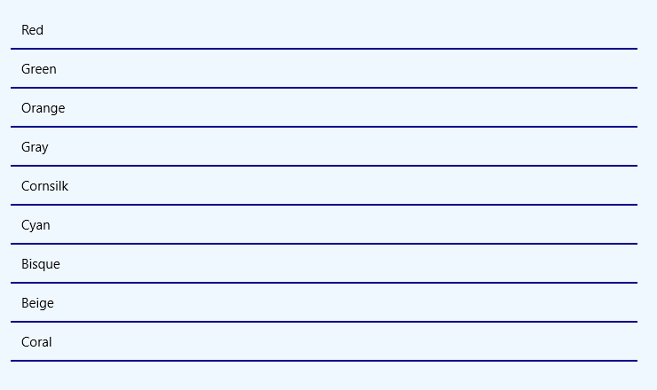
The following Universal Windows Platform application development tutorial demonstrates how we can add an item separator to ListView control. Here we will put an item separator line between each item of a ListView.
In this UWP tutorial code, we initialize an array with data. We loop through the array elements. Then we create a ListViewItem instance for each array item programmatically in the c# code section. We also set the ListViewItem content from the corresponding array element.
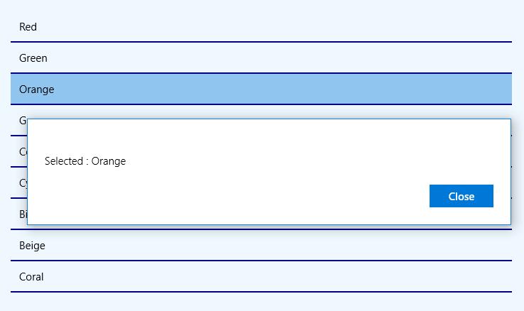
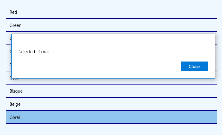
Now we add a border and border brush to the ListViewItem instance. We add the ListViewItem instance to the ListView item collection. Finally, the ListView shows the item separator line between each item. In this UWP example code, we also add a SelectionChanged event to the ListView control. We display the selected item on a dialog when a user changes the ListView item selection.
The ListViewItem class represents the container for an item in a ListView control. The ListViewItem class provides the container for items displayed in a ListView control.
The ListViewItem class BorderThickness property gets or sets the border thickness of a control. This ListVieItem property is inherited from Control. This property value is a Thickness which is the border thickness of a control, as a Thickness value.
The ListViewItem class BorderBrush property gets or sets a brush that describes the border fill of a control. This property is also inherited from Control. The BorderBrush property value is a Brush which is the brush that is used to fill the control's border. The default value is null, and a null brush is evaluated as Transparent for rendering.
MainPage.xaml
<Page
    x:Class="UniversalAppTutorials.MainPage"
    xmlns="http://schemas.microsoft.com/winfx/2006/xaml/presentation"
    xmlns:x="http://schemas.microsoft.com/winfx/2006/xaml"
    xmlns:local="using:UniversalAppTutorials"
    xmlns:d="http://schemas.microsoft.com/expression/blend/2008"
    xmlns:mc="http://schemas.openxmlformats.org/markup-compatibility/2006"
    mc:Ignorable="d">
    <StackPanel
        x:Name="stack_panel1"
        Margin="50"
        Orientation="Vertical"
        Background="AliceBlue"
        Padding="25"
        >
        <ListView
            x:Name="ListView1"
            SelectionChanged="ListView1_SelectionChanged"
            >
        </ListView>
    </StackPanel>
</Page>
MainPage.xaml.cs
using Windows.UI.Xaml.Controls;
using Windows.UI.Popups;
using Windows.UI.Xaml.Media;
using Windows.UI;
using Windows.UI.Xaml;

namespace UniversalAppTutorials
{
    public sealed partial class MainPage : Page
    {
        public MainPage()
        {
            this.InitializeComponent();

            // Initialize a new string array
            string[] colors = {
                "Red",
                "Green",
                "Orange",
                "Gray",
                "Cornsilk",
                "Cyan",
                "Bisque",
                "Beige",
                "Coral"
            };

            // Get the list view item collection
            ItemCollection ic = ListView1.Items;

            // Loop through the array items
            for (int index = 0; index < colors.Length; index++) {
                // Initialize a new ListViewItem instance
                ListViewItem item = new ListViewItem();

                // Add the content to item
                item.Content = colors[index];

                // Set the item border as item separator
                item.BorderThickness = new Thickness(0, 0, 0, 2);
                item.BorderBrush = new SolidColorBrush(Colors.DarkBlue);

                // Finally, add the item to the list view item collection
                ic.Add(item);
            }
        }


        private void ListView1_SelectionChanged(object sender, SelectionChangedEventArgs e)
        {
            // Get the list view instance
            ListView listView = sender as ListView;

            // Get the list view selectted item
            ListViewItem item = (ListViewItem)listView.SelectedItem;

            // Get the list view selectted item text
            string selectedItemText = item.Content.ToString();

            // Initialize a new message dialog
            MessageDialog dialog = new MessageDialog("Selected : " + selectedItemText);

            // Finally, display the selected item text on dialog
            dialog.ShowAsync();
        }
    }
}


