AutoPostBack feature in RadioButtonList
The following ASP.NET C# example code demonstrates to us how can we use
the RadioButtonList AutoPostBack property/feature. RadioButtonList is an
asp.net list web server control that renders a radio group on the web page.
RadioButtonList provides a single selection/check radio group. Users can
select an item from RadioButtonList at a time.
We can get the user selection from a RadioButtonList after page submission to the web server. RadioButtonList control has a property named AutoPostBack which allows us to automatically submit the page to web server each time the RadioButtonList item selection is changed. AutoPostBack property accepts a Boolean value.
If we set the AutoPostBack property value to true then each time we change the RadioButtonList item selection, it posts the web page to the server. If we set the AutoPostBack property value to false then it does not post the page to the server when we change the RadioButtonList item selection.
If we set the RadioButtonList control's AutoPostback property value to true and write an event handler for the SelectedIndexChanged event then we can get the selected item's text and value each time users change the item selection of RadioButtonList.
RadioButtonListAutoPostBack.aspx
<%@ Page Language="C#" %>
<!DOCTYPE html>
<script runat="server">
protected void RadioButtonList1_SelectedIndexChanged(object sender, System.EventArgs e)
{
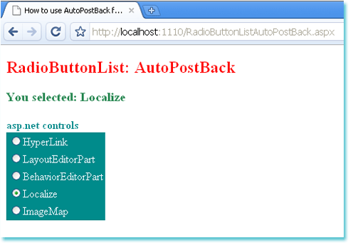
Label1.Text = "You selected: " + RadioButtonList1.SelectedItem.Text;
}
</script>
<html xmlns="http://www.w3.org/1999/xhtml">
<head id="Head1" runat="server">
<title>How to use AutoPostBack feature in RadioButtonList</title>
</head>
<body>
<form id="form1" runat="server">
<div>
<h2 style="color:Red">RadioButtonList: AutoPostBack</h2>
<asp:Label
ID="Label1"
runat="server"
Font-Bold="true"
ForeColor="SeaGreen"
Font-Size="Large"
>
</asp:Label>
<br /><br />
<asp:Label
ID="Label2"
runat="server"
Font-Bold="true"
ForeColor="DarkCyan"
Text="asp.net controls"
>
</asp:Label>
<asp:RadioButtonList
ID="RadioButtonList1"
runat="server"
AutoPostBack="true"
OnSelectedIndexChanged="RadioButtonList1_SelectedIndexChanged"
BackColor="DarkCyan"
ForeColor="AliceBlue"
>
<asp:ListItem>HyperLink</asp:ListItem>
<asp:ListItem>LayoutEditorPart</asp:ListItem>
<asp:ListItem>BehaviorEditorPart</asp:ListItem>
<asp:ListItem>Localize</asp:ListItem>
<asp:ListItem>ImageMap</asp:ListItem>
</asp:RadioButtonList>
</div>
</form>
</body>
</html>